

A friend of mine gave me a nudge. He says: "Bro, you stopped filming for TikTok, you were killing it." One of the few people who actually supports me filming.
And I'm like: bro, I don't know. The comments wear me out. Clients with terrible offers wear me out. I just forgot why I do it.
So I get home. I sit down at the PC. And now what? Play games? Not in the mood. Watch a show? Not in the mood either. Fine, I open TikTok Studio and go Live.
The idea was to find some e-commerce stores that need a redesign. Cool, two birds with one stone: I stream on TikTok, teach the kids something, and at the same time I work for myself and look for new clients.
Bingo, great formula. So with them keeping me company, I start digging.
First: a moodboard and a look at similar brands
I go through the site of every similar brand and look: ok, this section is good and could be used. This one is bad, this one is good. That way I collect everything I like and anything that could help sell more for the brand I'm redesigning.
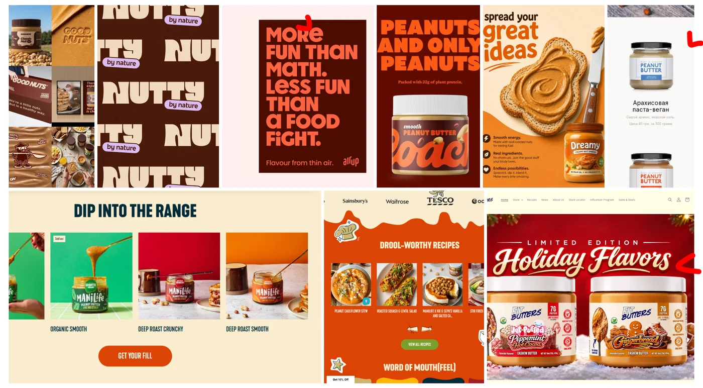
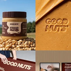 Fresh colors
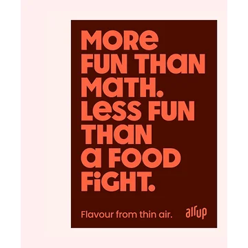 Bold typography
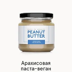 Simple visuals
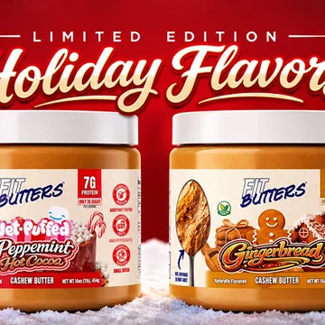 Seasonal campaigns (header)
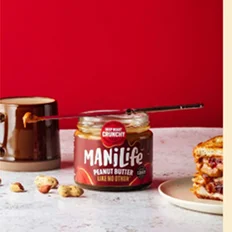 Lifestyle photography
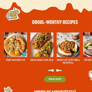 Recipes, better SEO
Problem 1: a site with no system
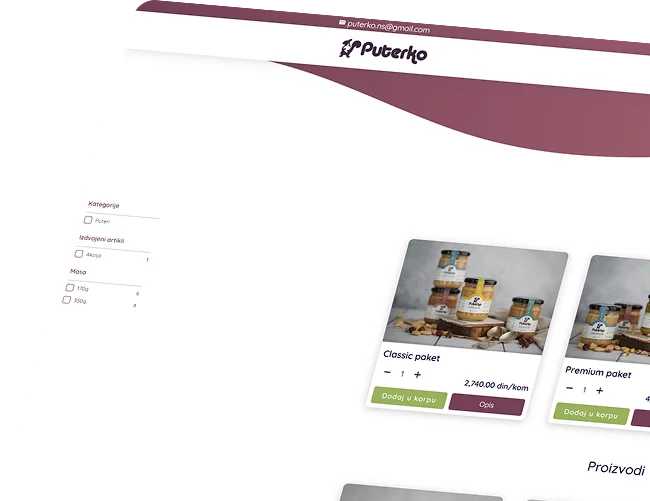
Their site is pretty basic. It doesn't follow any system, and the images are too small.
Anyone who lands there for the first time knows what it is, but not why they should buy it. There's nothing that tells them the product is good. At the end of the day, it might just be a scam. What if I order and nothing shows up?
Old site
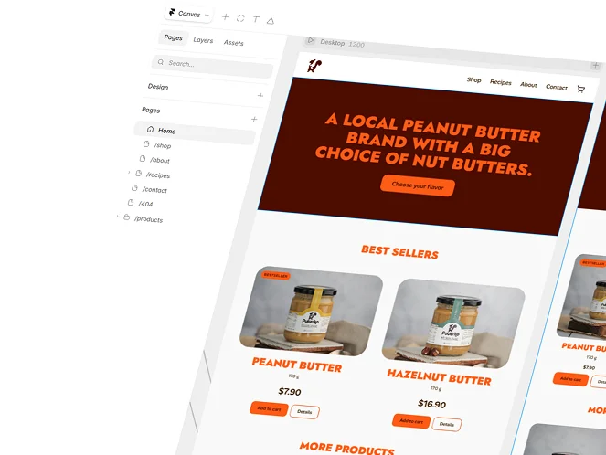
New site
Problem 2: an identity that doesn't fit the niche
The second problem was that their visual identity doesn't match the niche the brand is in, which is peanut butter. The font in their logo feels more like a baby product, and the colour isn't that bad, but it doesn't convince you the taste is good either.
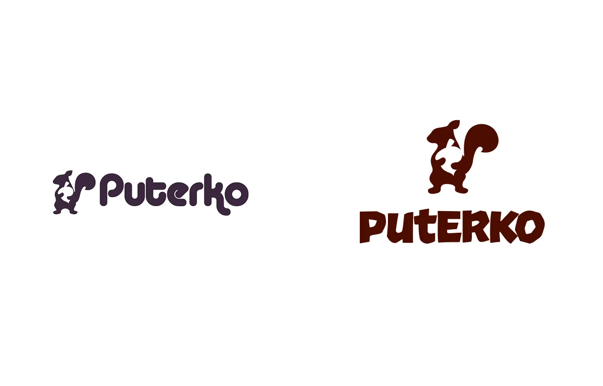
Old logo
- Unappealing colors
- Reminds me of baby powder
- Poor balance of logo and type
New logo
- The symbol stands out, better visual balance
- Bright, more appealing colors
- The type reminds me of how squirrels move: quick, always changing direction
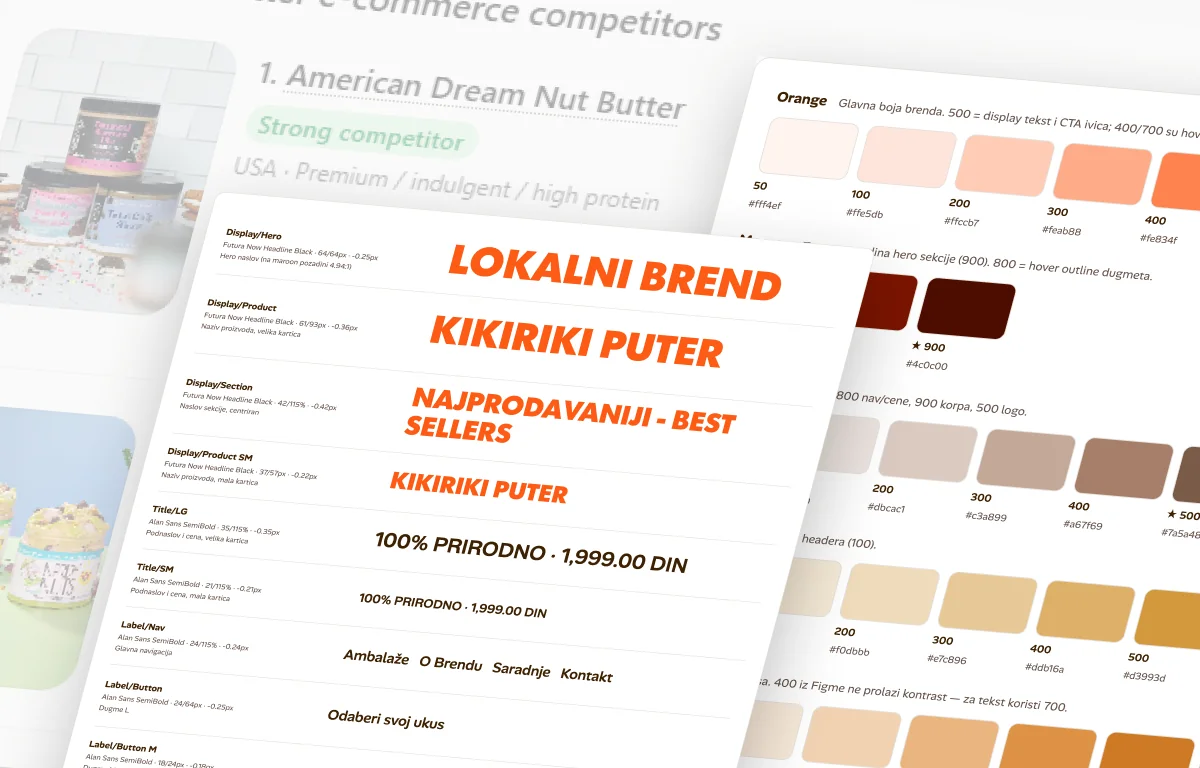
1. Design system
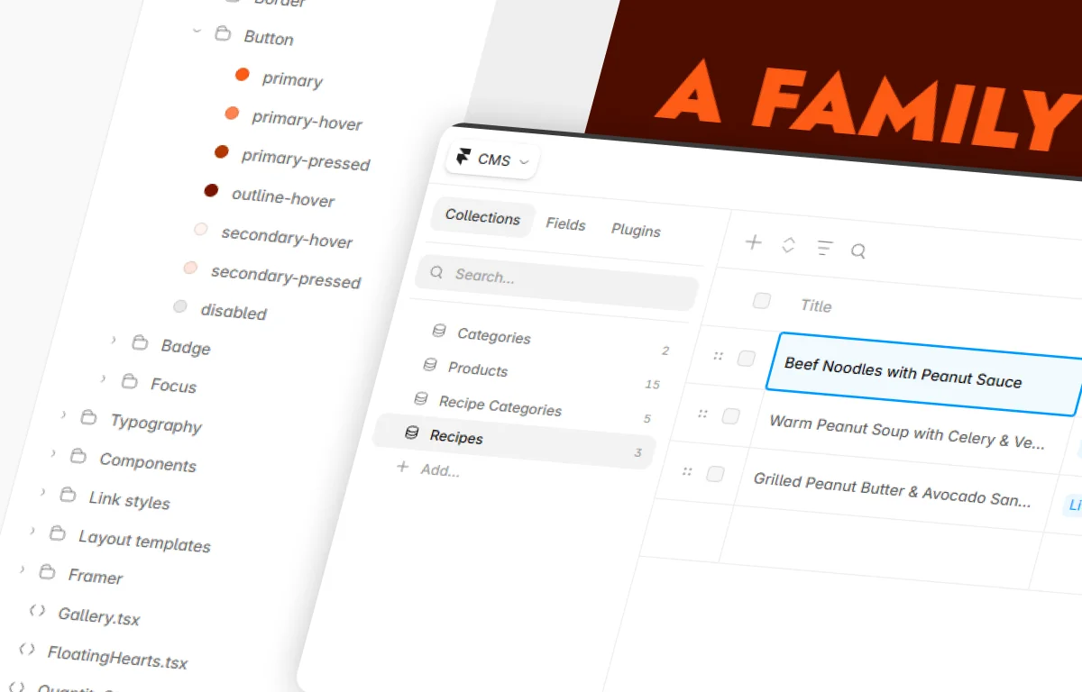
We picked the colours, we picked the font. Now we build the design system: colours, fonts and icons.
2. Components
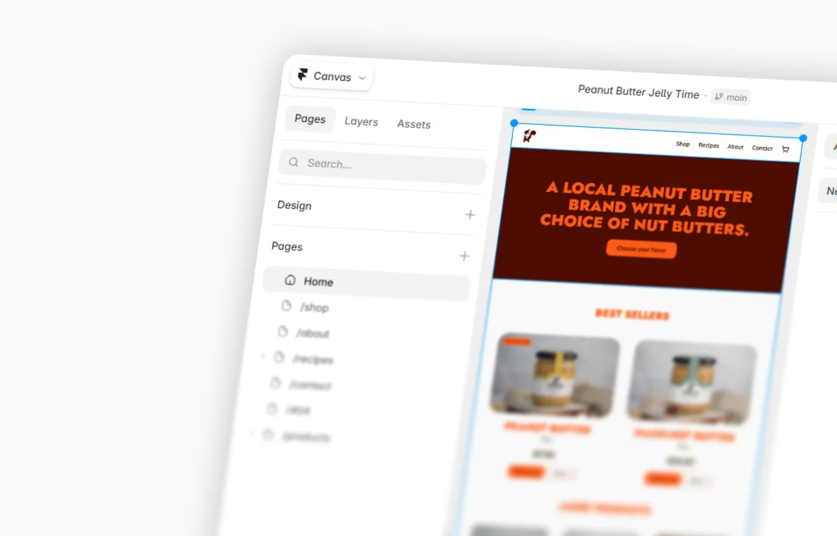
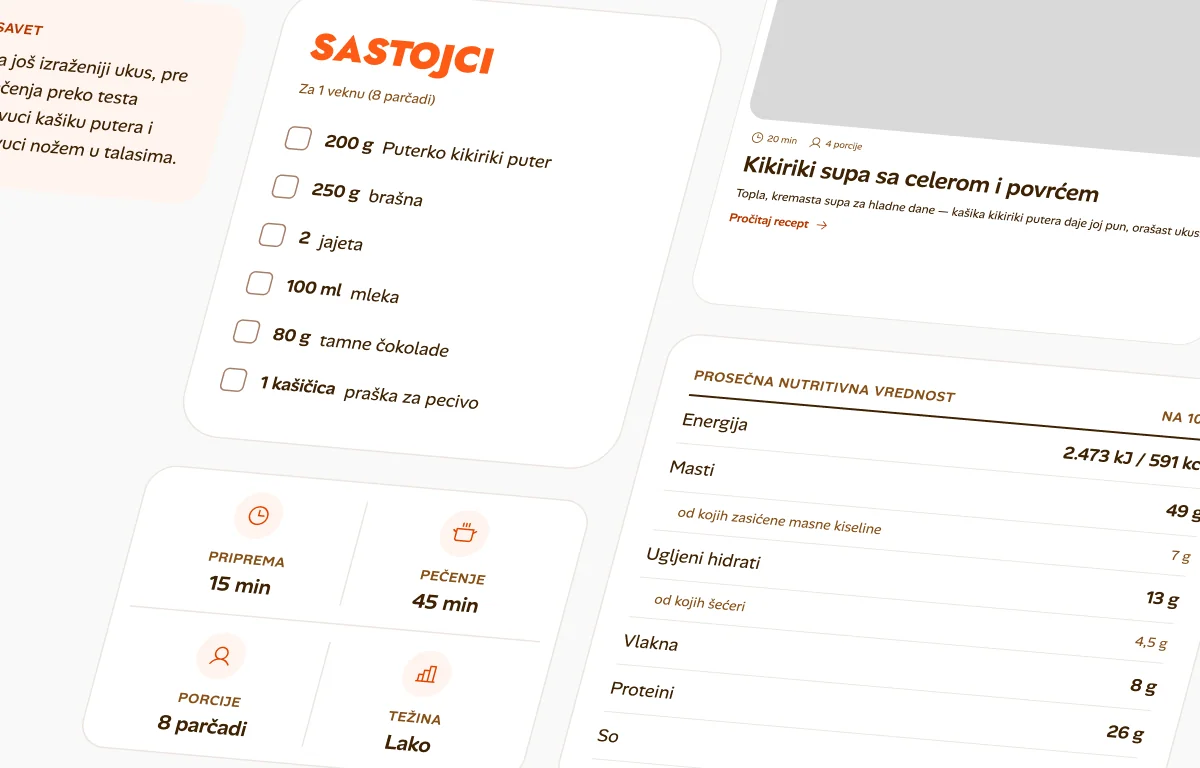
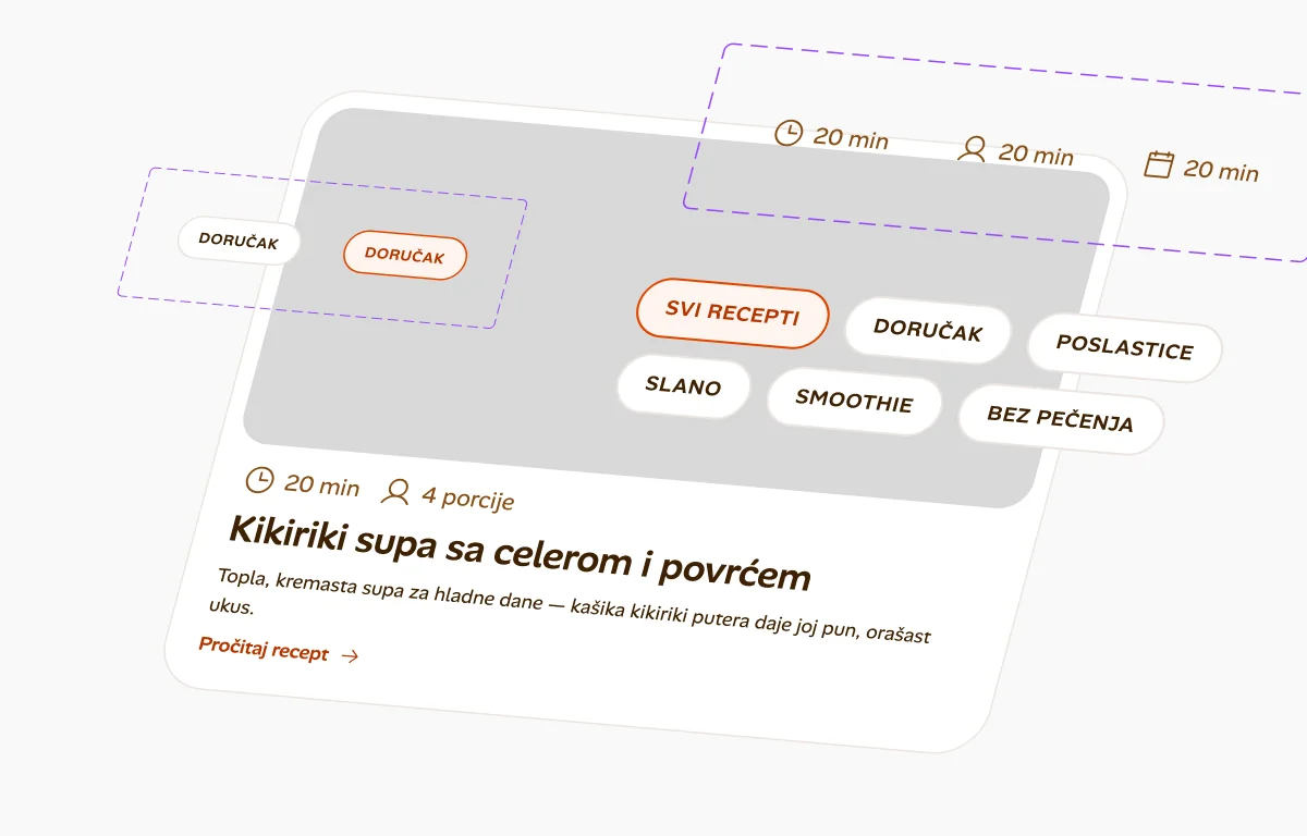
I build components for every part of the site.
3. Off to Framer
The basics first: add the colours and fonts from the design system to Framer.