Rivera
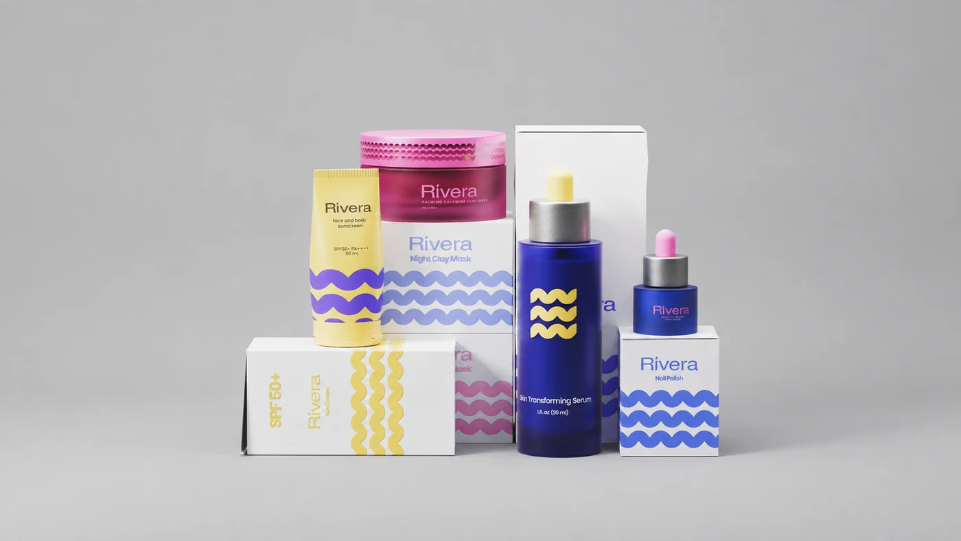
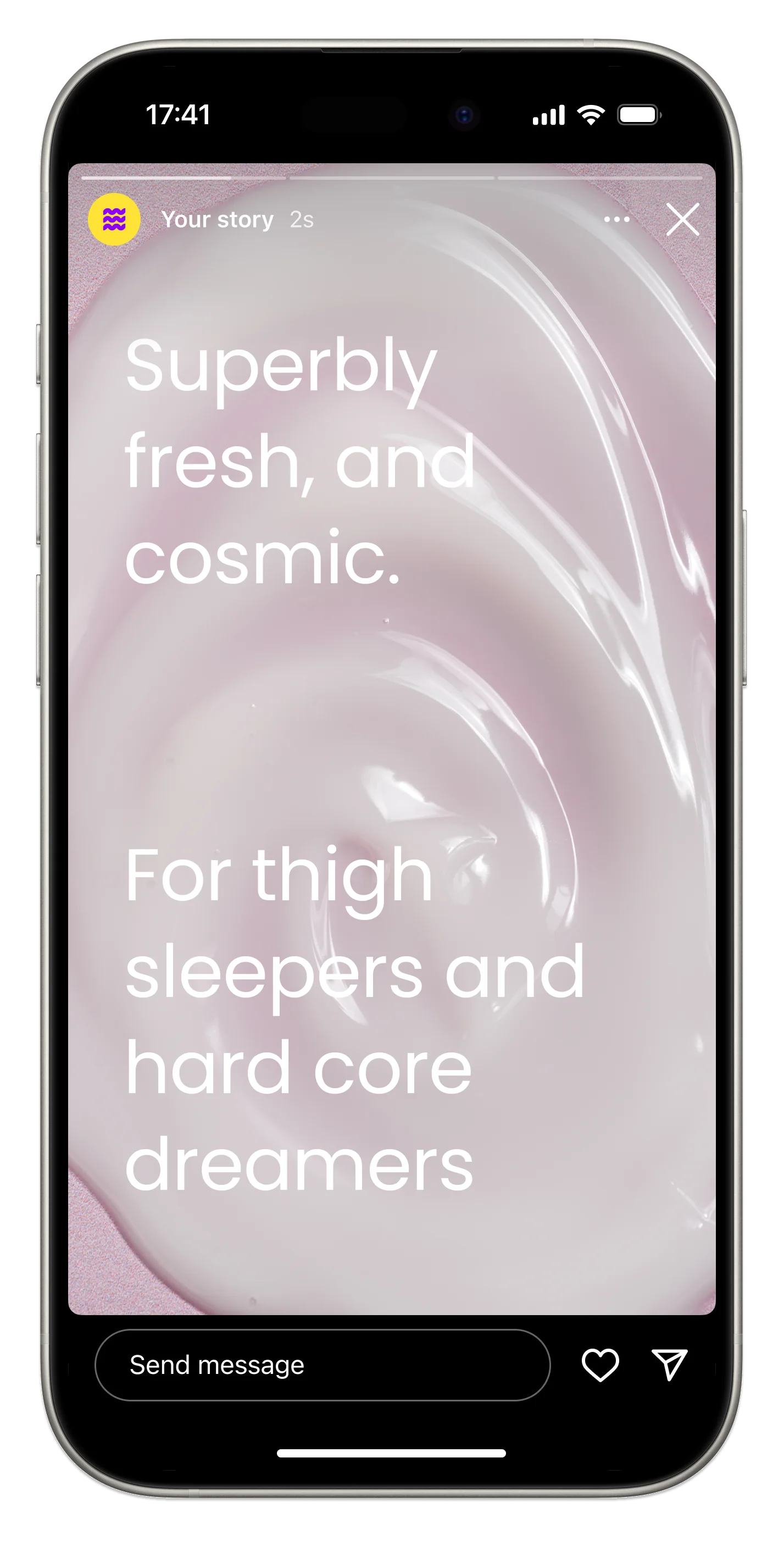
Rivera is a colourful, Gen Z skincare brand built around self-expression, confidence, and individuality. Its mission is to encourage young women to pursue their ambitions, embrace who they are, and express themselves freely. Each collection uses a distinctive mix of bright, energetic colours, turning every product into a visual statement designed to stand out on shelves, vanities, and bedroom spaces.
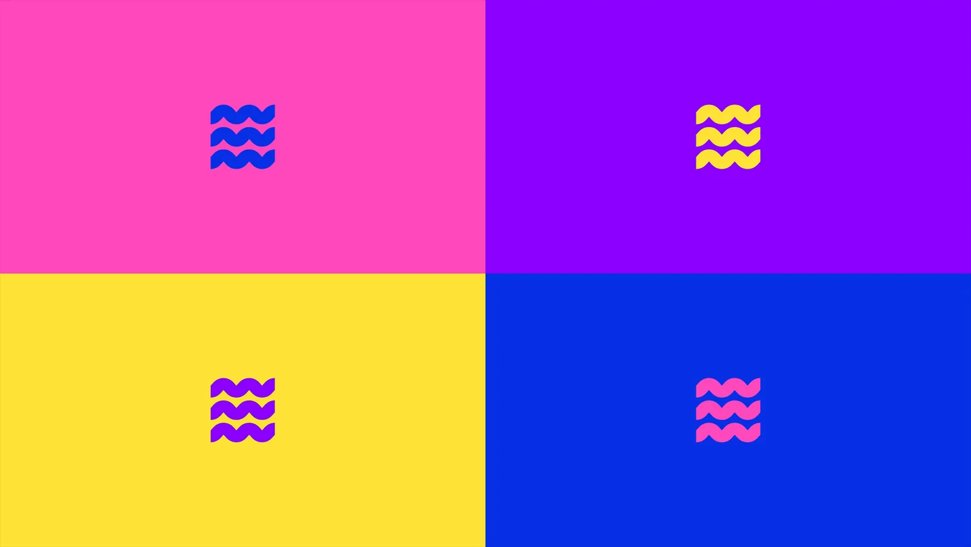
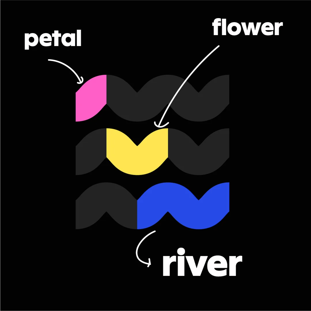
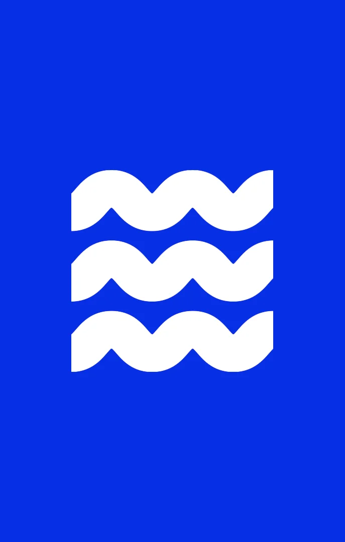
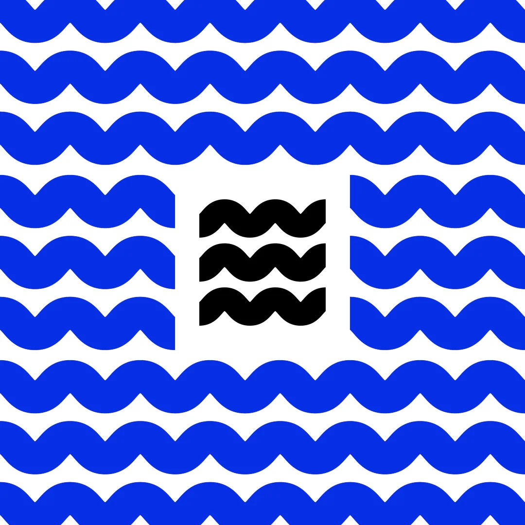
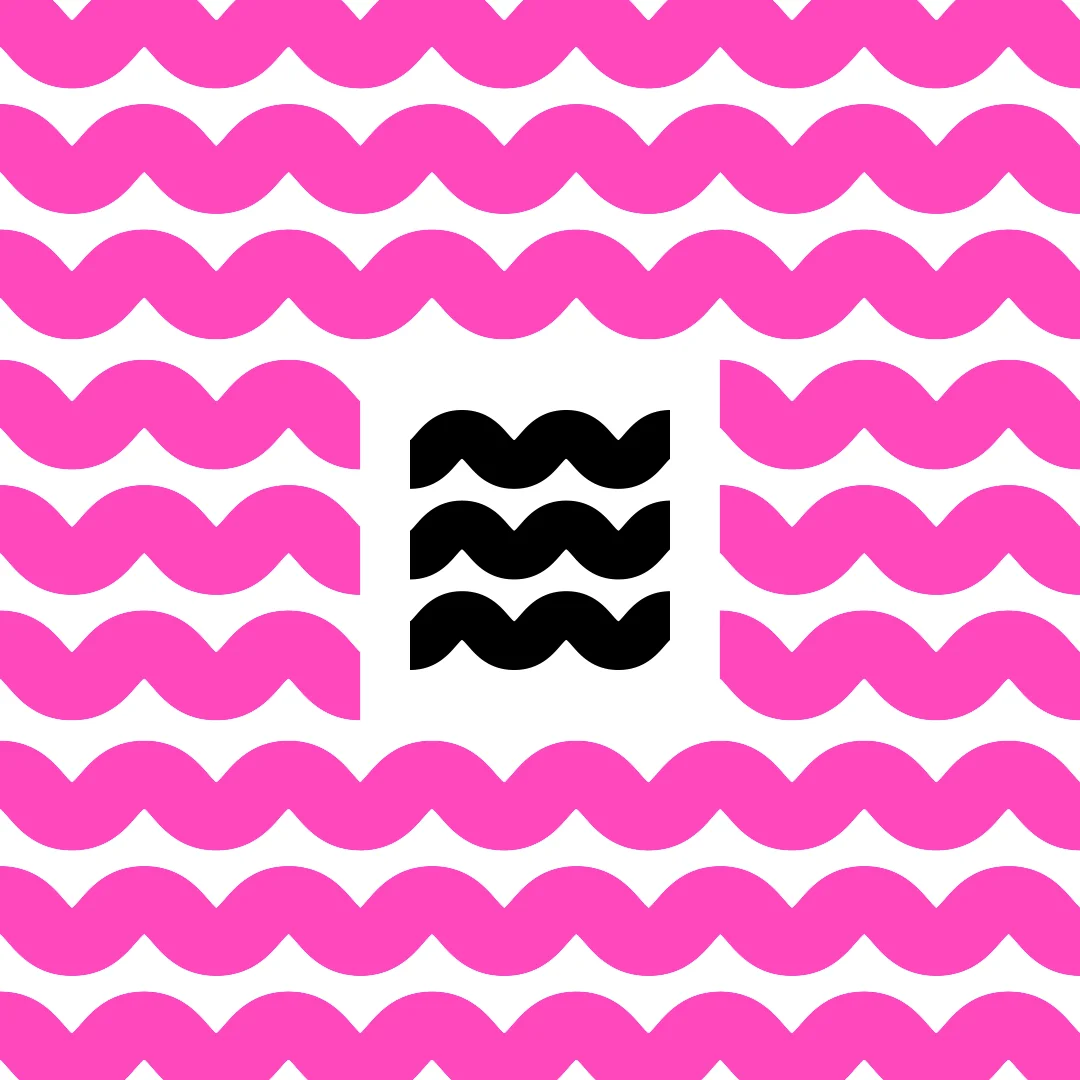
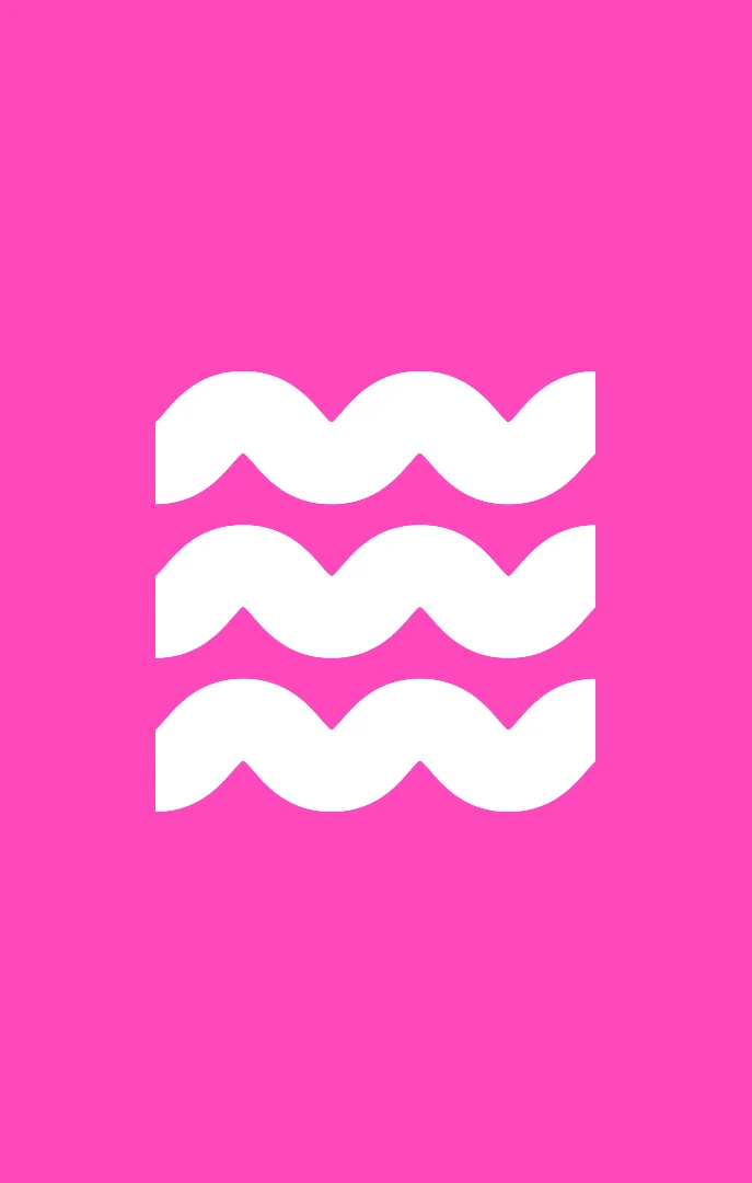
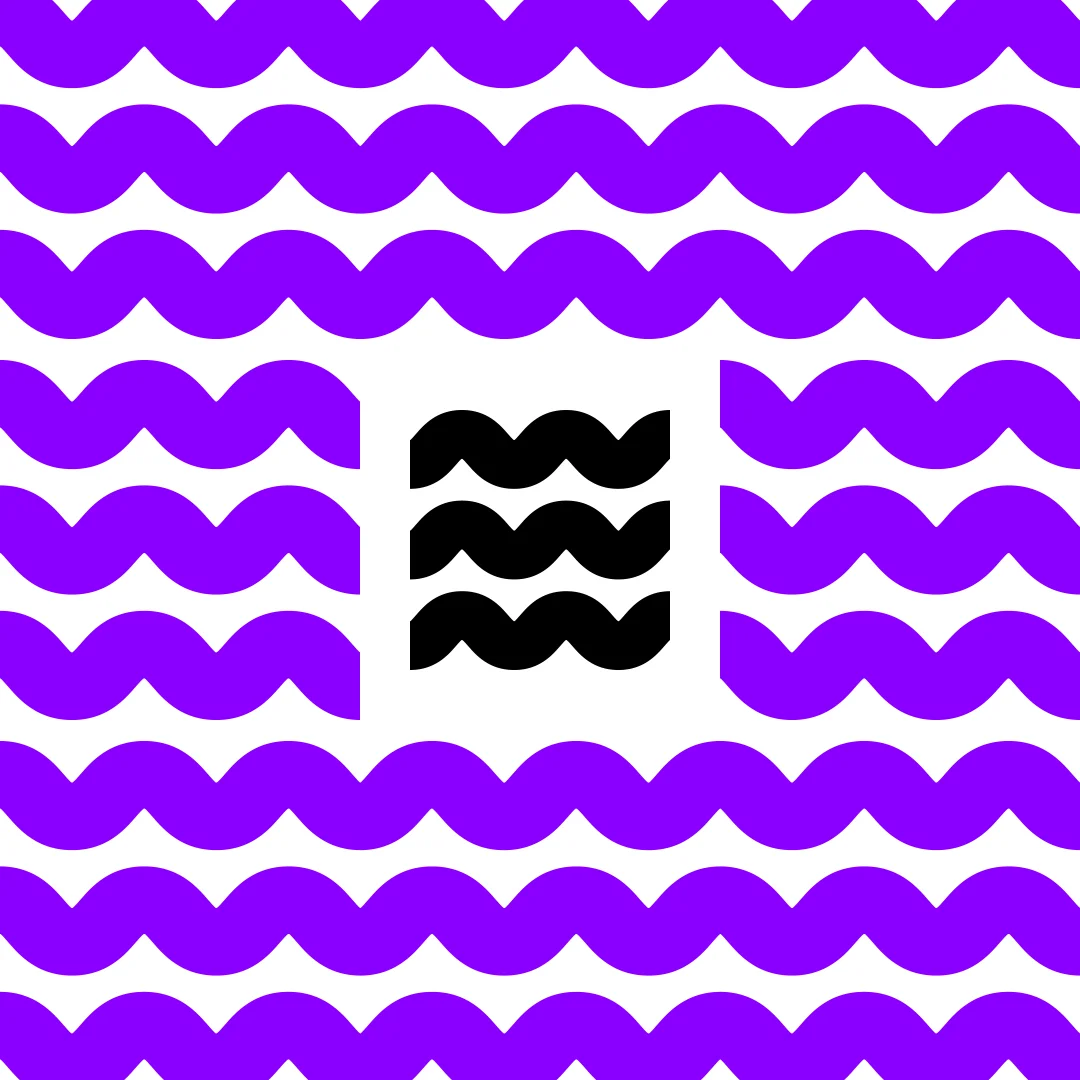
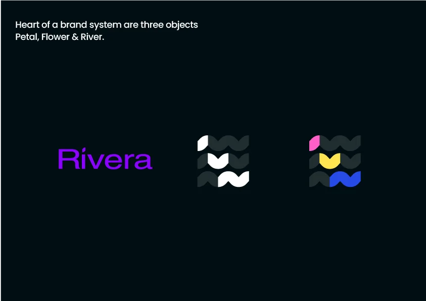
The wave / A mark that moves with her
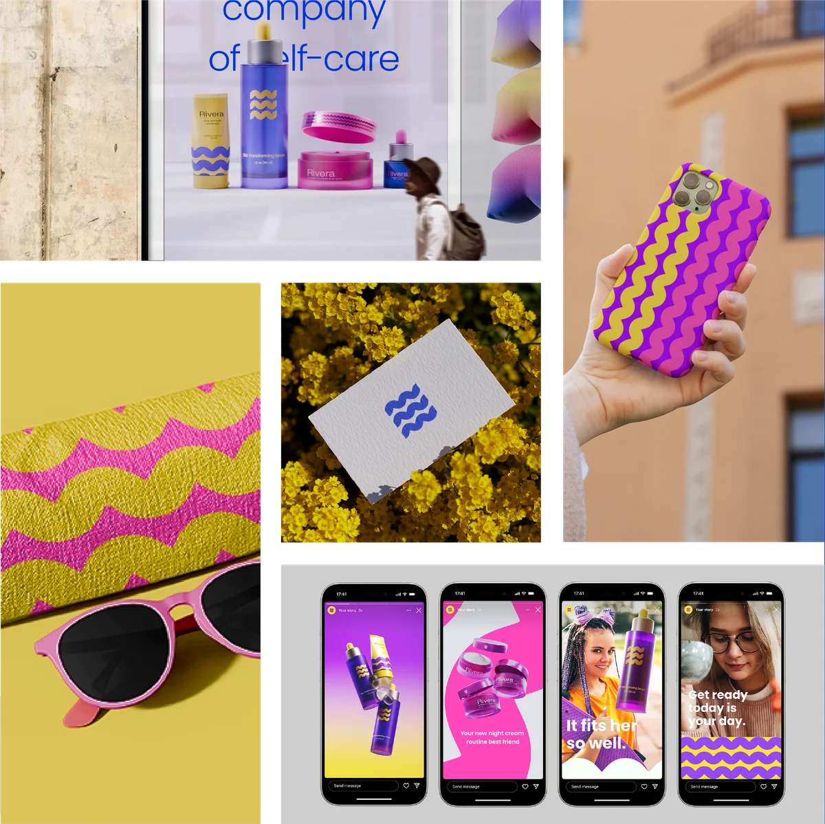
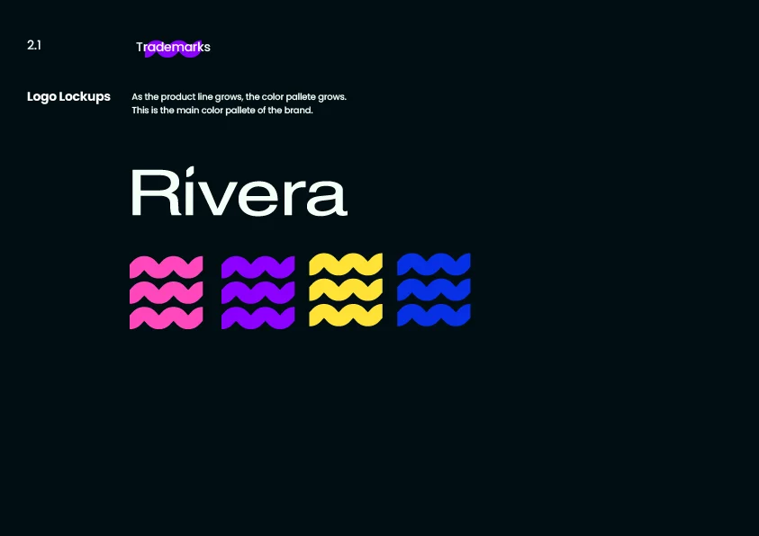
Rivera needed more than a logo. It needed a language. One that could stretch across nail polish, clay masks, skin serums, and sunscreens without losing its identity.
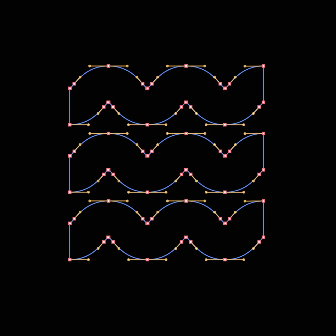
The wave became that language. A recurring motif drawn from movement, energy, and the kind of confidence teenage girls carry when they feel seen. Not decorative. Structural.
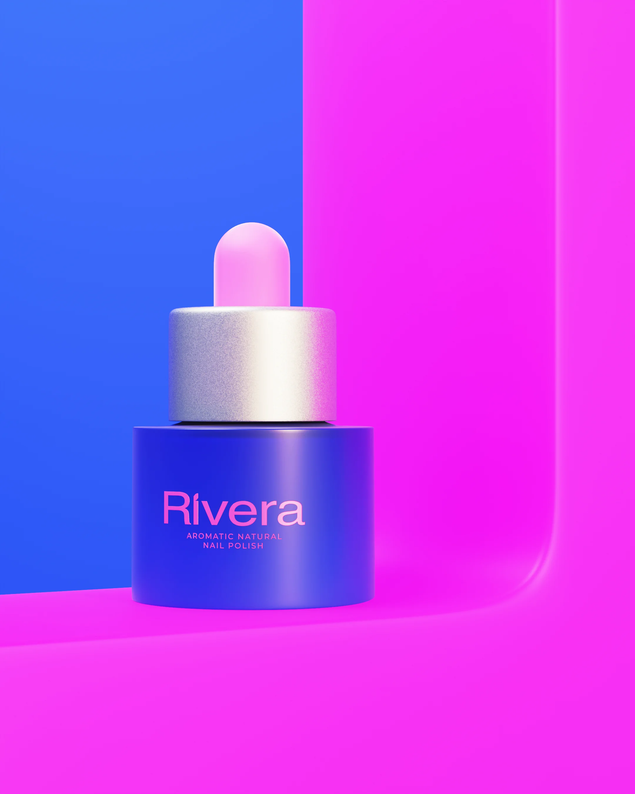
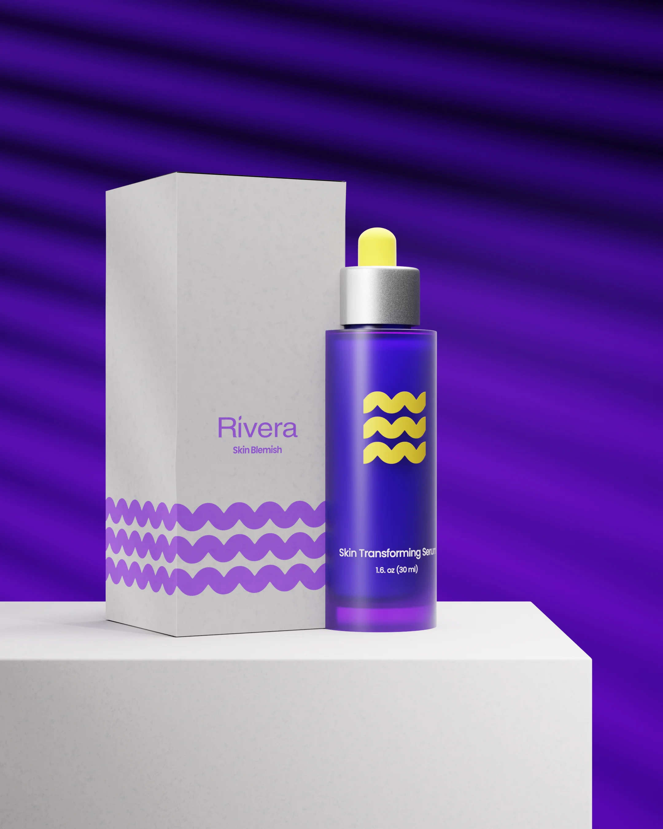
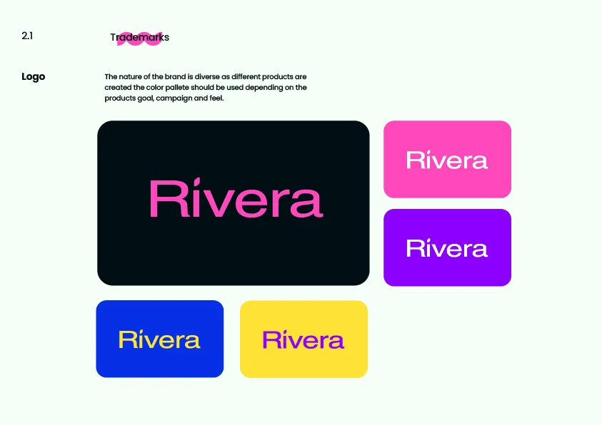
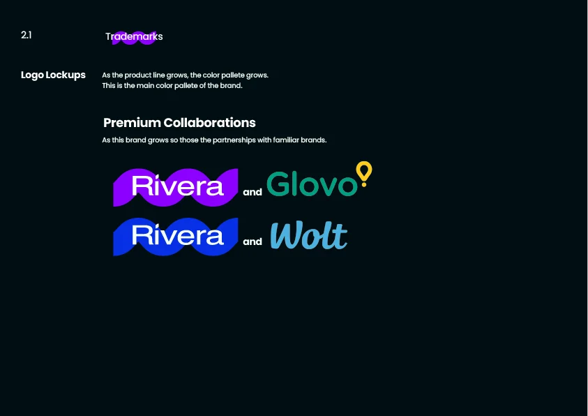
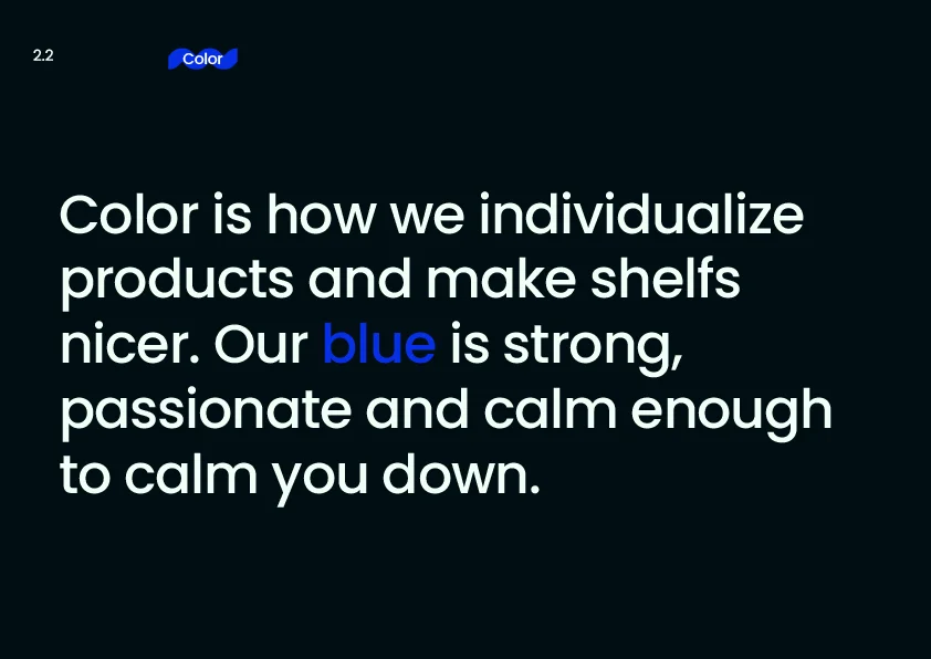
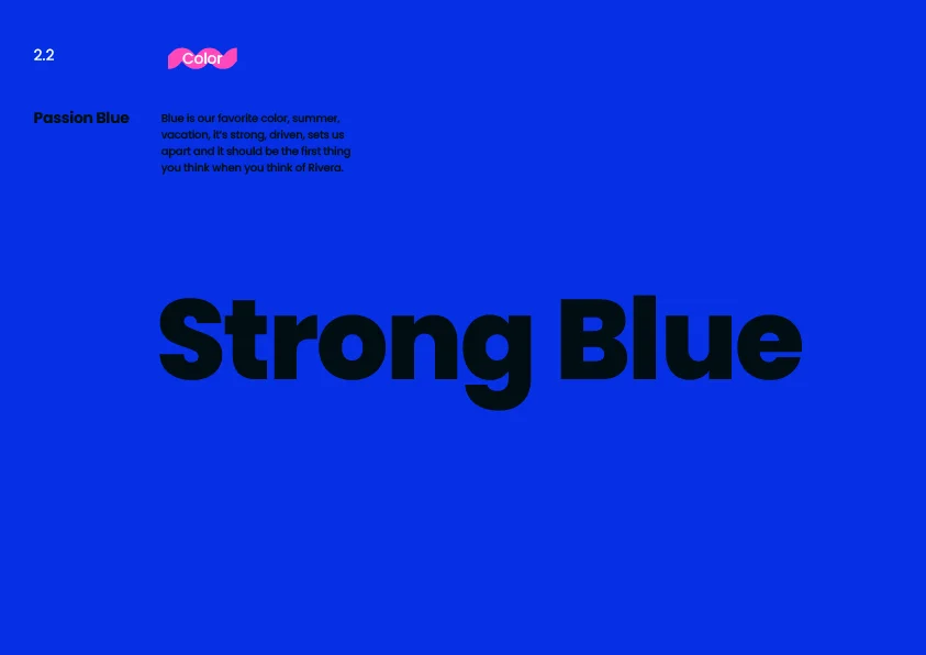
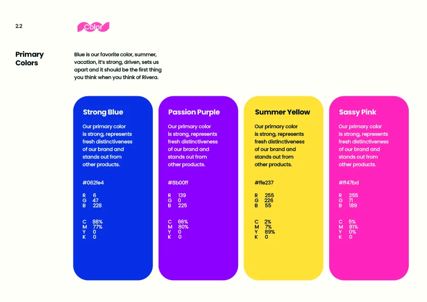
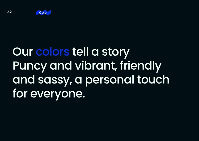
Color does the differentiation. Each collection gets its own palette while sharing the same DNA: the mark, the wave, the rhythm.
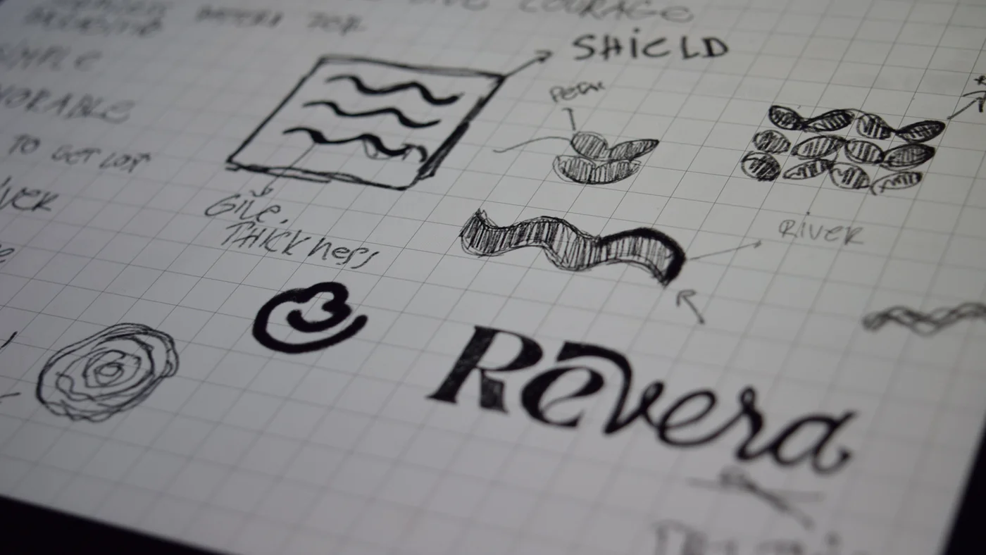
Logo Process
From first sketch to final mark. The wave refined.
Target Audience
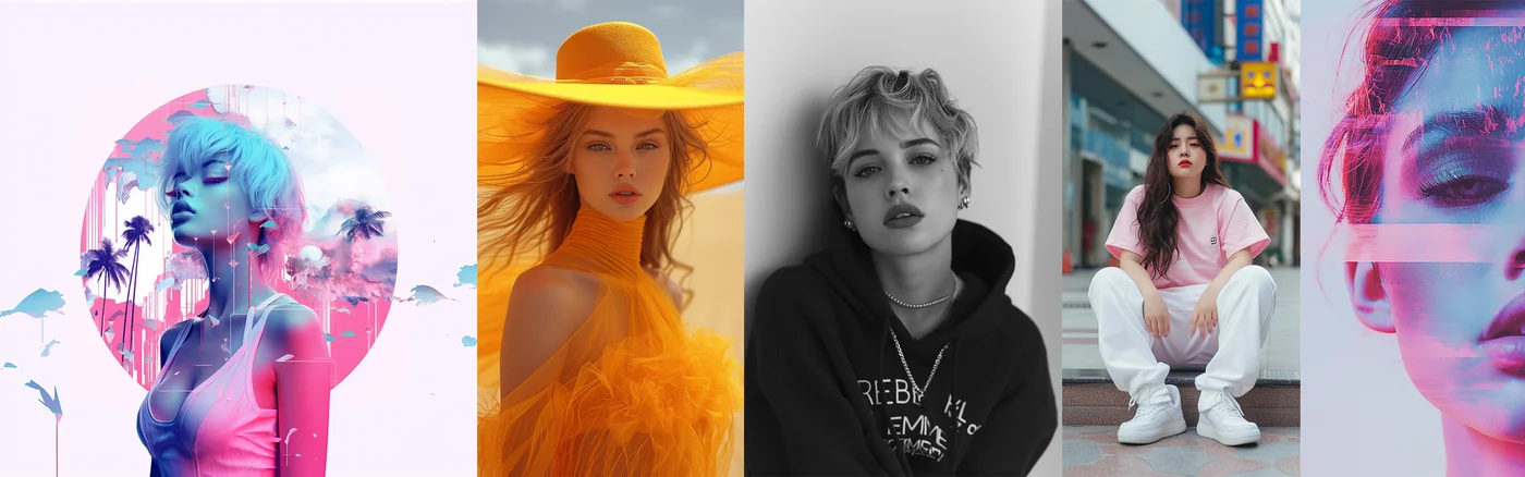
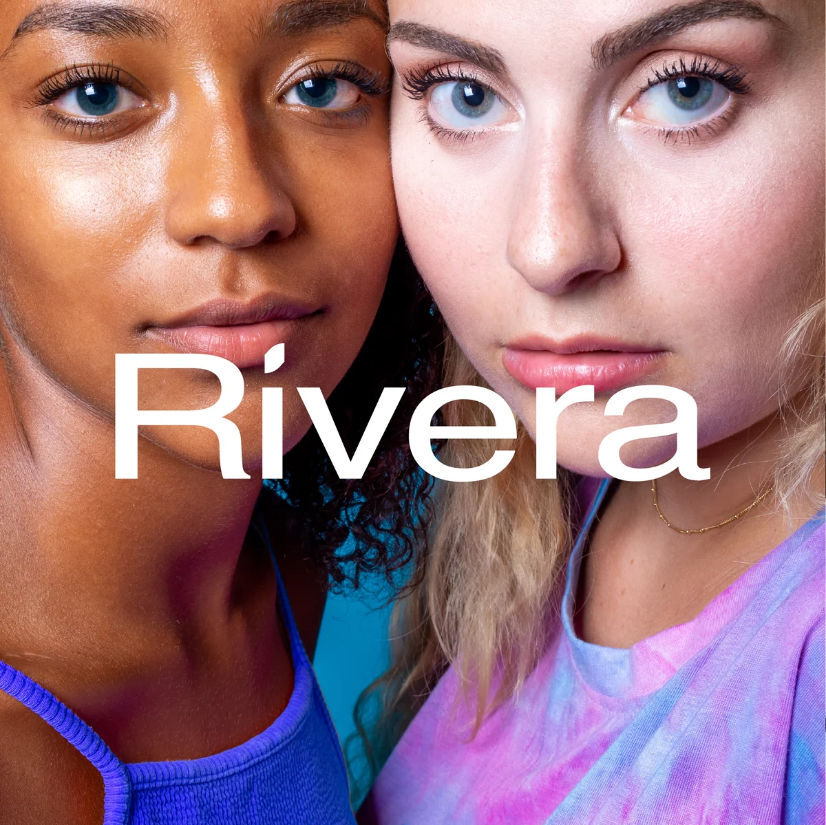
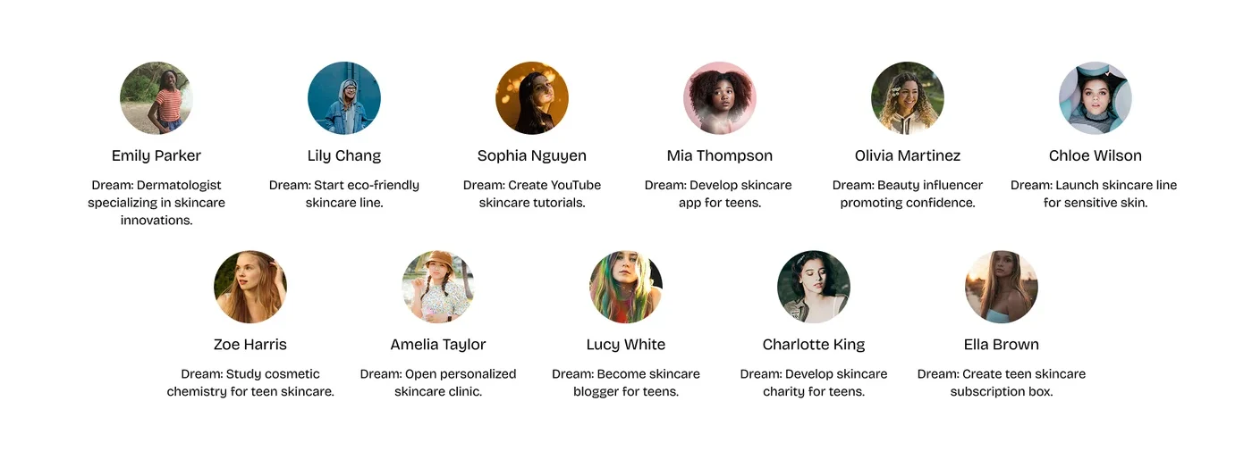
A Gen Z skincare audience aged 14 to 22. Ambitious, expressive, and unafraid to stand out. They dream of starting businesses, building platforms, and shaping culture.
Rivera is built to speak their language. Bold colour, bold identity, zero apology.
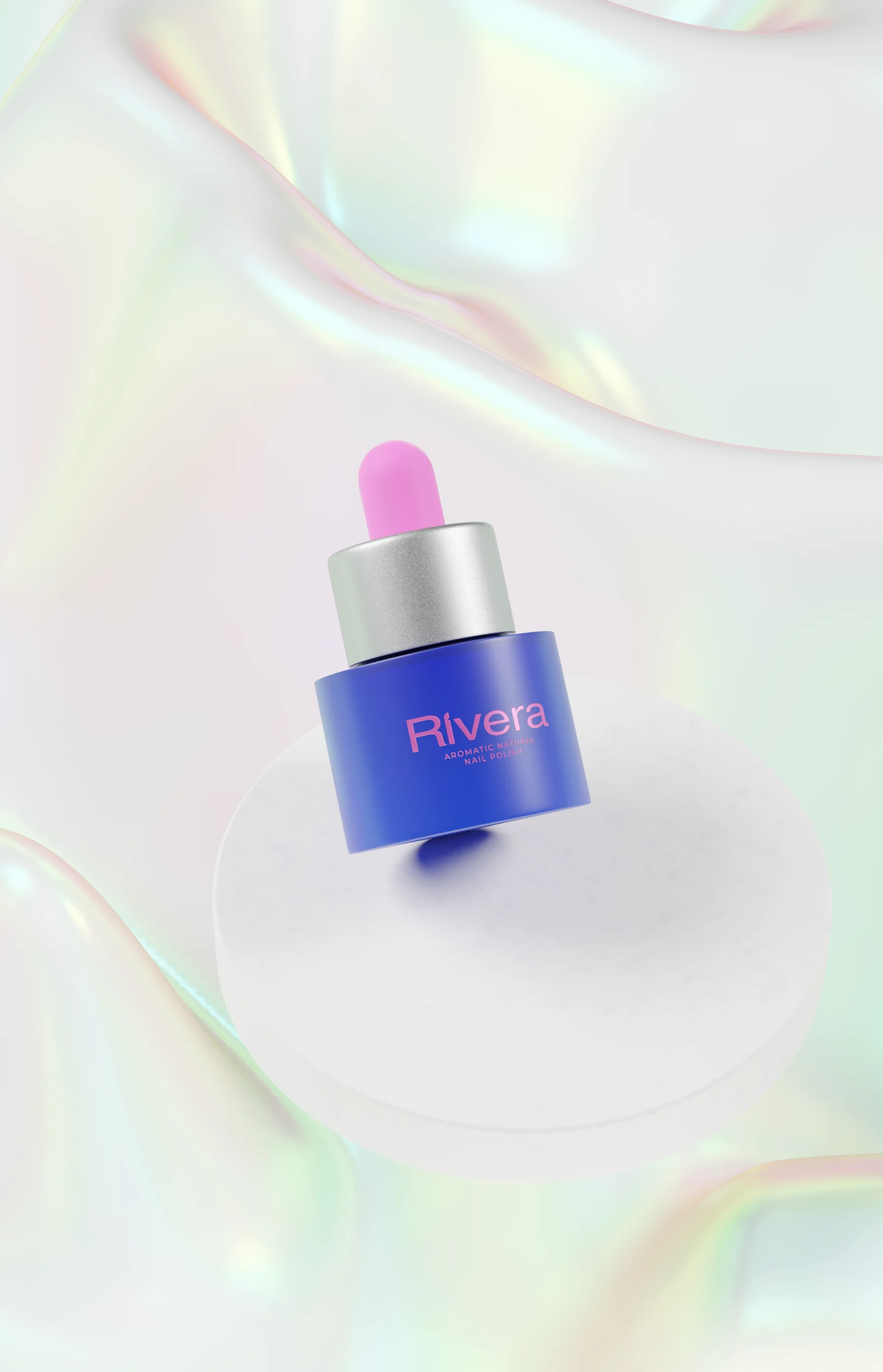
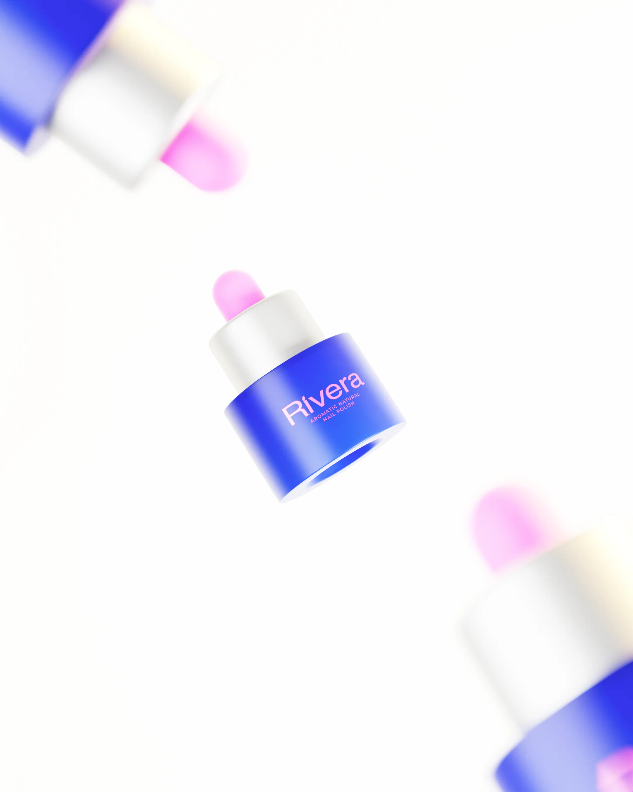
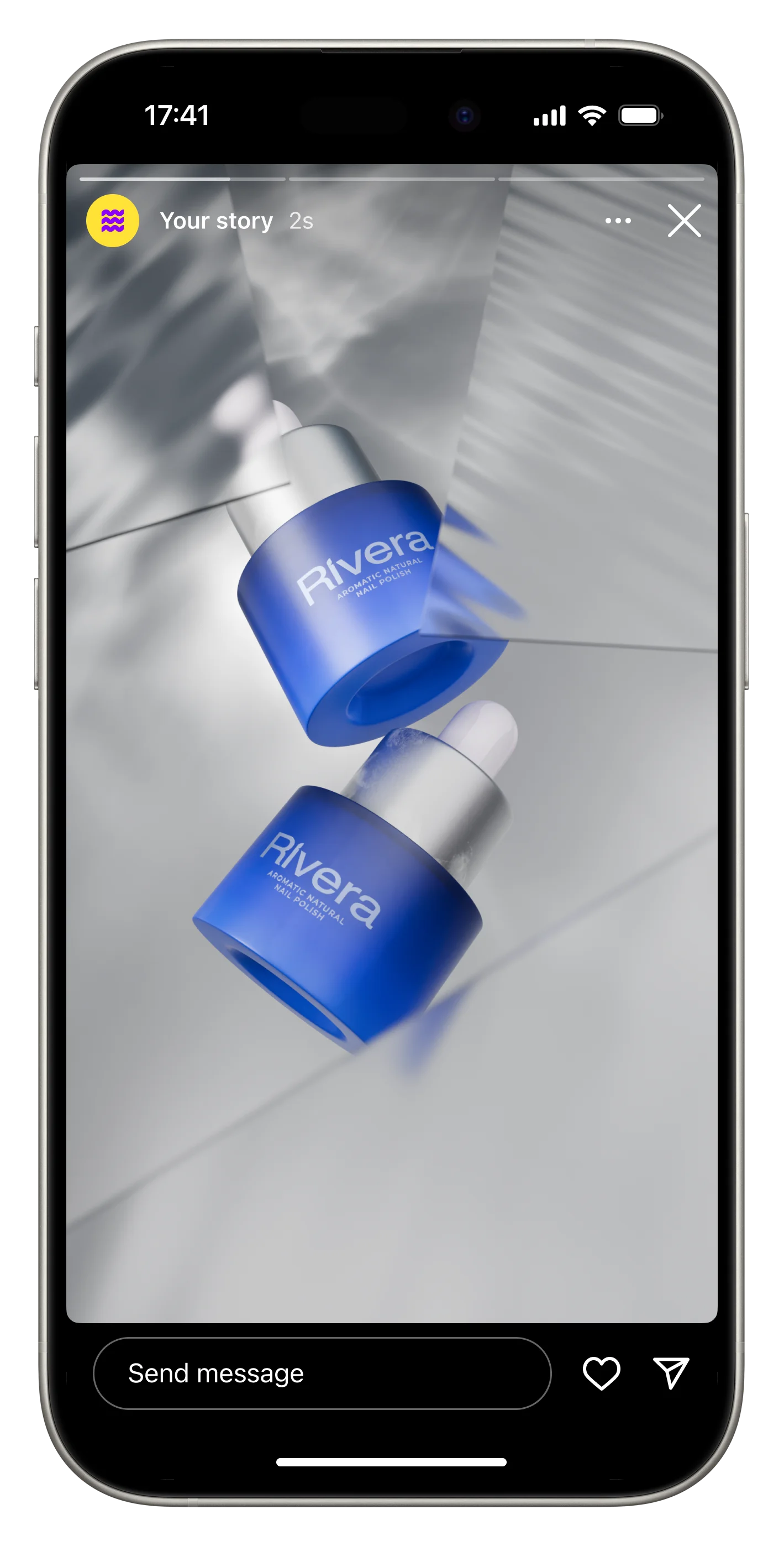
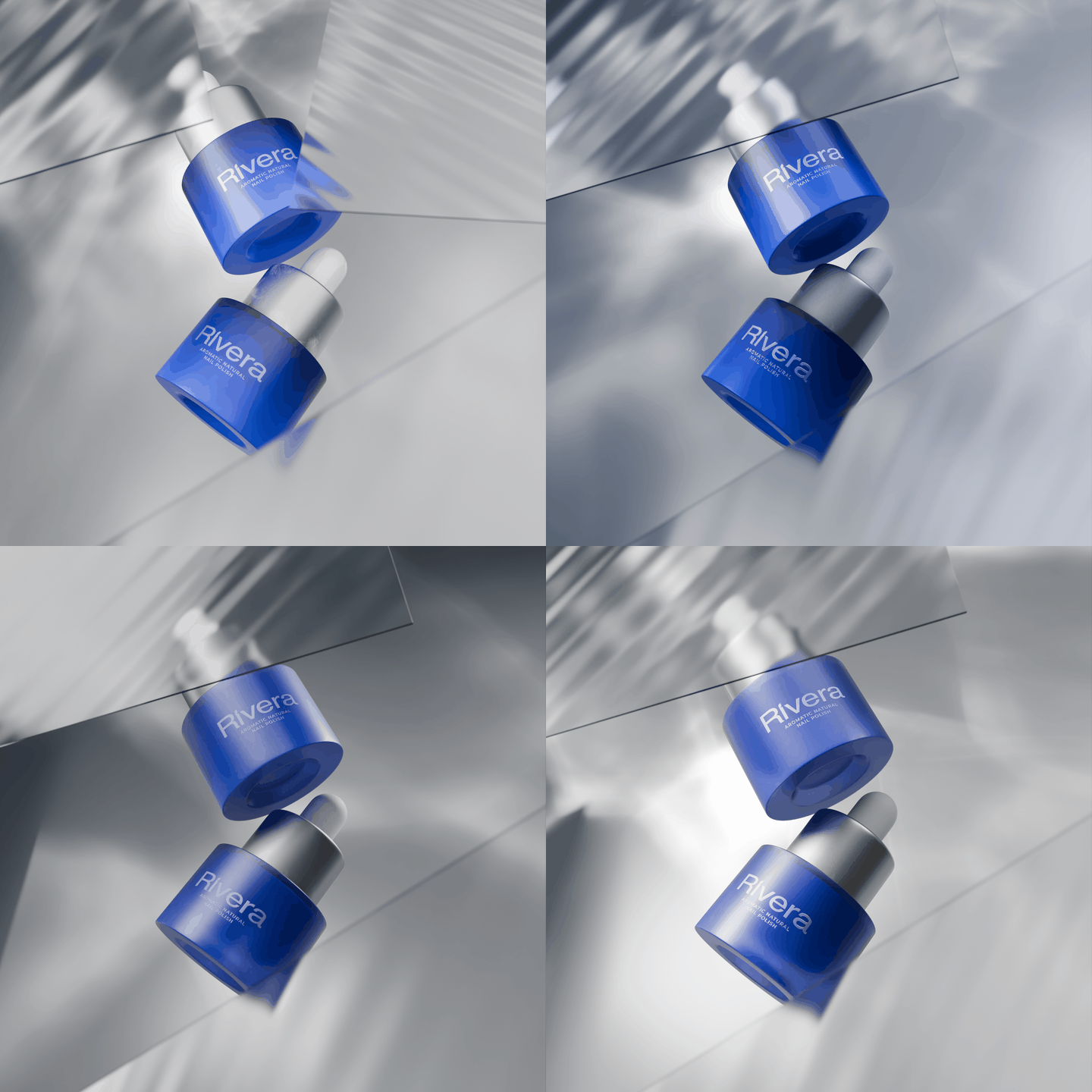
Nail Polish Collection

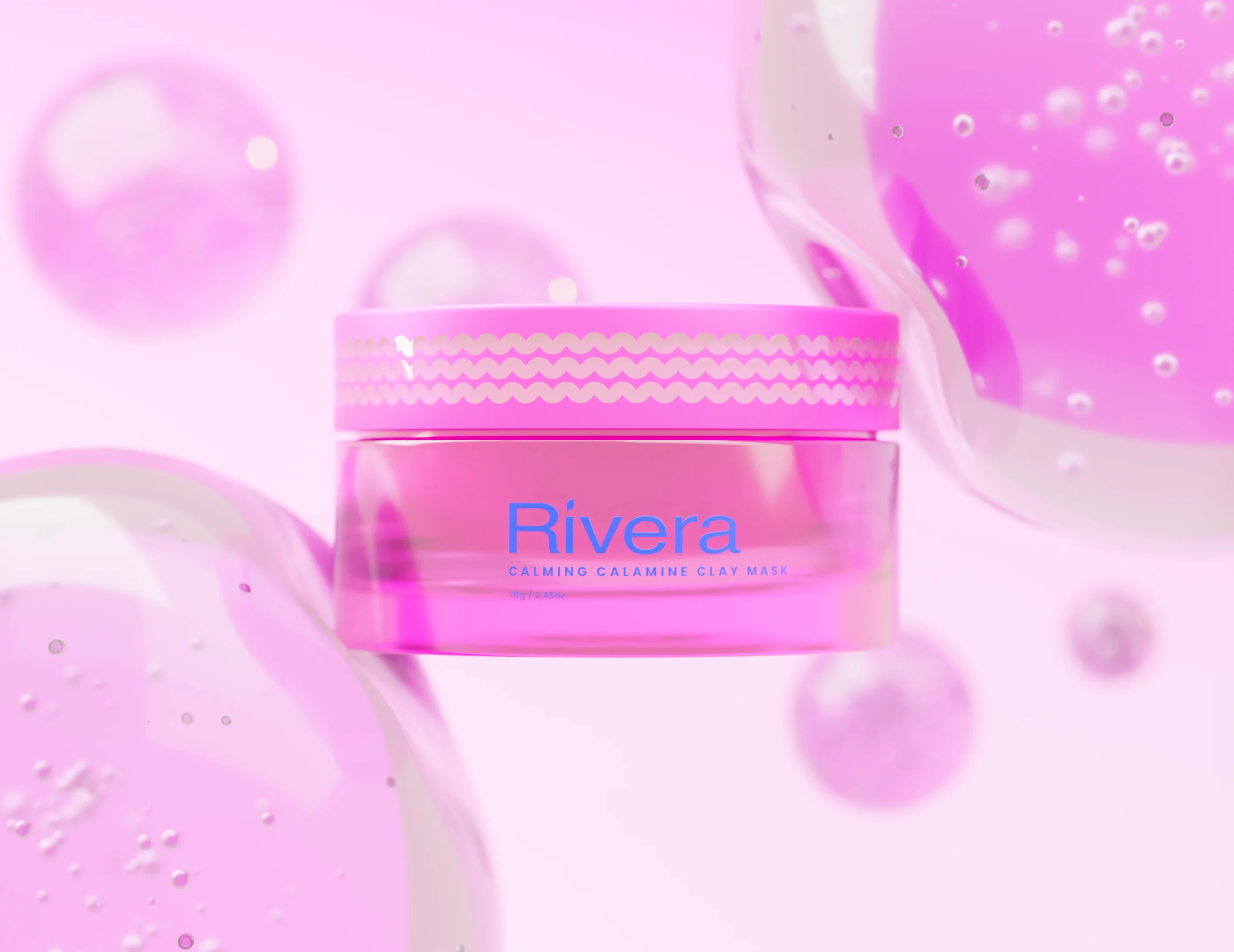
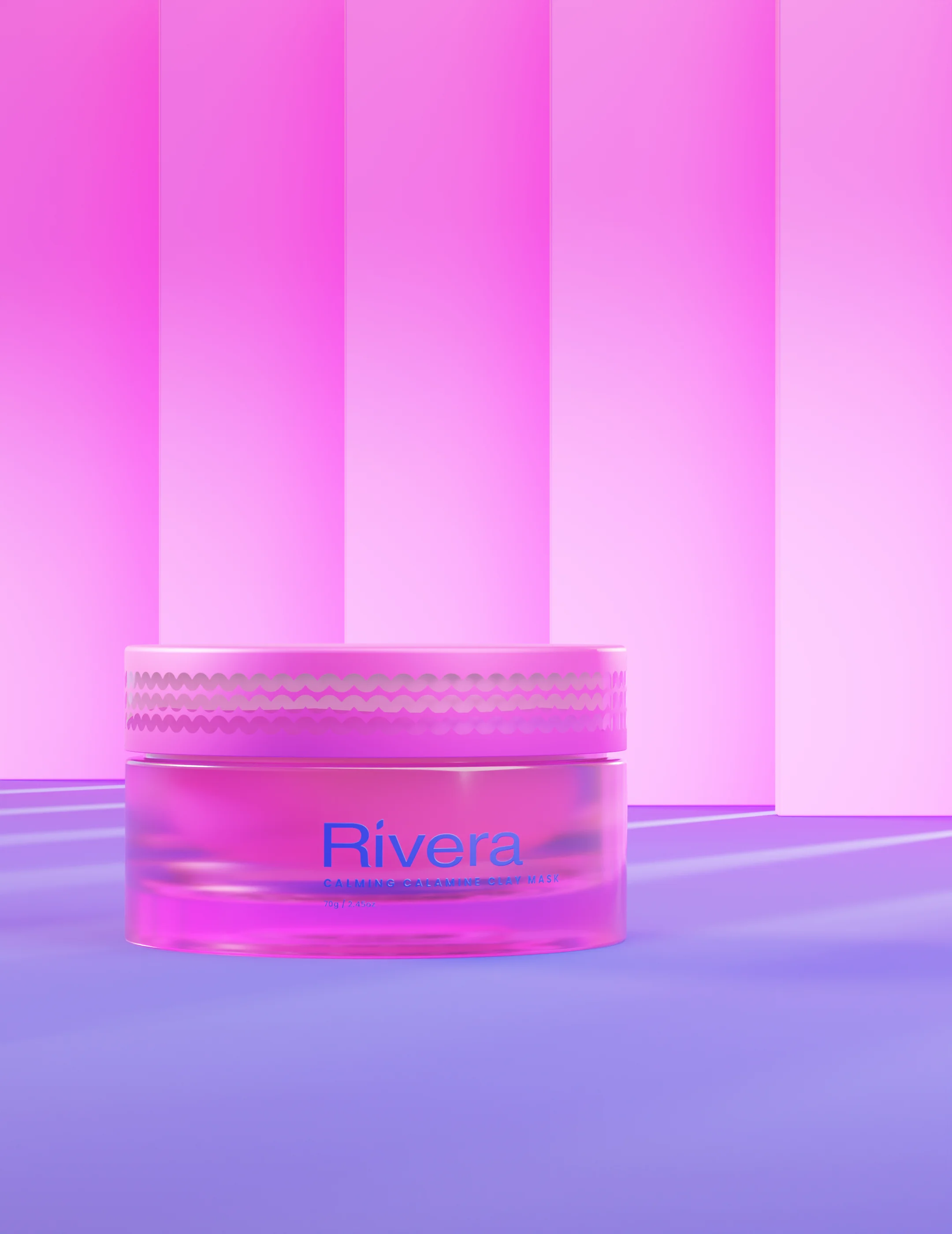
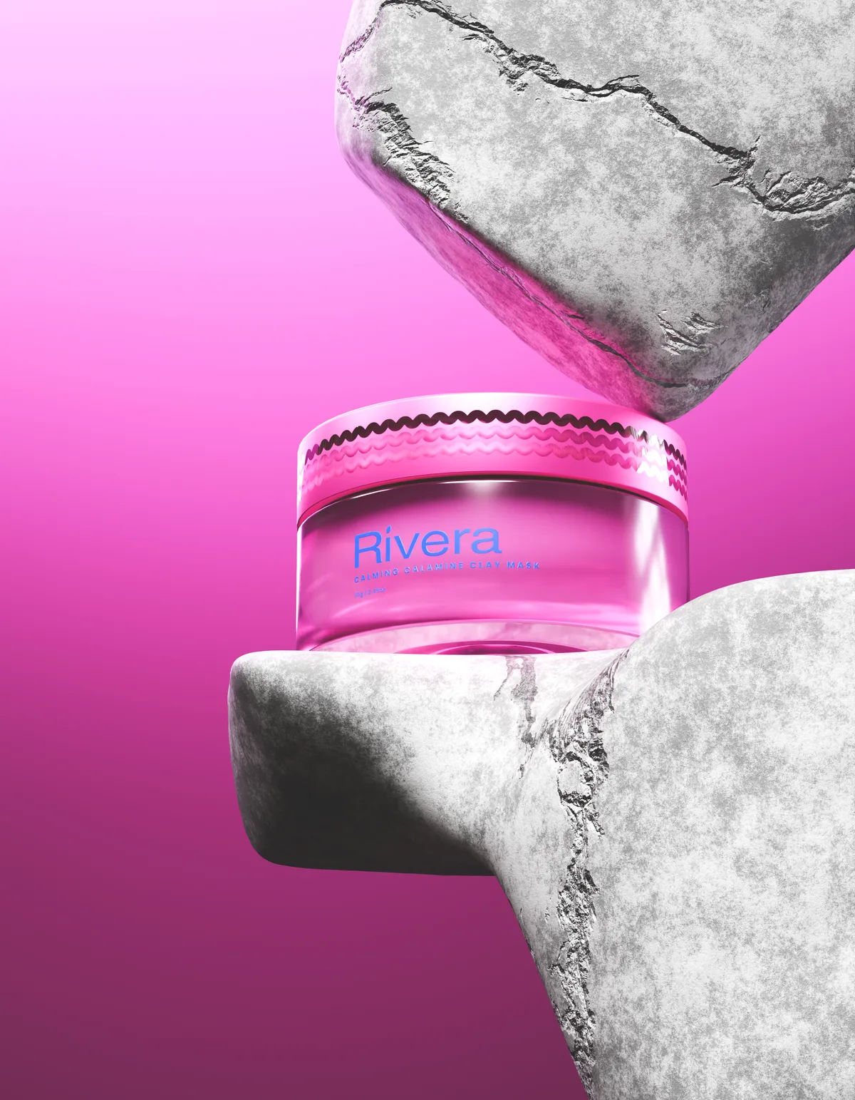
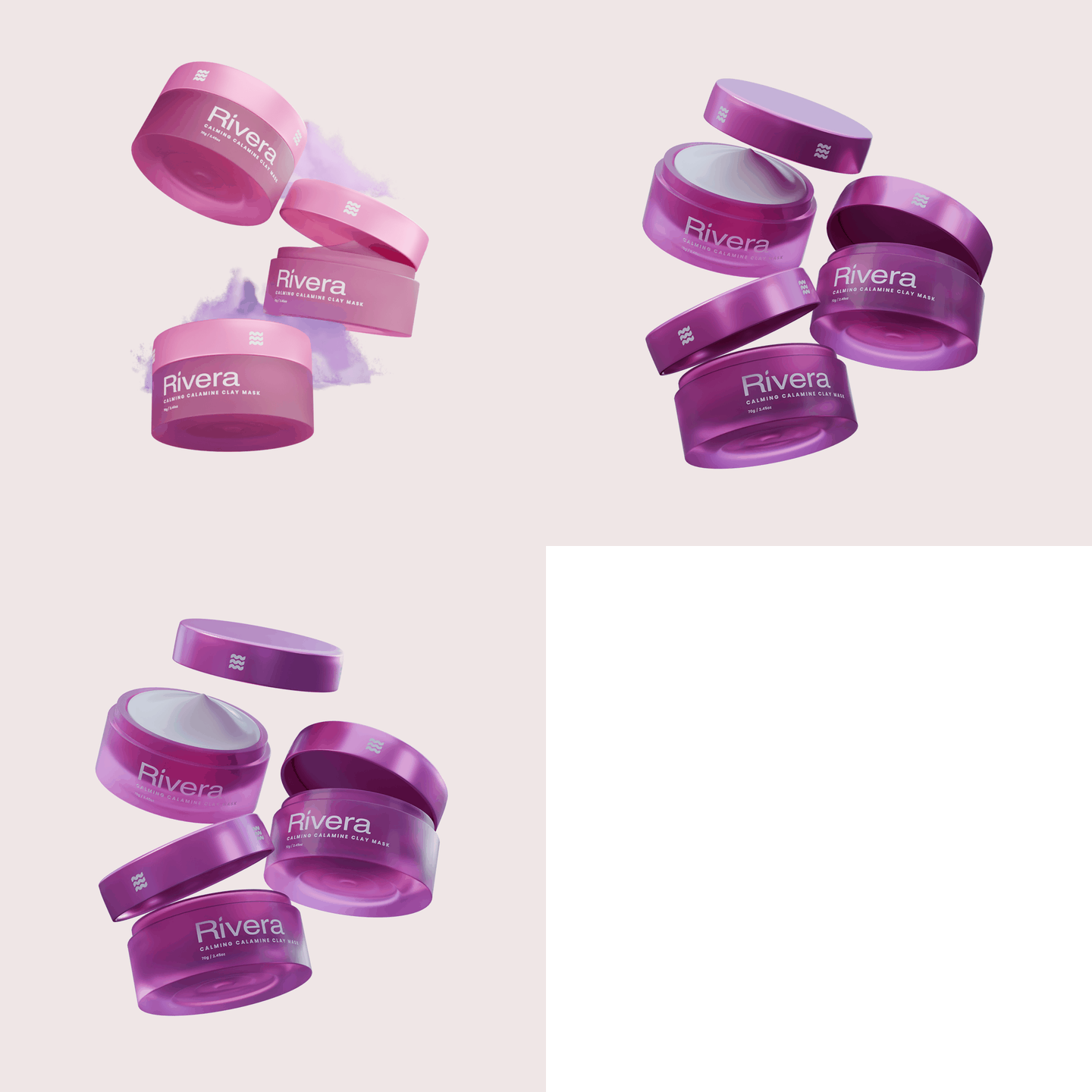
Clay Mask Collection
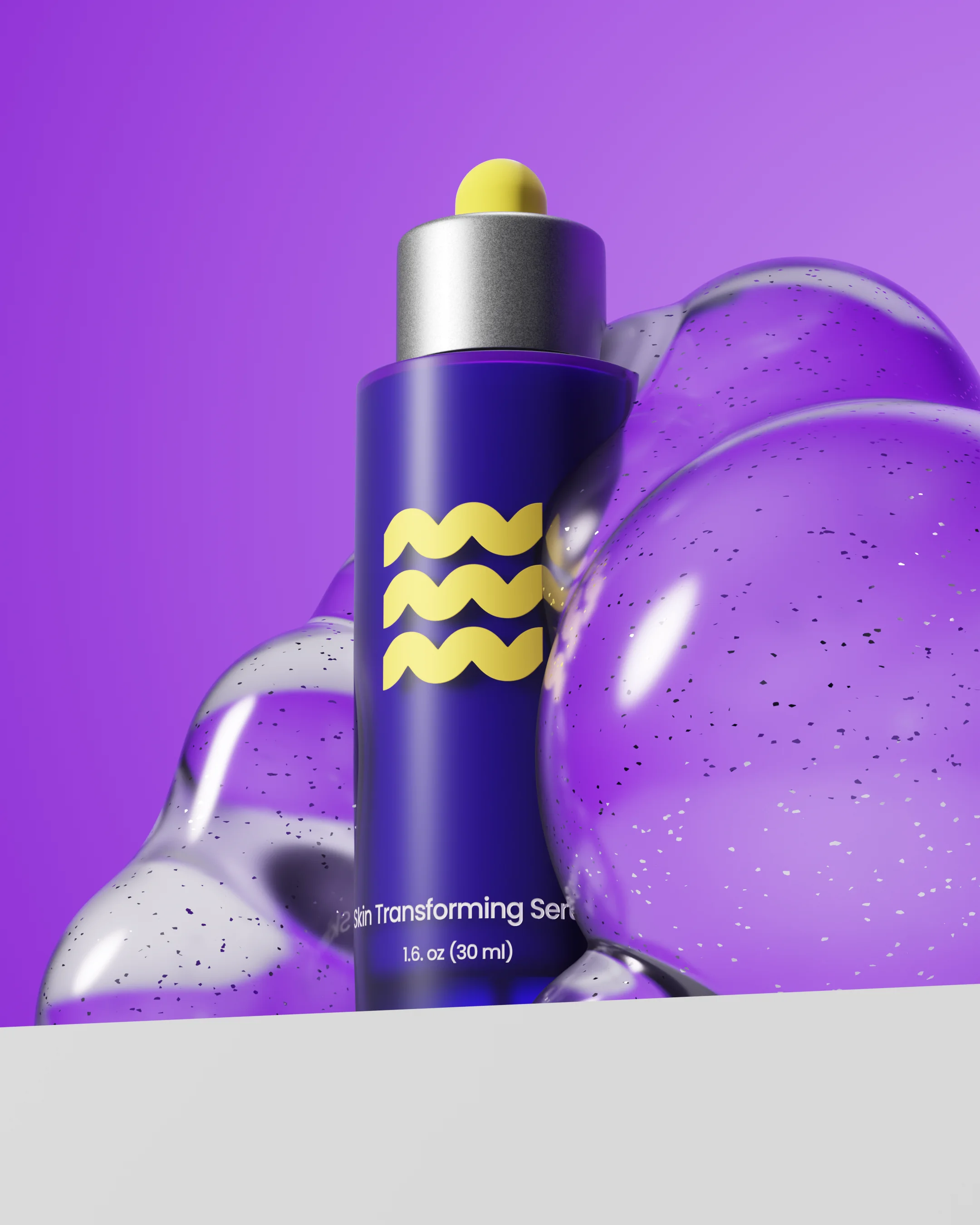
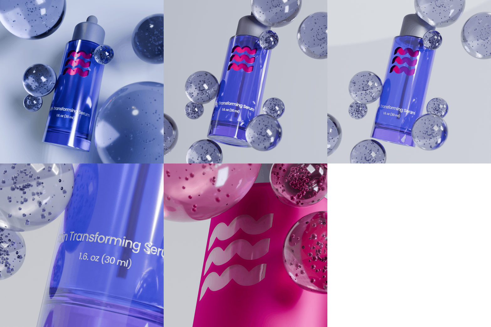
Skin Serum Collection
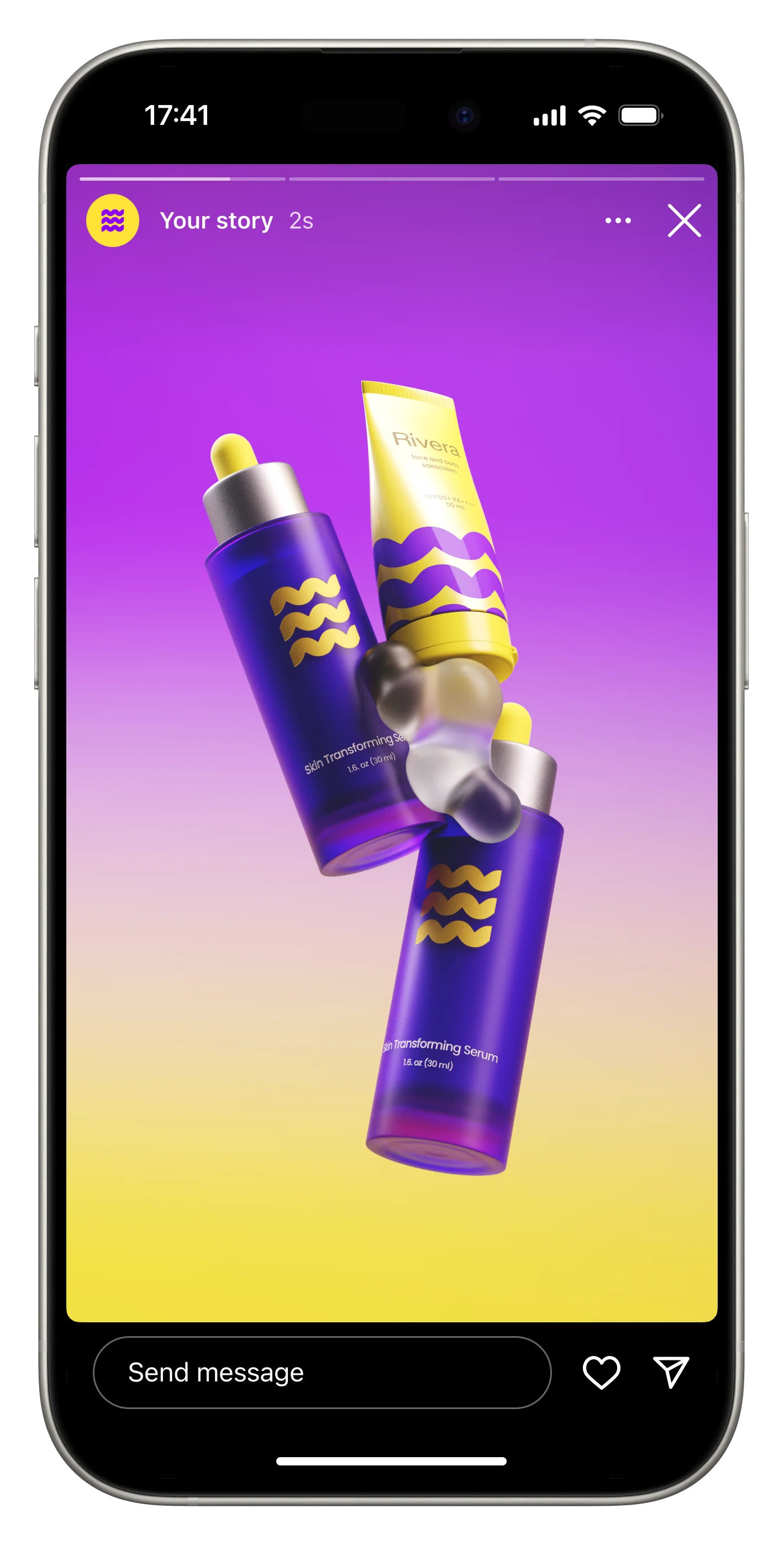
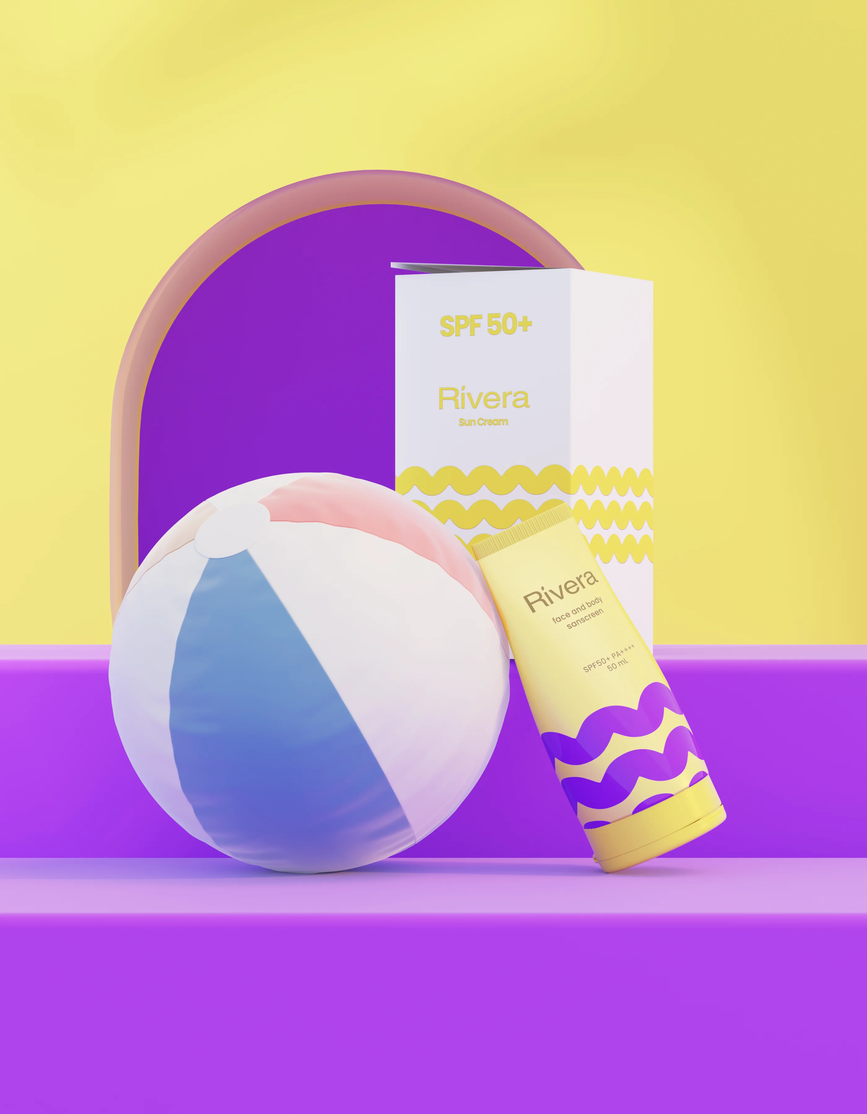
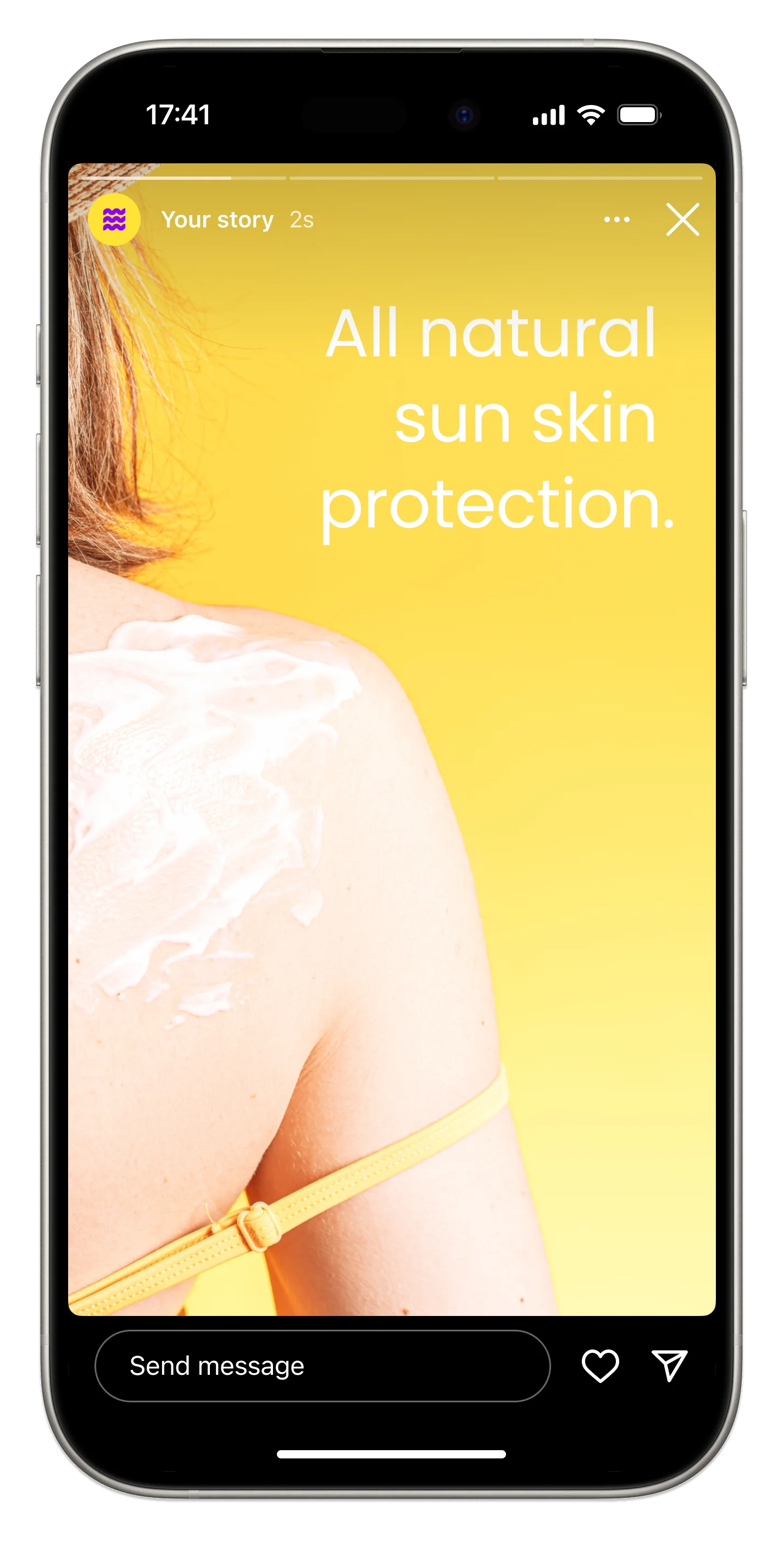
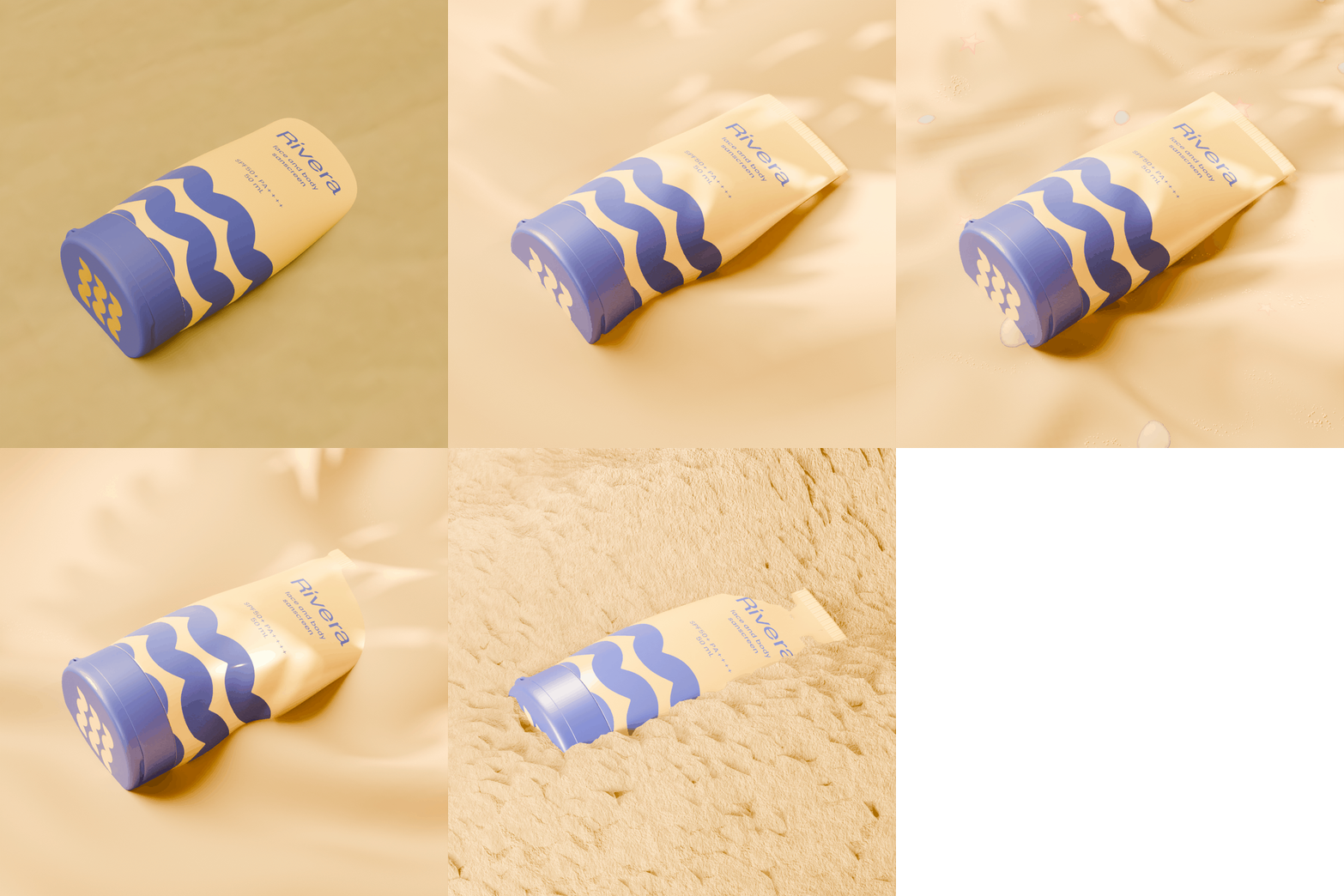
Sunscreen Collection
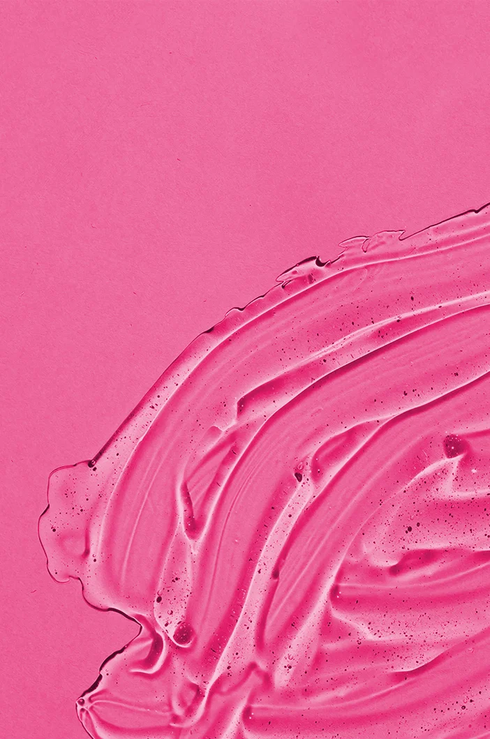
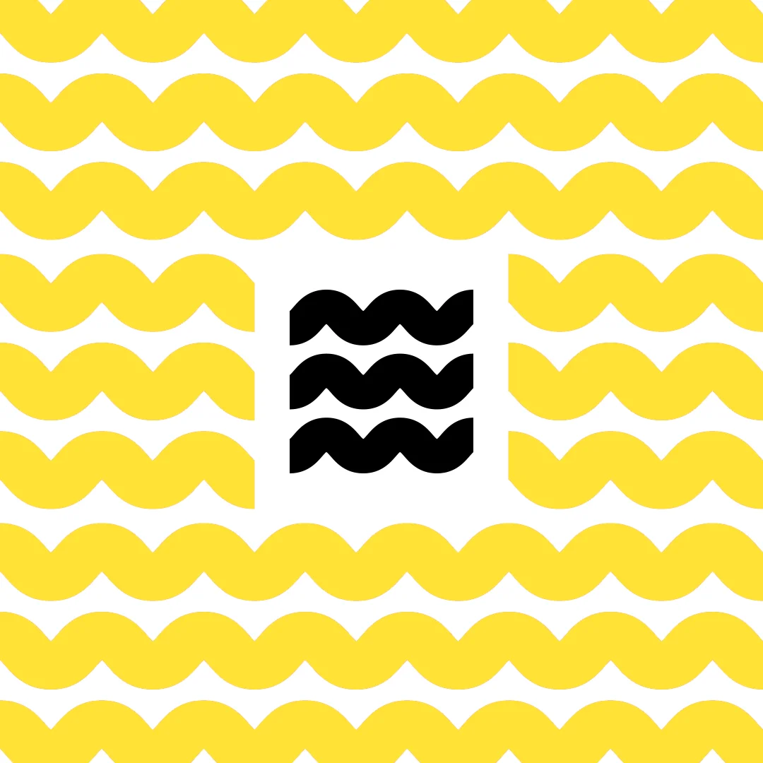
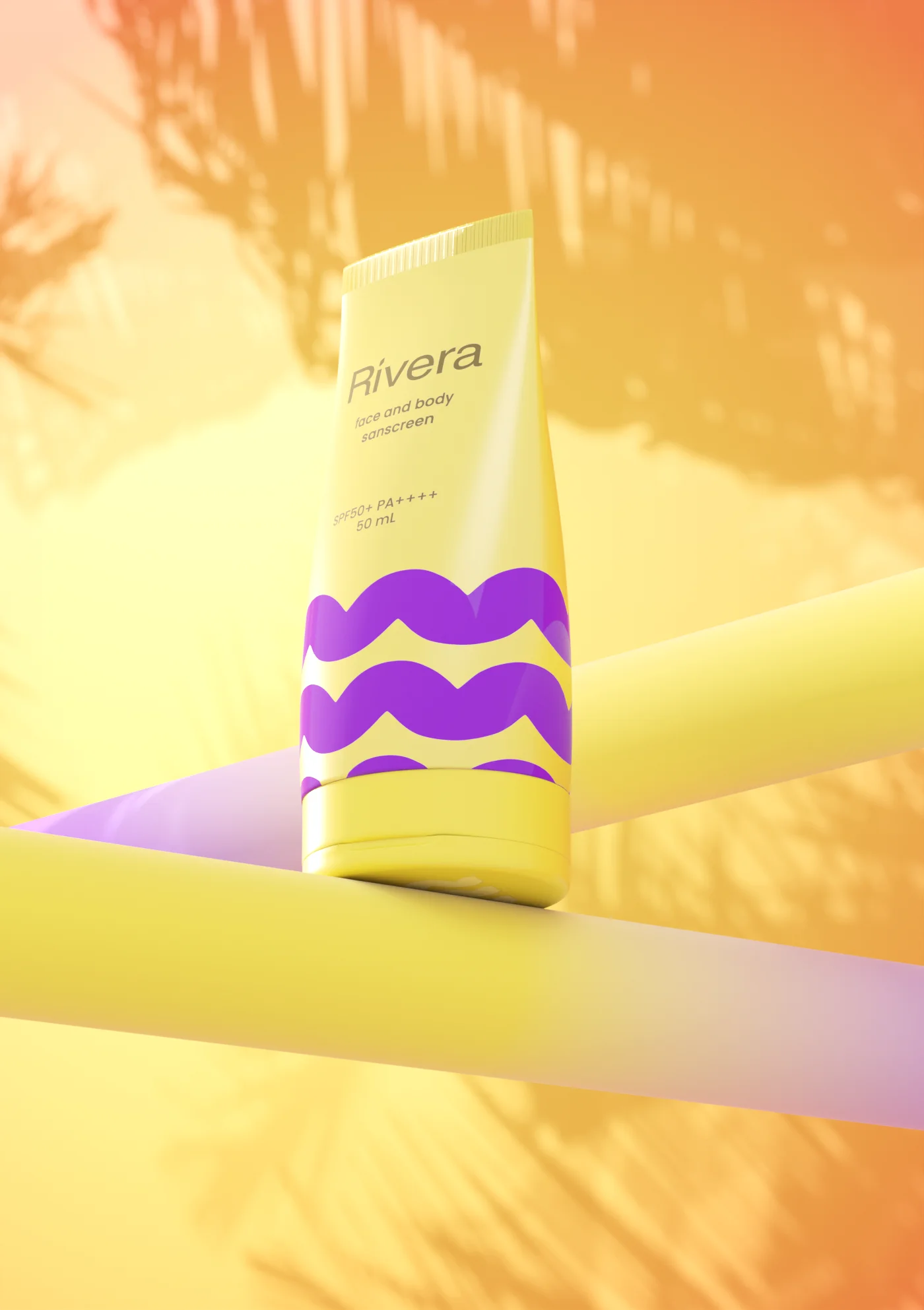
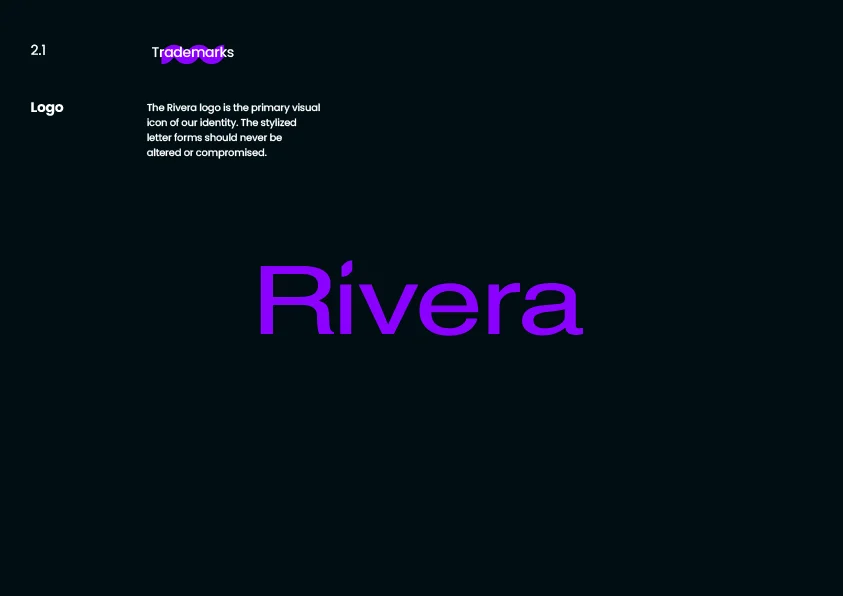
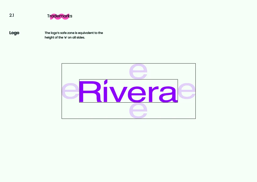
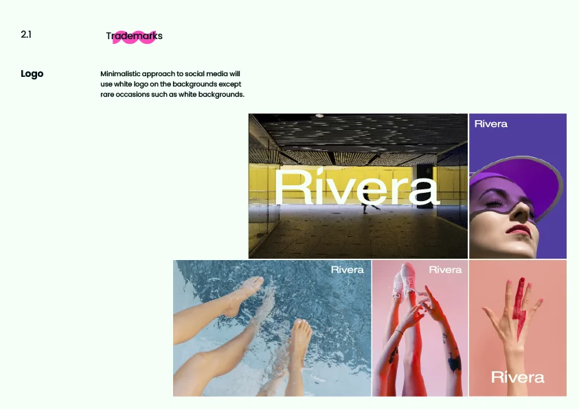
Brand Guidelines
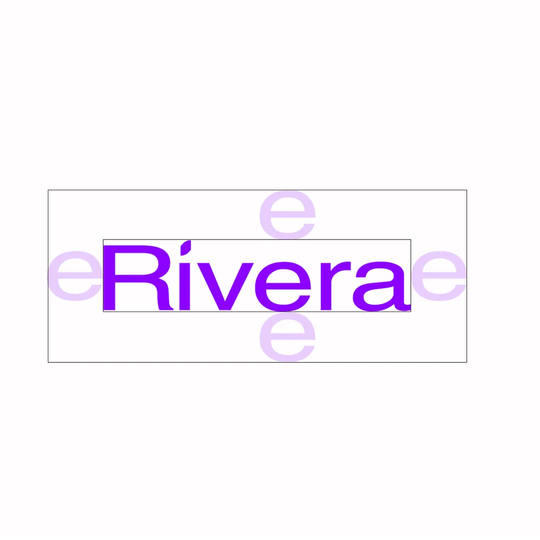
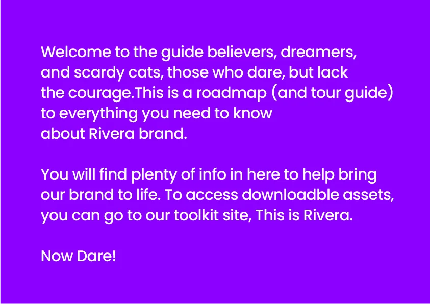
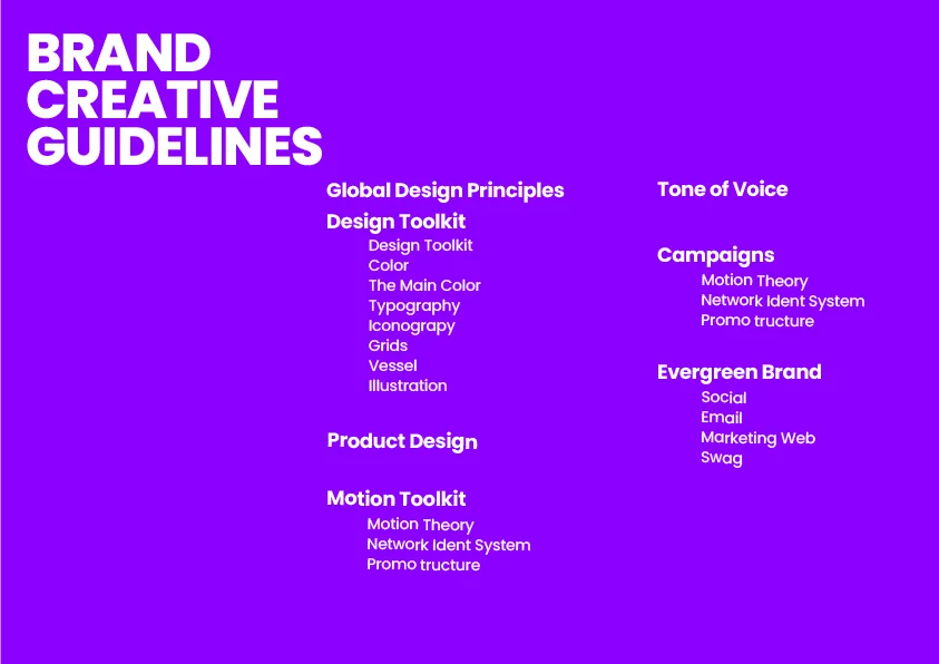
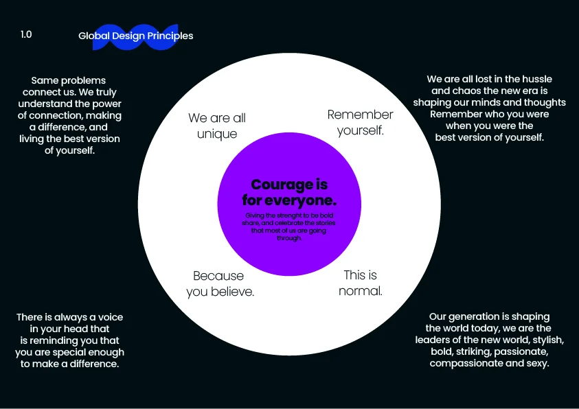
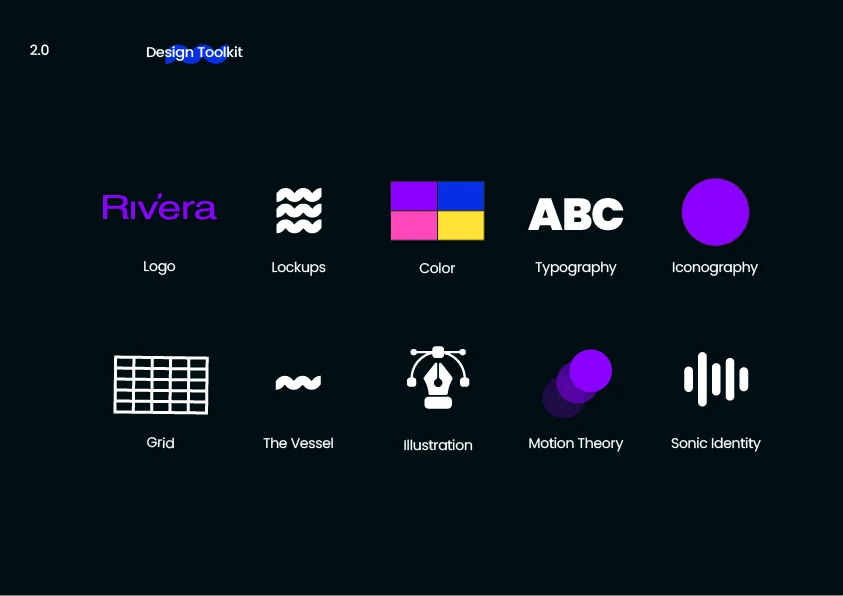
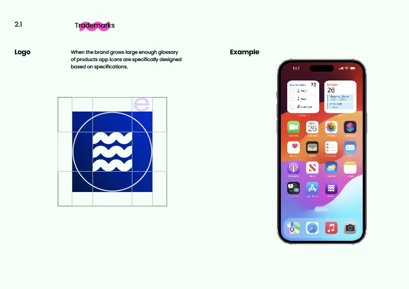
Complete brand system: identity, colour, typography, collections, and collateral.
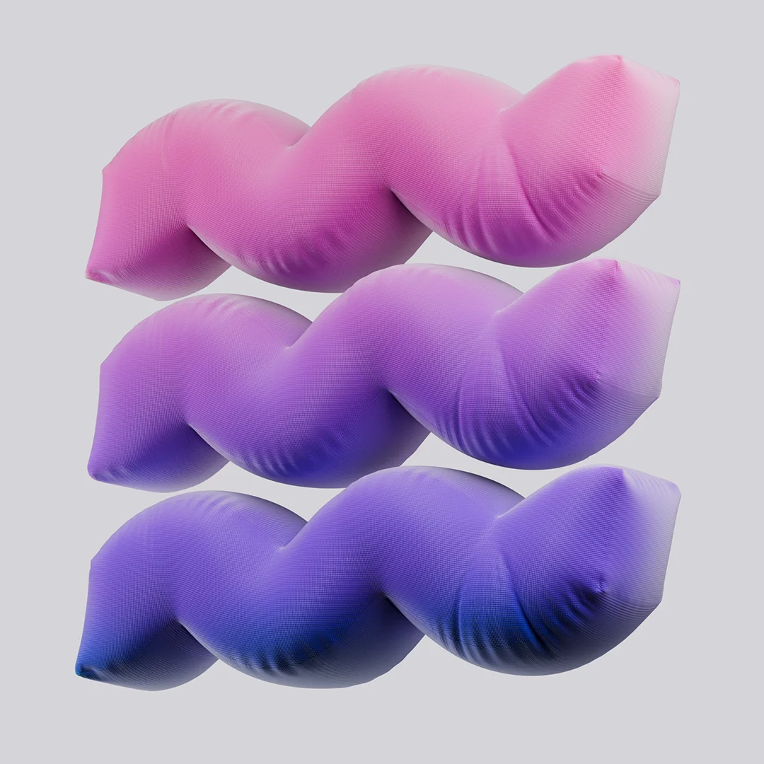
3D Material Exploration
A full brand system for a generation that refuses to blend in. Built to live on shelves, screens, and bedroom mirrors.
Four collections. One language. A mark that adapts without losing its edge.