Paradigma
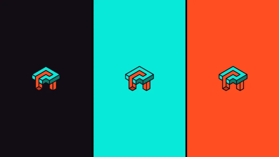
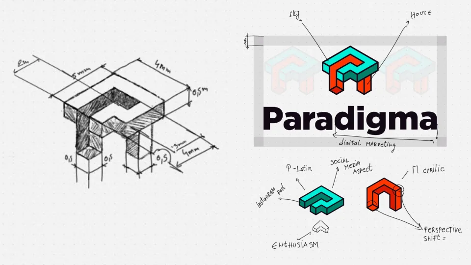
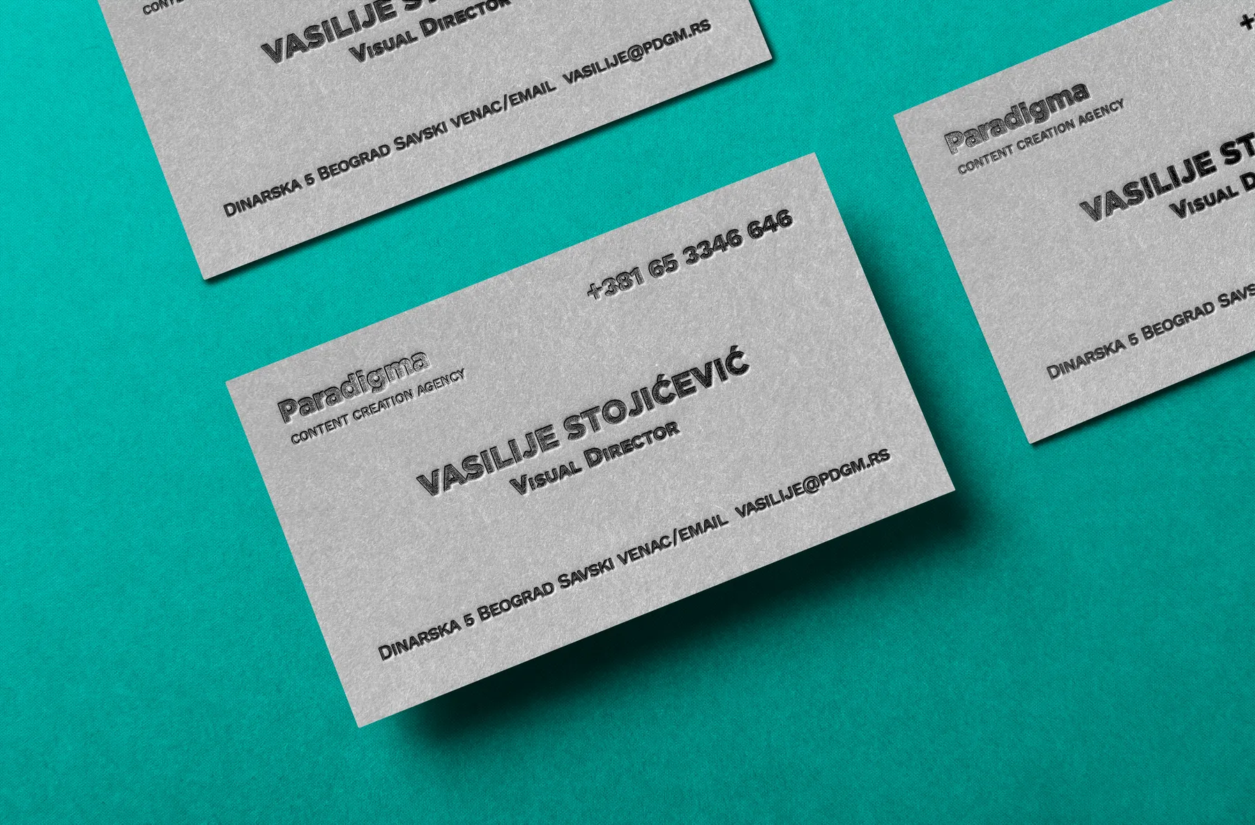
Paradigma needed a credible visual foundation for a young social media agency preparing to work with larger clients. The identity was built around the relationship between its two founders, combining Latin P and Cyrillic П into a single geometric mark supported by typography, colour, stationery, and a broader visual system.
Two letters. One mark.
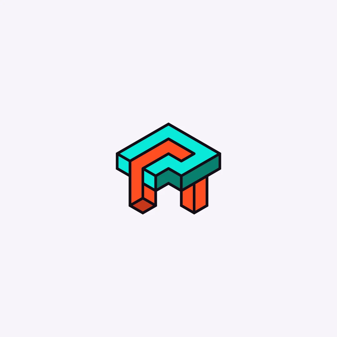
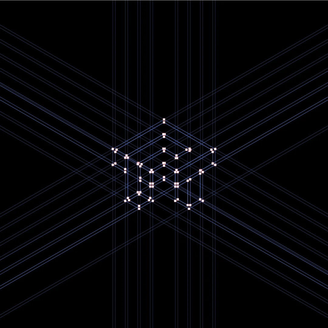
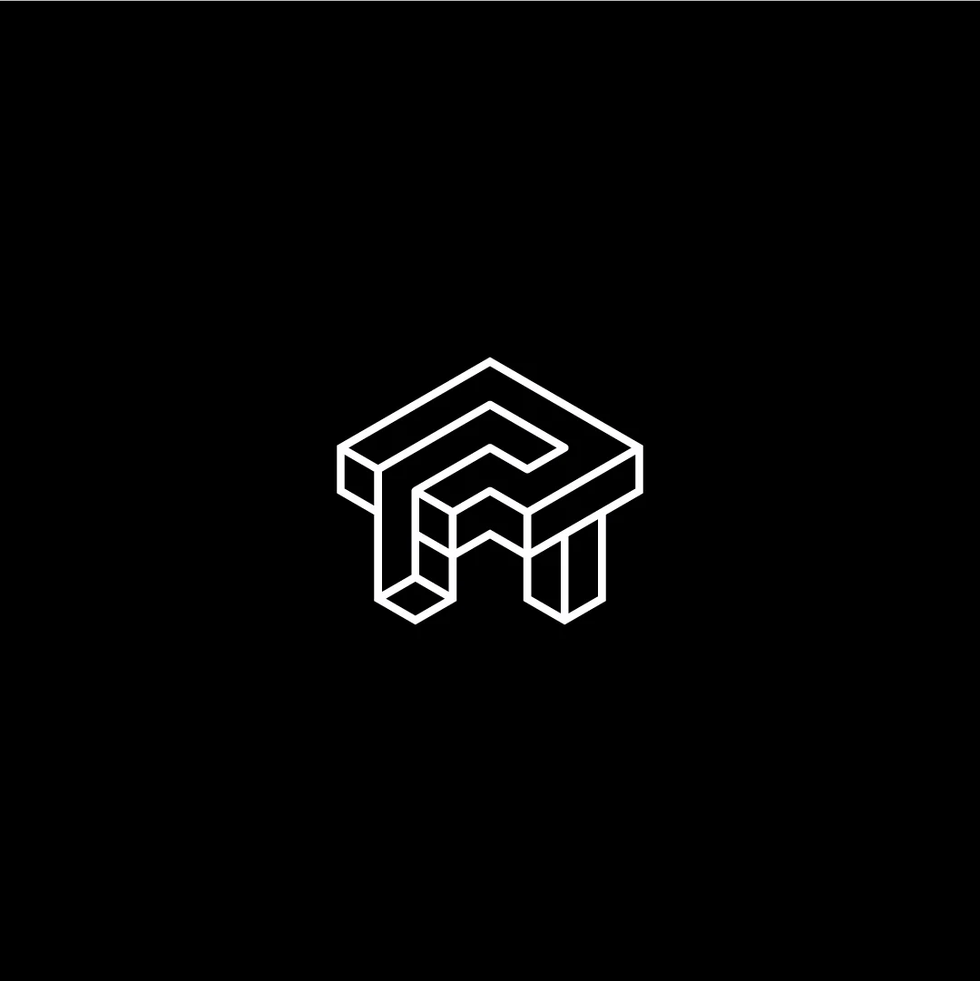
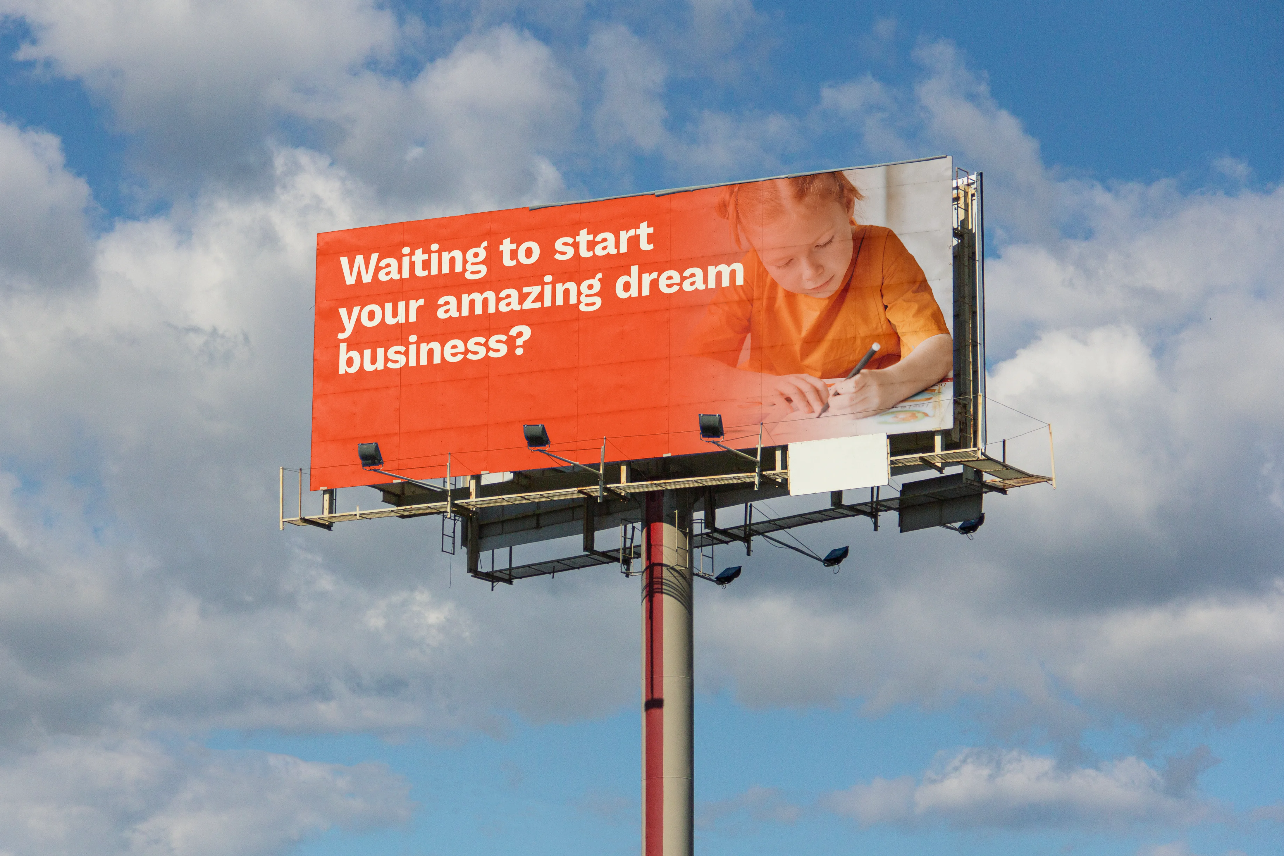
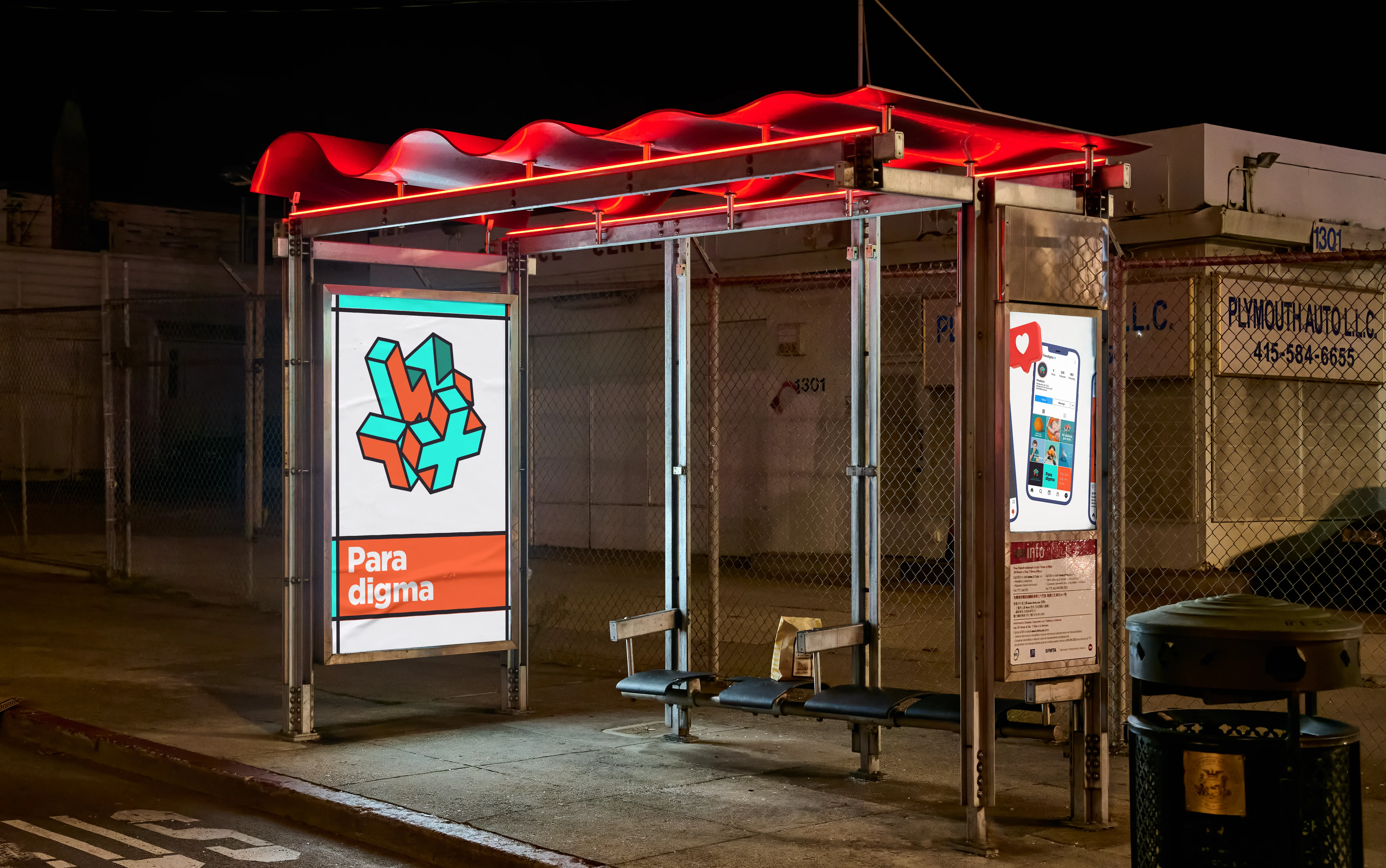
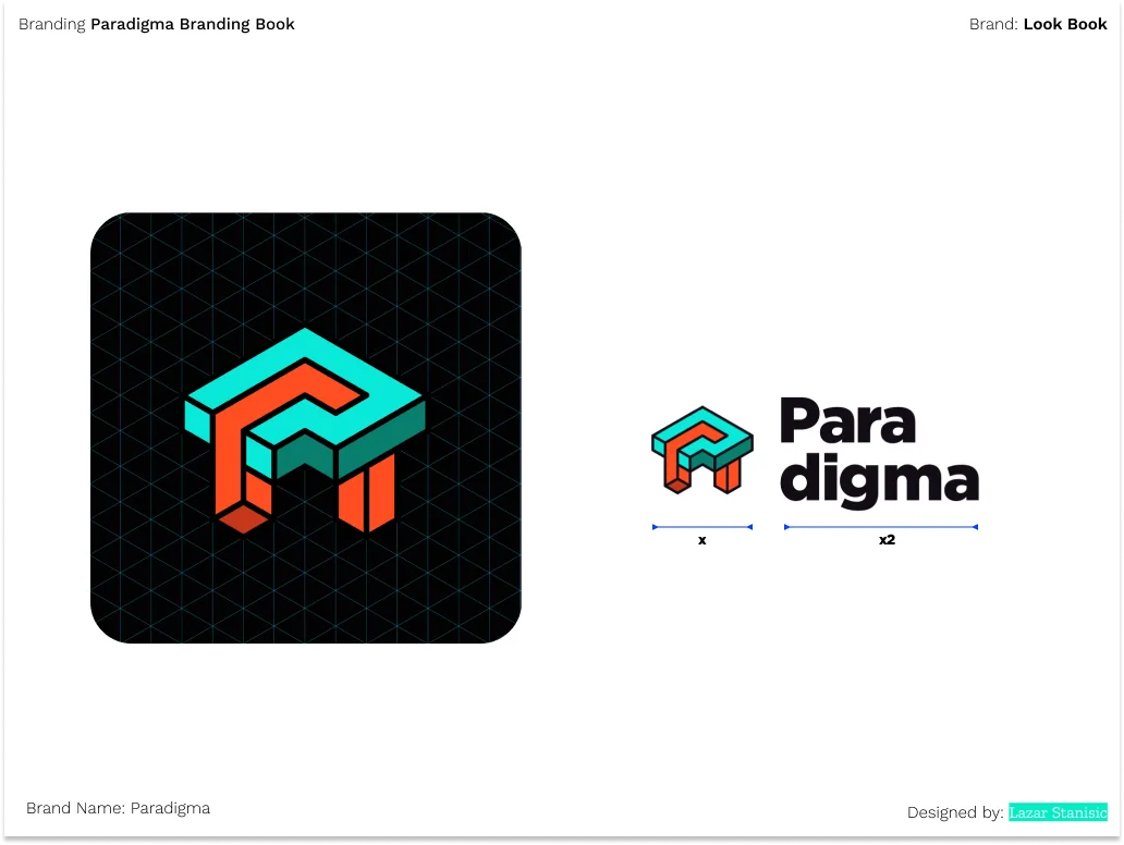
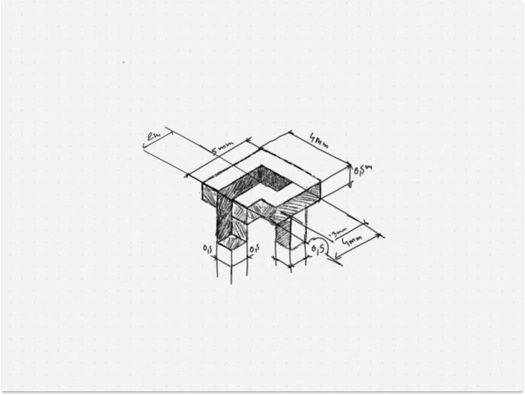
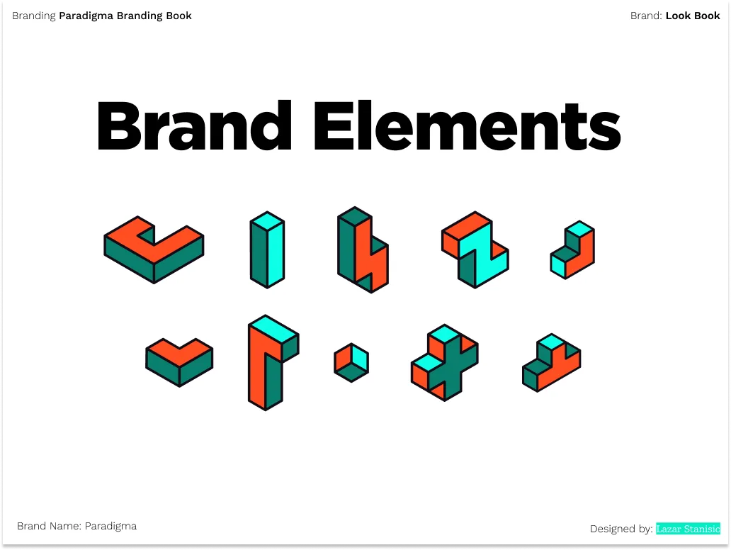
The mark was constructed on an isometric grid. The same geometric logic that gives the letterform its dimensional depth also makes it legible at any scale, from a favicon to a billboard.
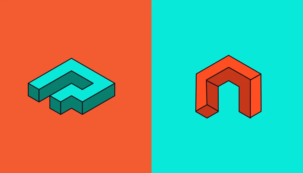
The brief came from two friends launching together: one drawn to blue, one to green. The goal was to combine two letterforms, Latin P and Cyrillic П, into a single unified shape. Not a compromise between the two, but a resolution of them.
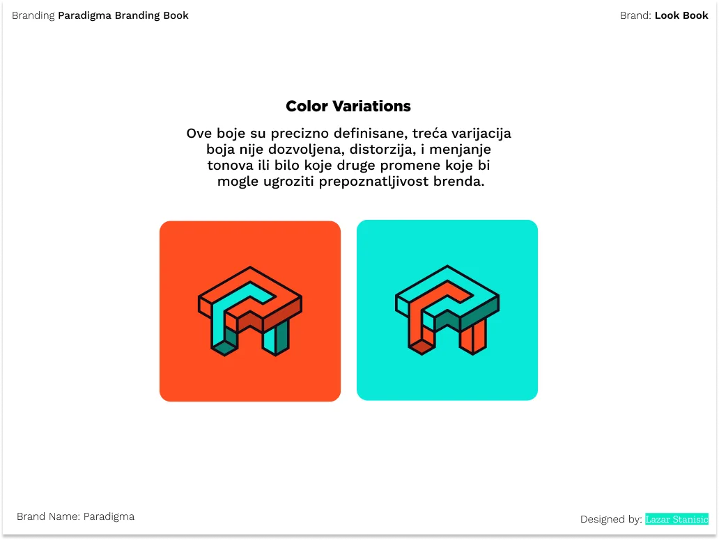
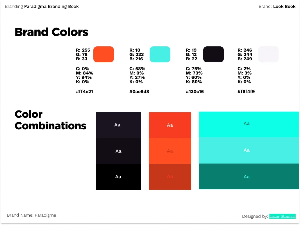
The merged form carries the idea of closeness and friendship, while the colour balance between teal and green-blue speaks to two markets, English and Serbian, existing as equals within one identity.
The Mark
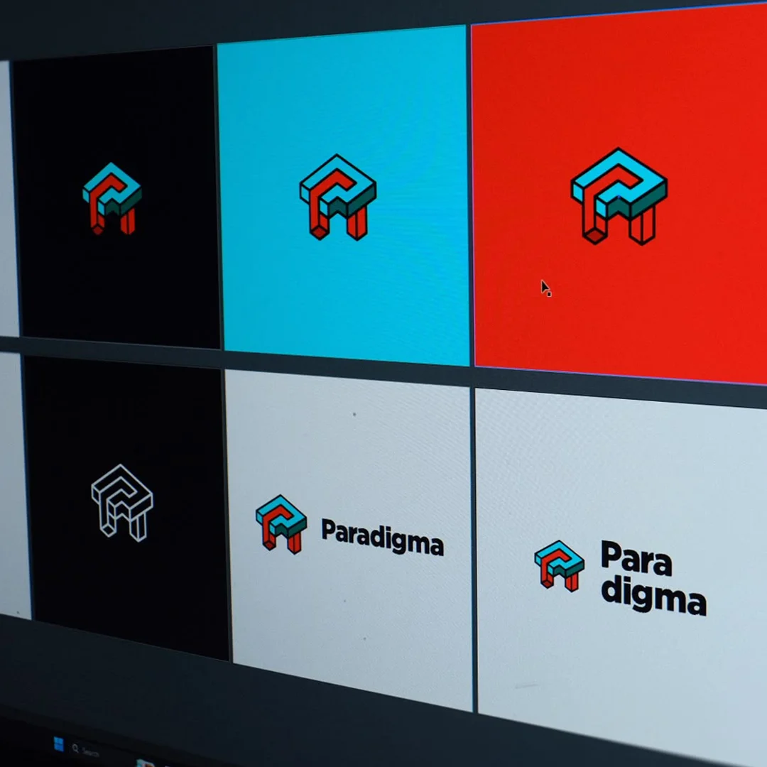
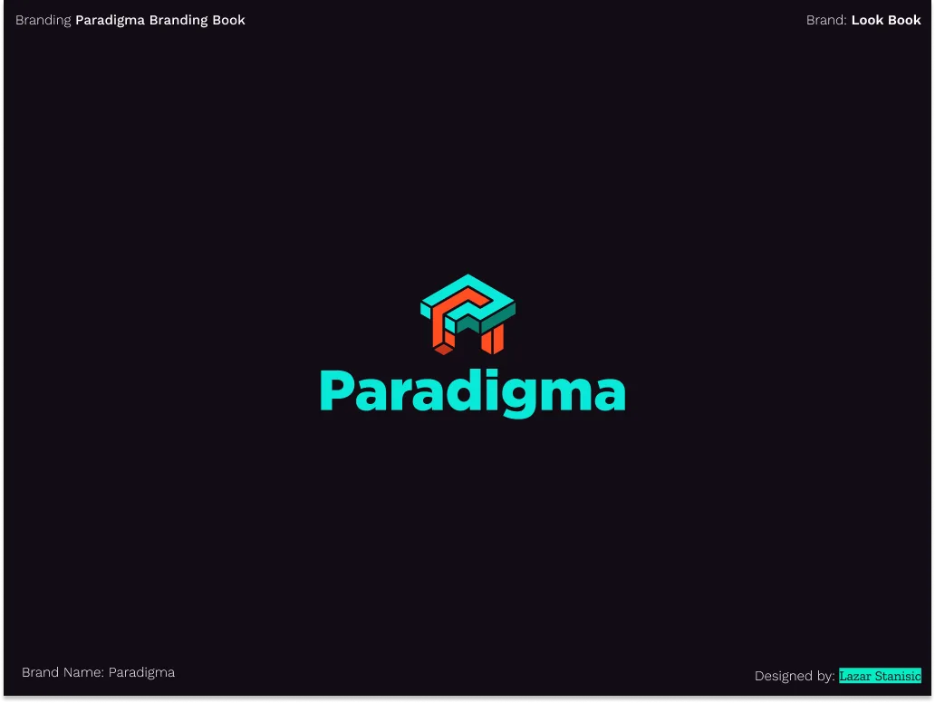
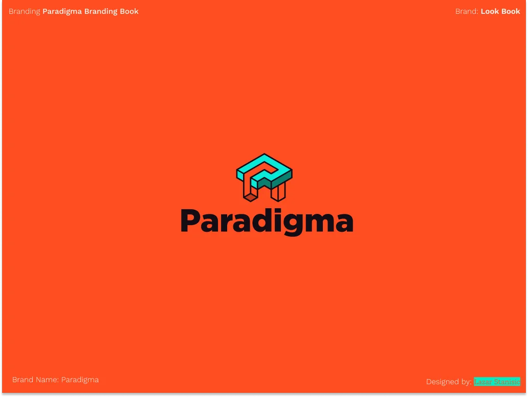
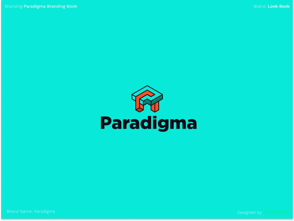
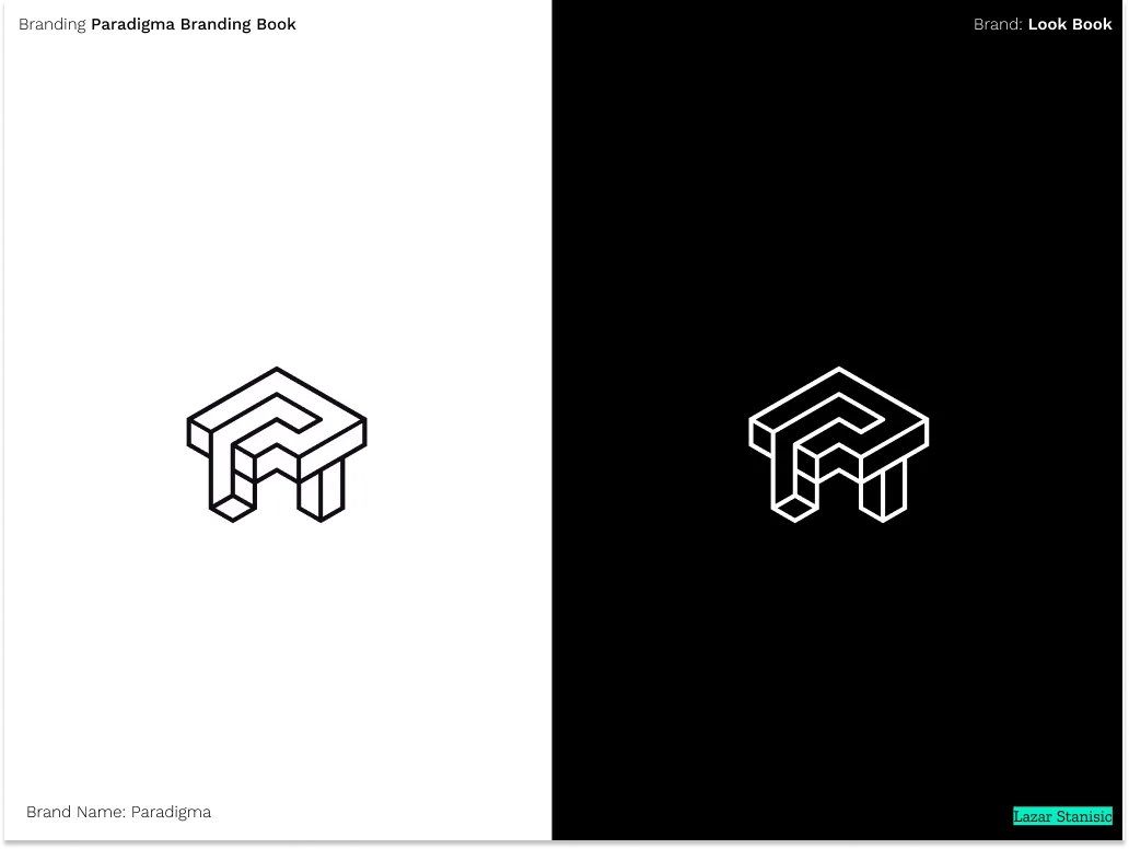
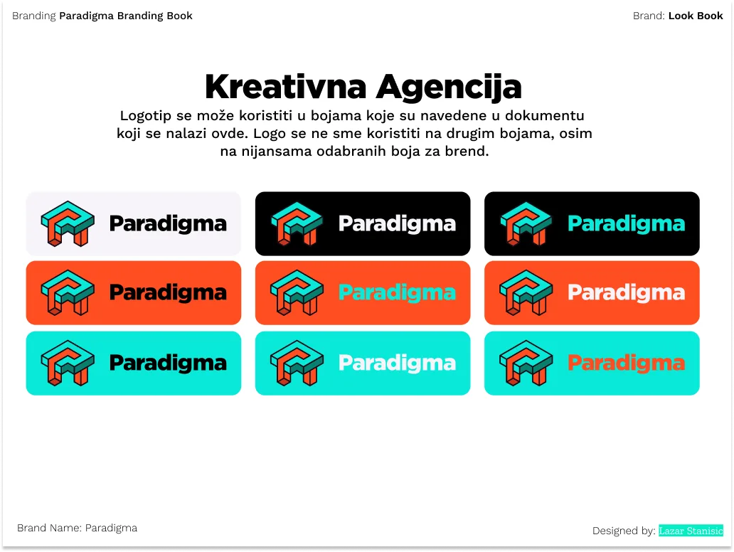
The merged form across backgrounds. Legible at any scale, in any context.
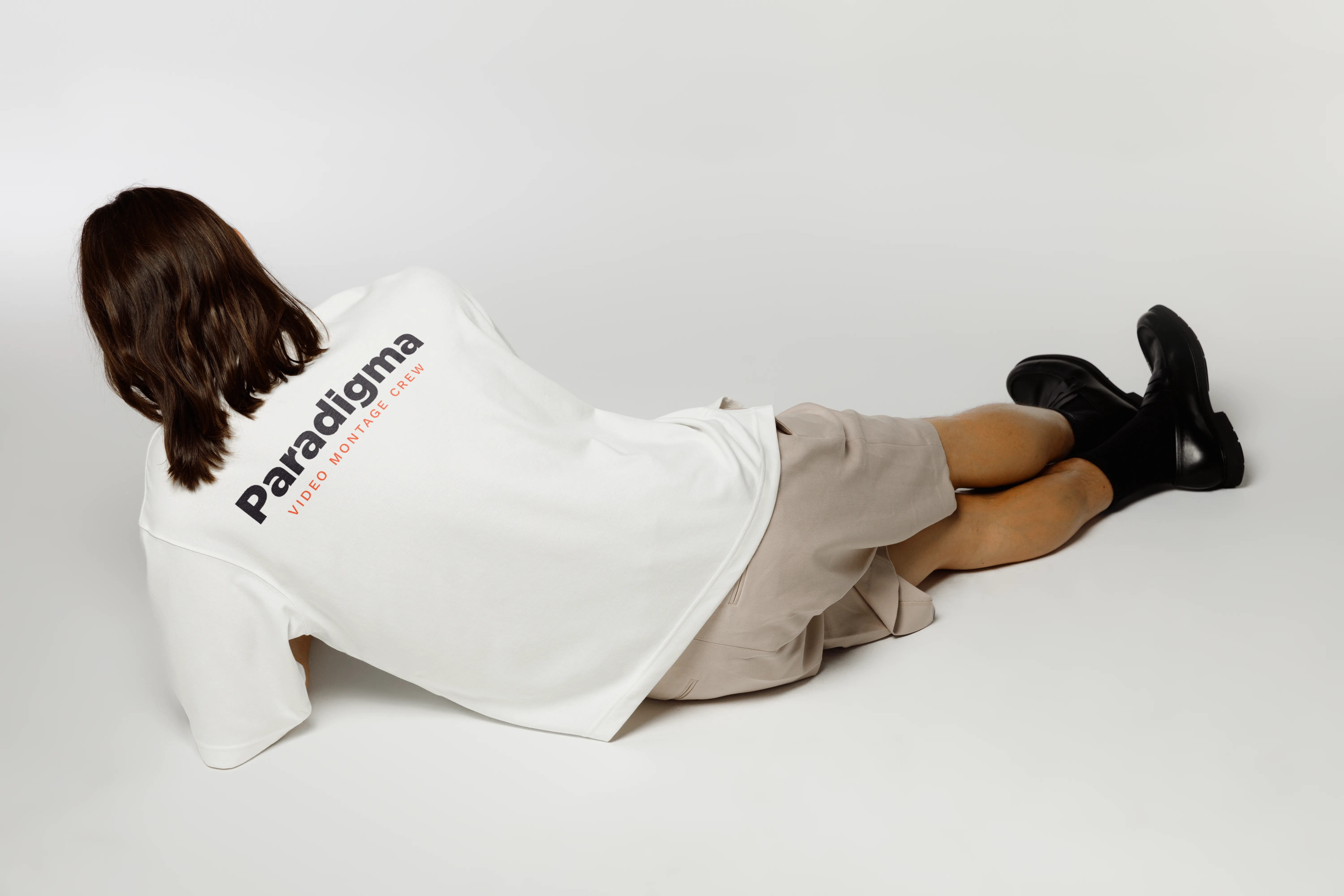
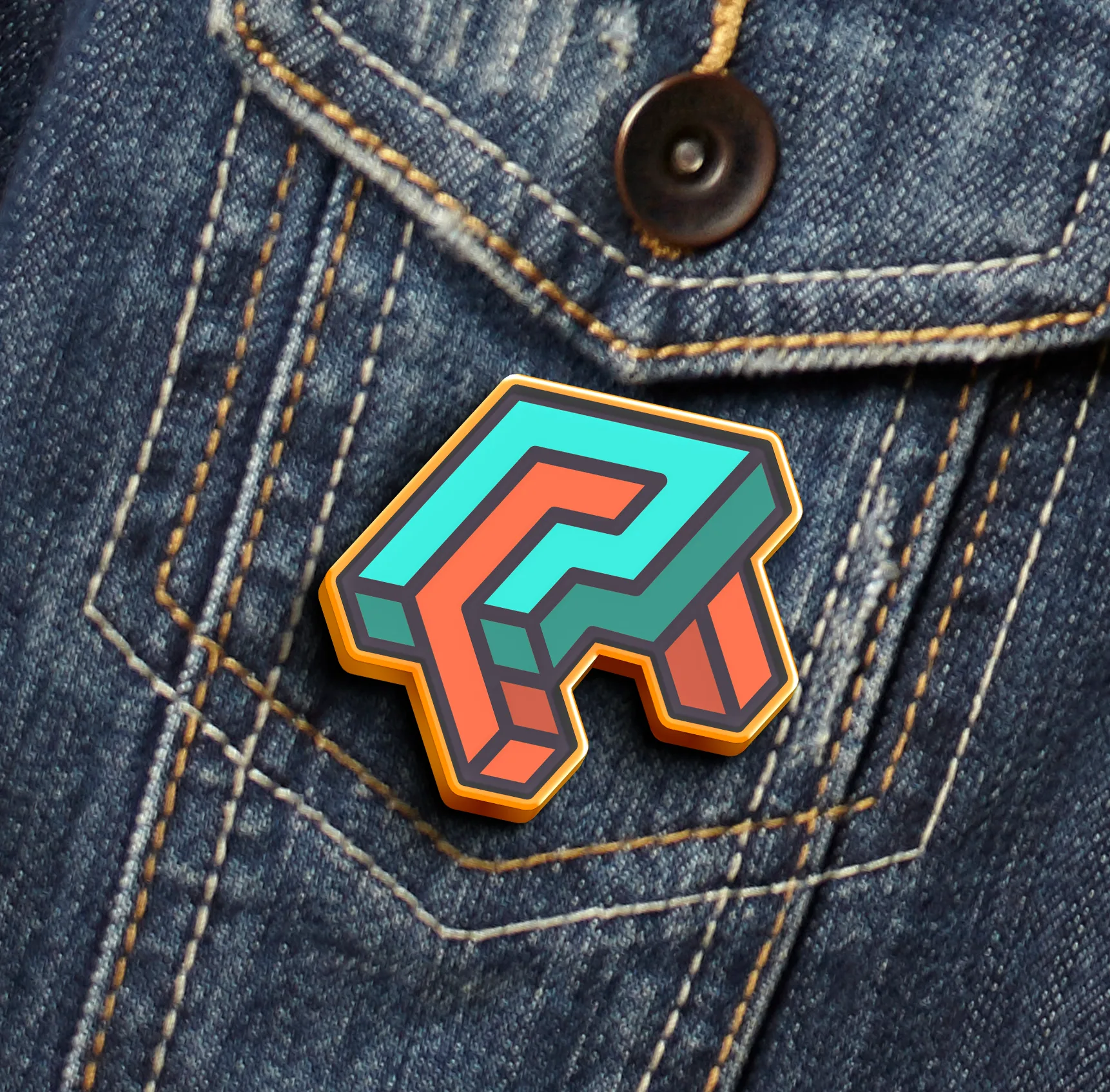
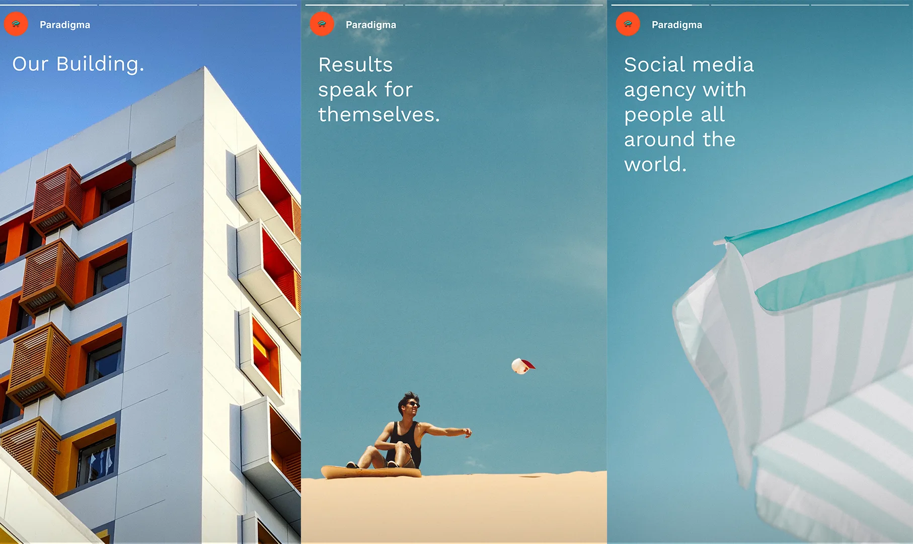
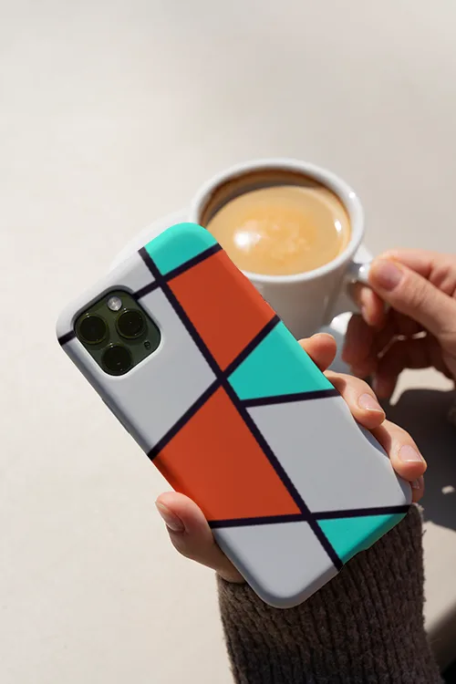
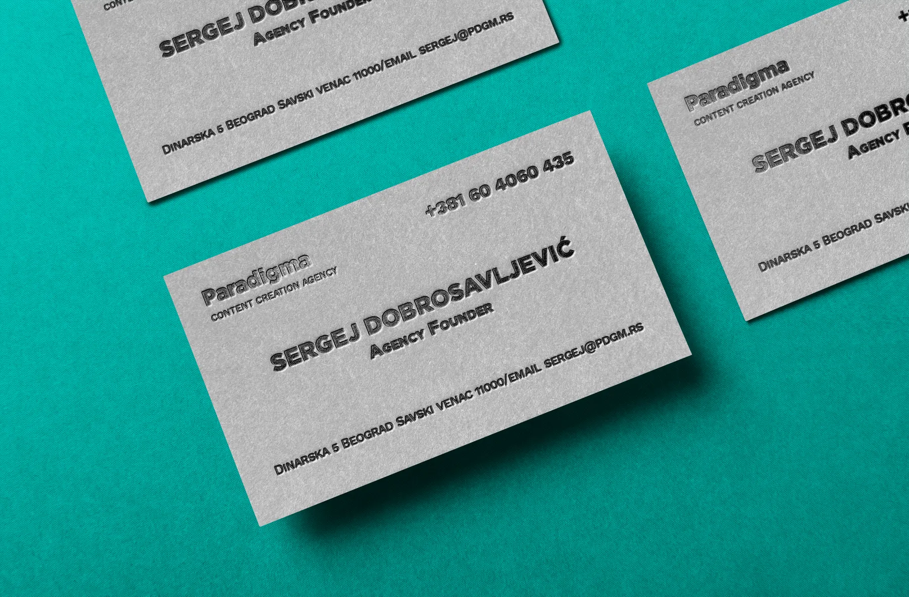
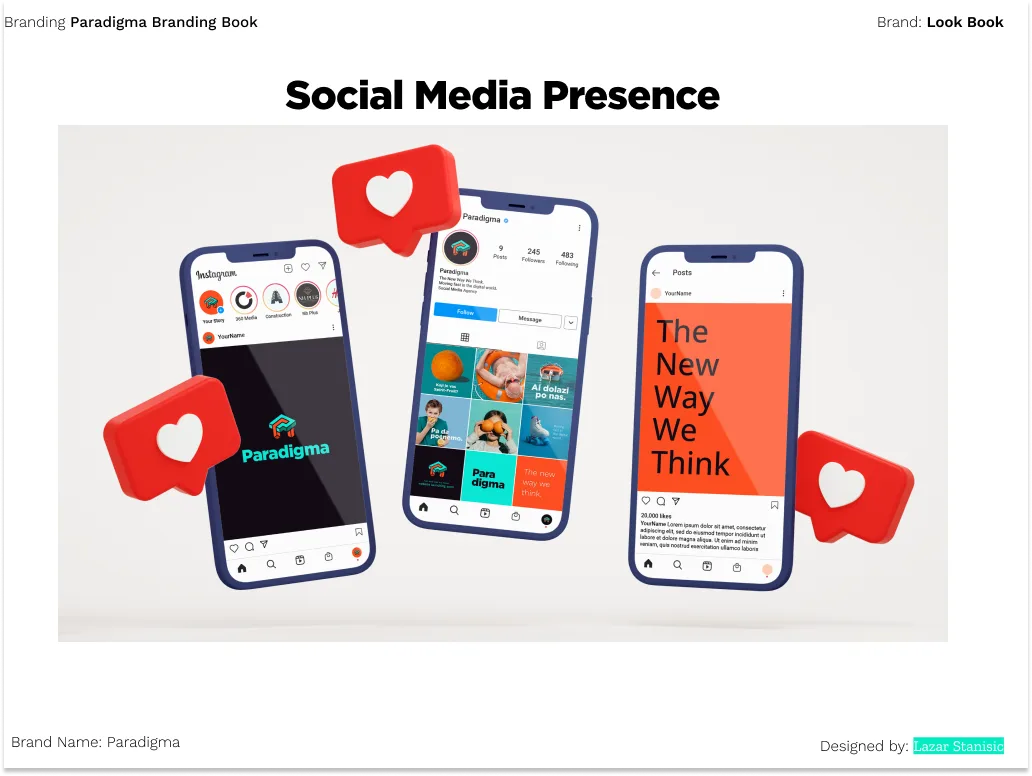
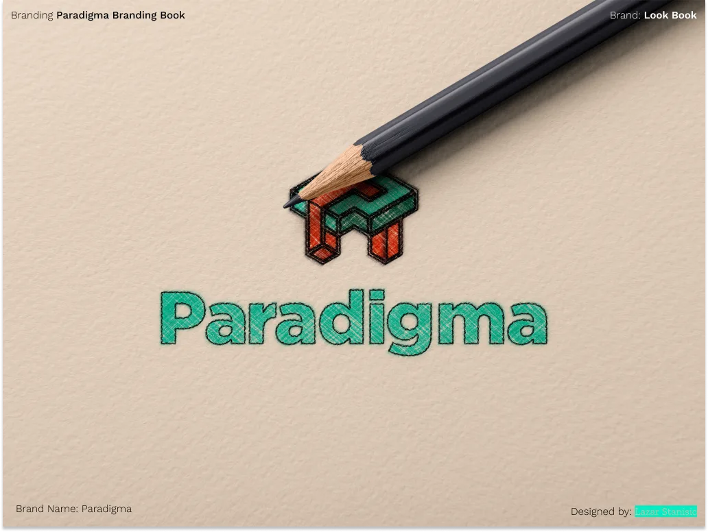
Mockups

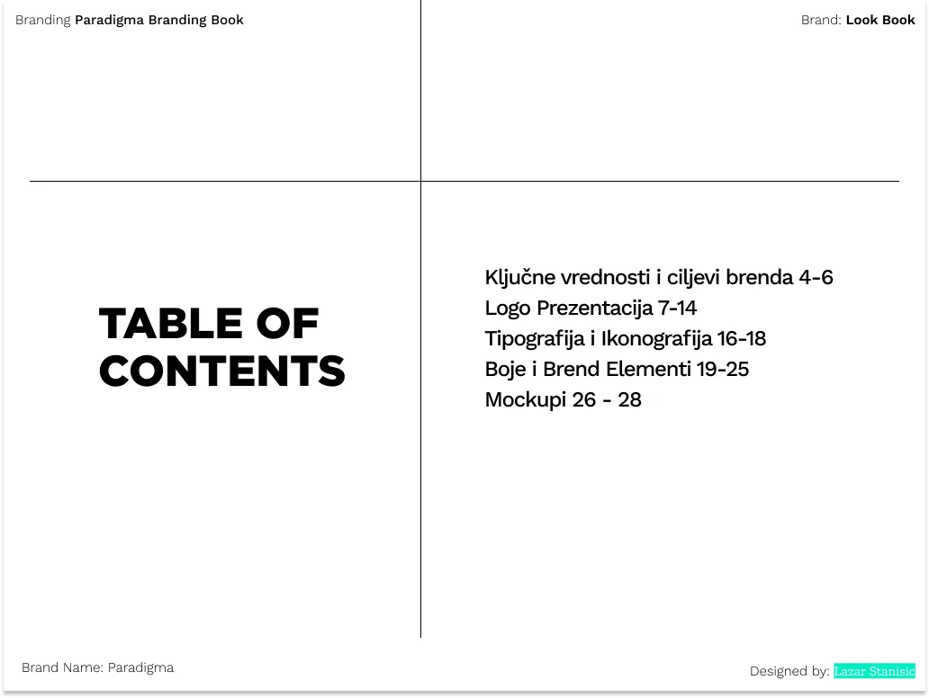
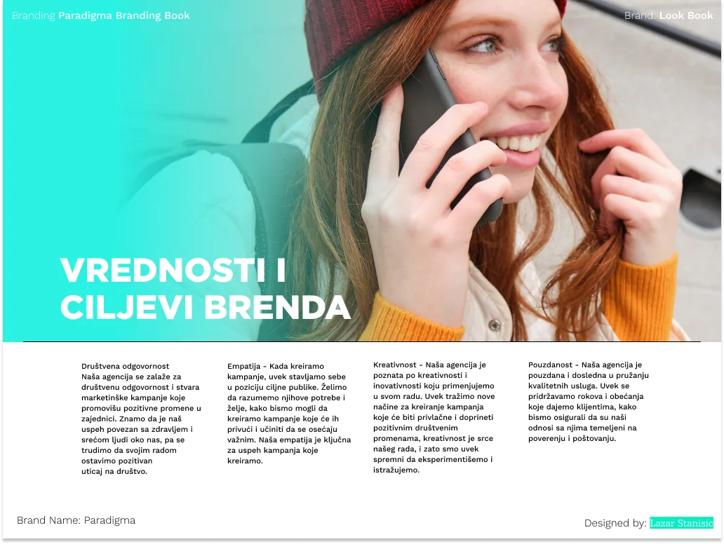
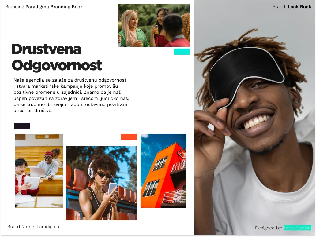
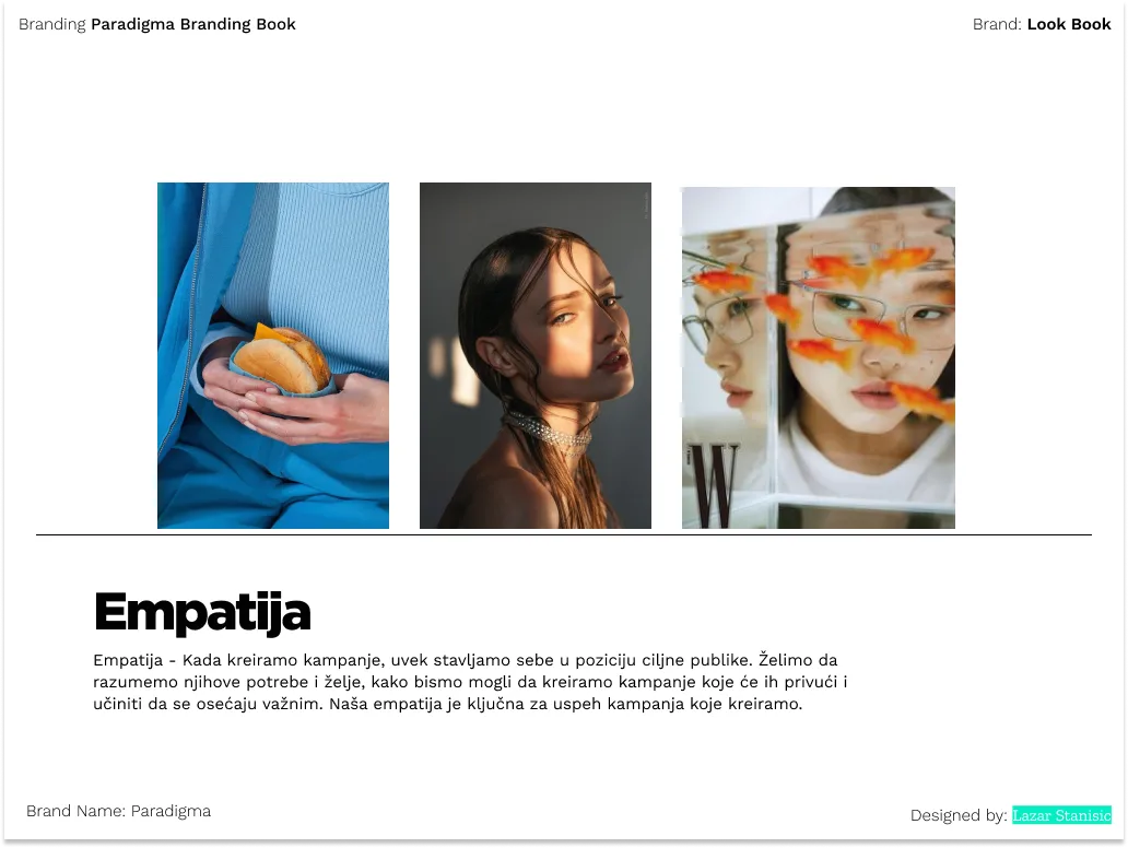
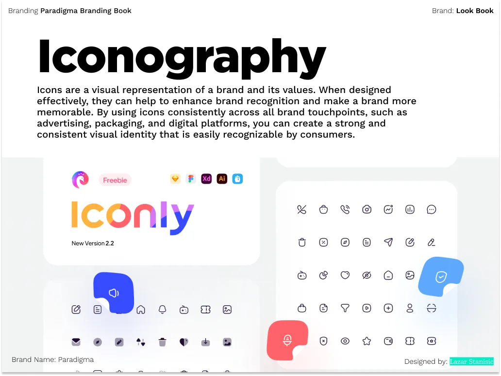
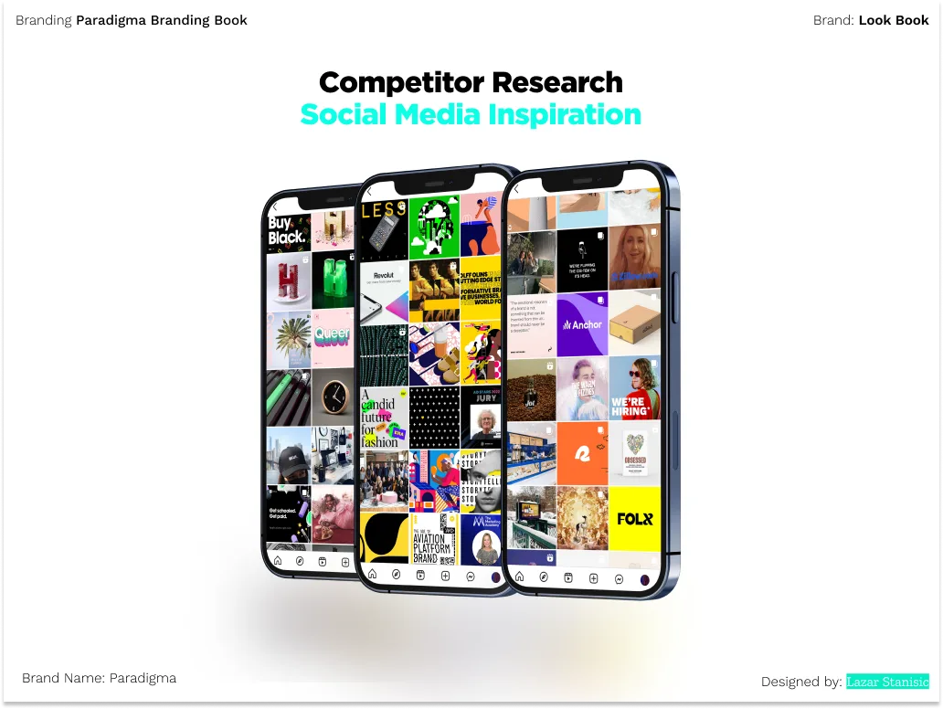
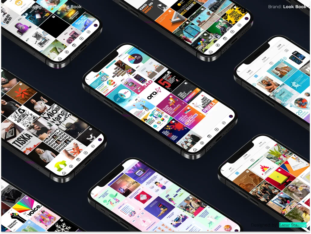
Brand Book
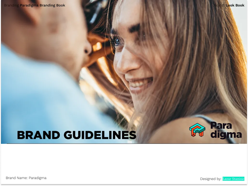
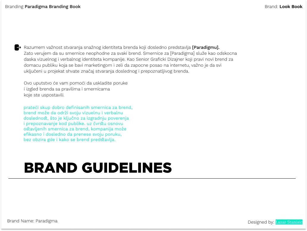
Complete brand guidelines: identity, colour, typography, and collateral.
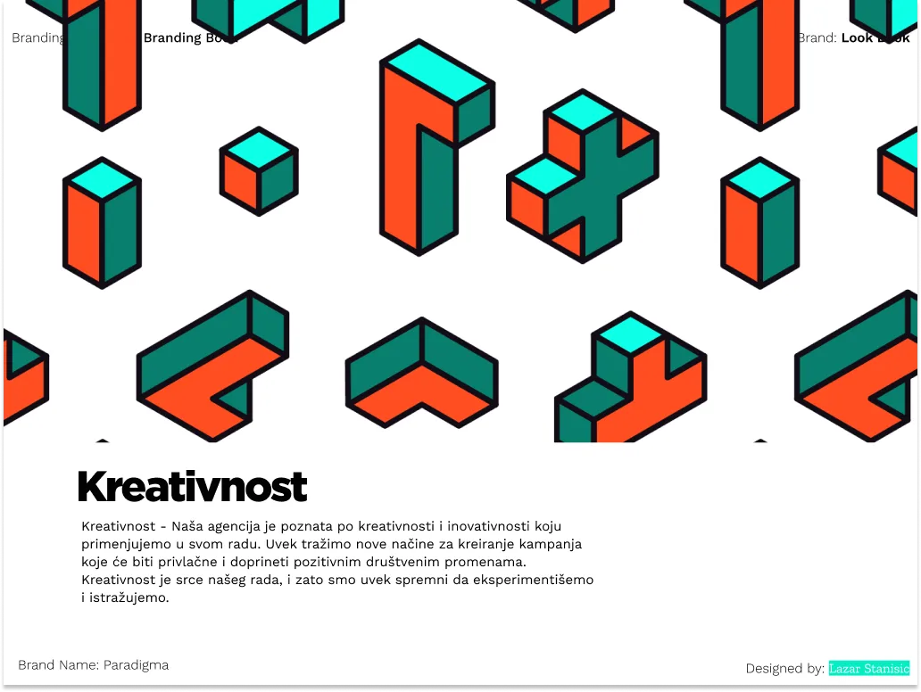
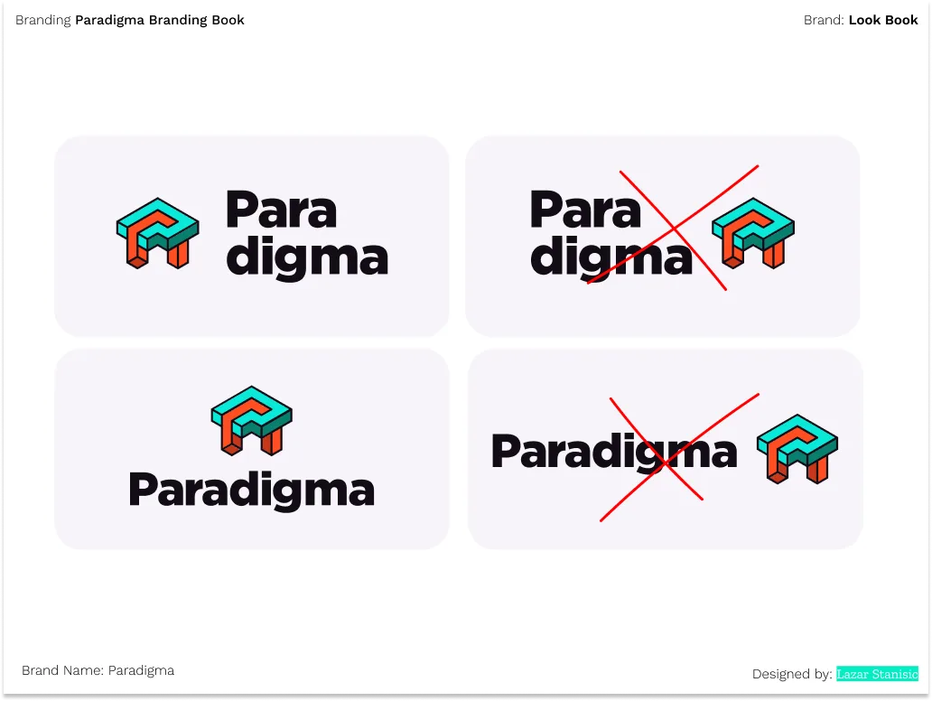
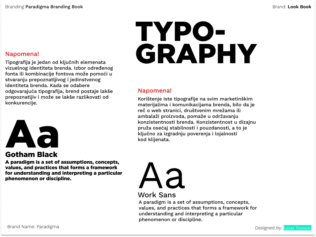
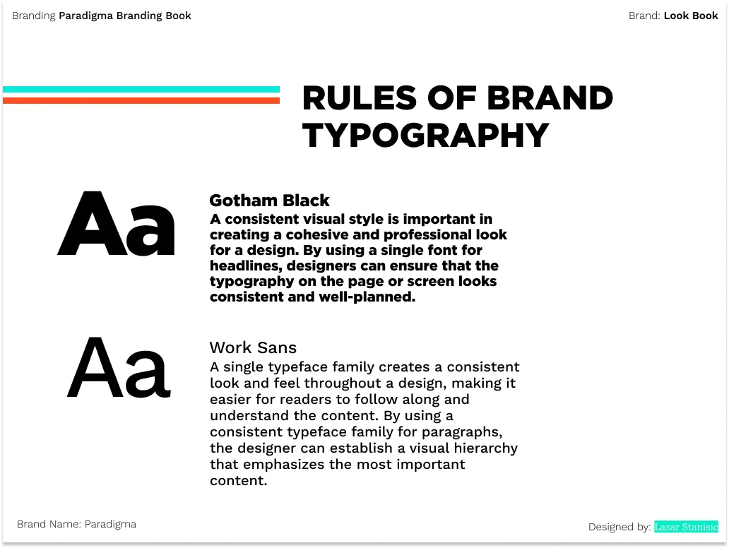
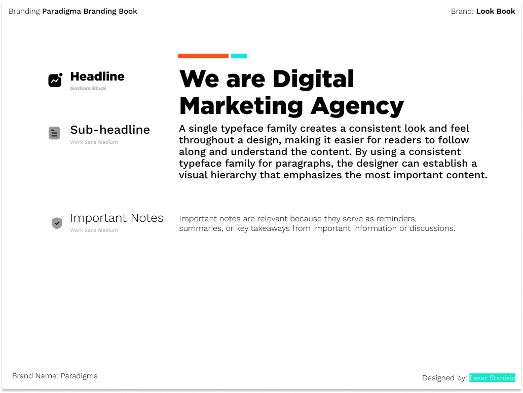
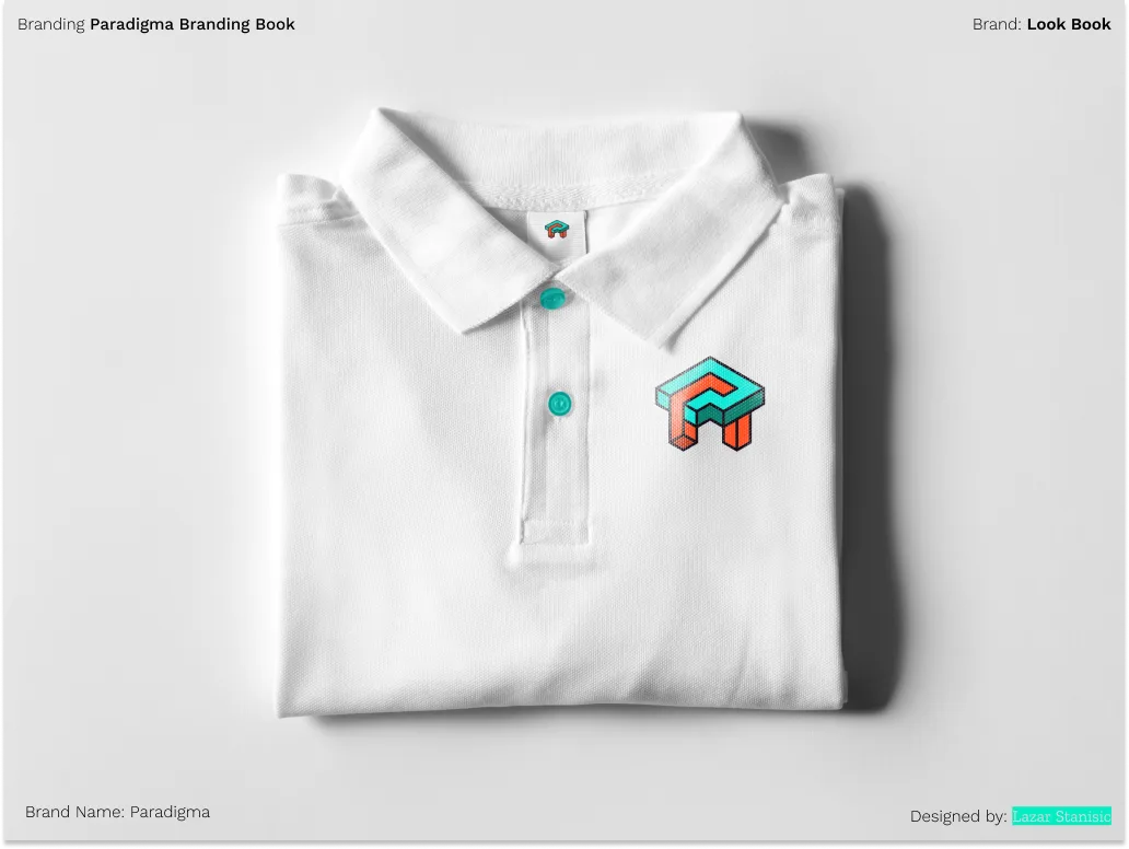
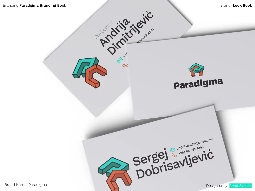
An identity built on friendship. Two letters, two markets, one mark that holds at any scale.
Clean, deliberate, and made to last. One system that speaks to two audiences without compromise.