Prop Firm Expo
Prop Firm Expo needed to feel distinct from Prop Firm Match. While the parent platform is structured, static and data-led, the event identity needed to feel fluid, atmospheric and charged with anticipation.
The identity grew into a conversion-focused event platform and a flexible communication system for speakers, exhibitors, sponsors, partners, venue information and future city editions.
The Challenge
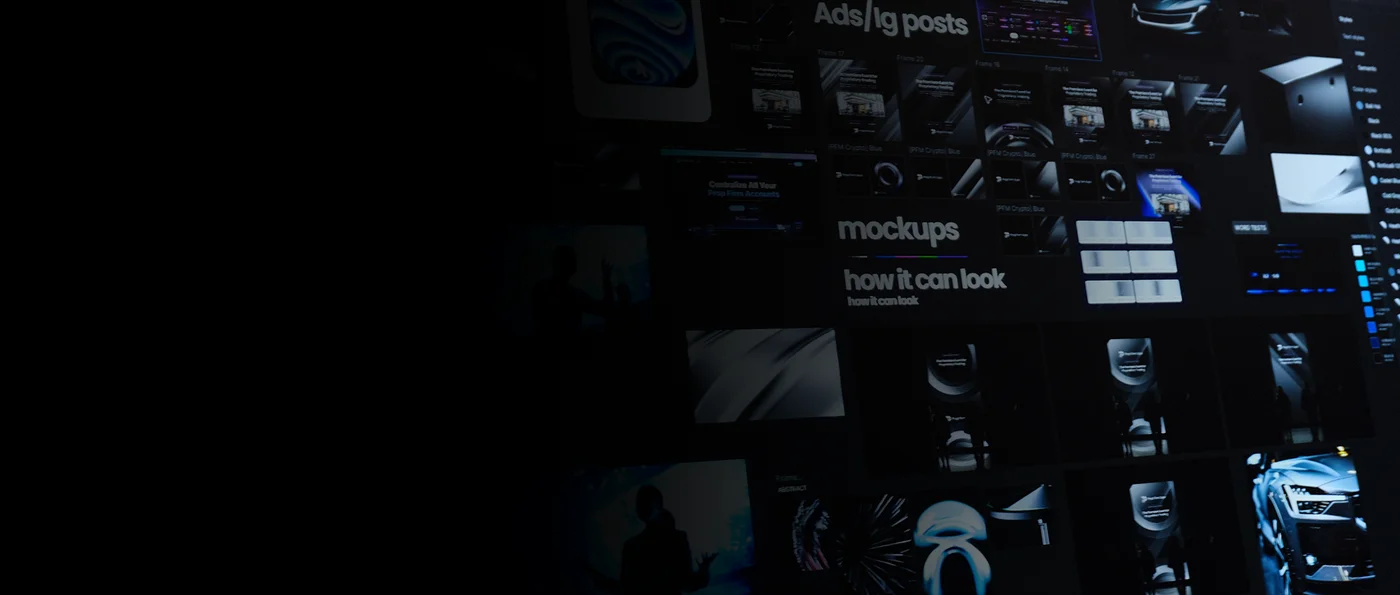
Differentiate Prop Firm Expo from Prop Firm Match, keeping the authority at PFM, but introducing elegancy and fluidity into the new event brand. Prop Firm Match is structured, data heavy, static. The event identity should feel fluid, atmospheric and make the attendee feel intrigue and anticipation, while simultaneously feeling the professional tone of Prop Firm Match.
This was a start of something great and the scope of the project was not clear. Introducing the brand in 48 hours still put a lot of pressure on me as I started exploring visual direction on how the brand will communicate and be used in the global remote team.
Looking at the Atmosphere
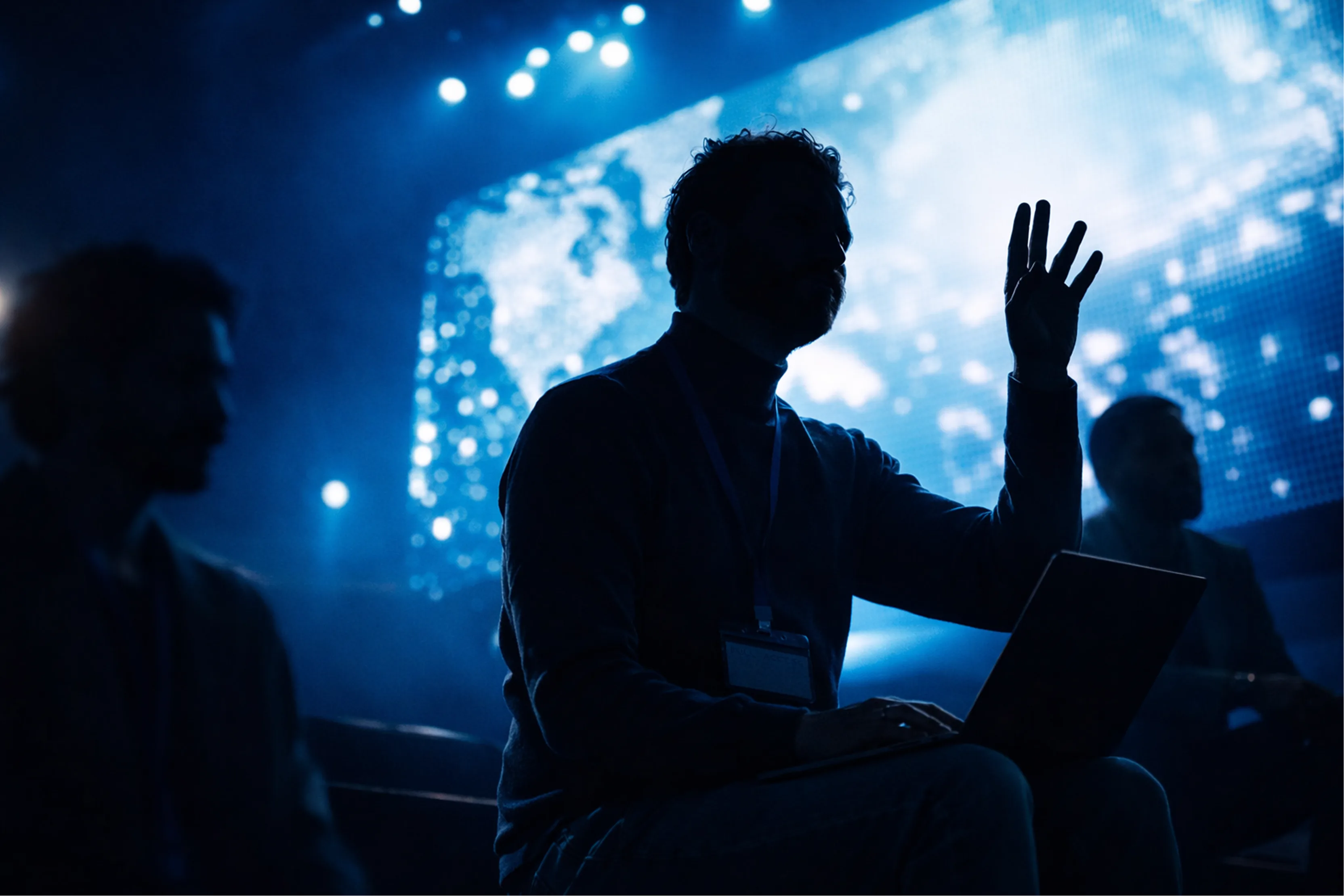
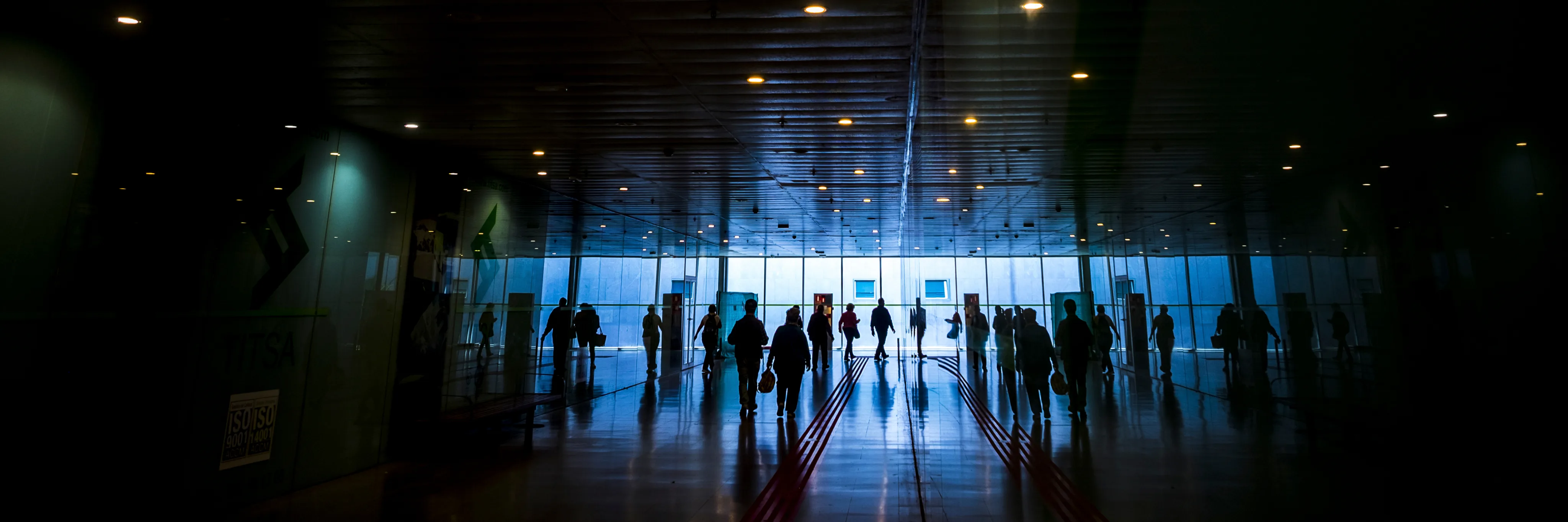
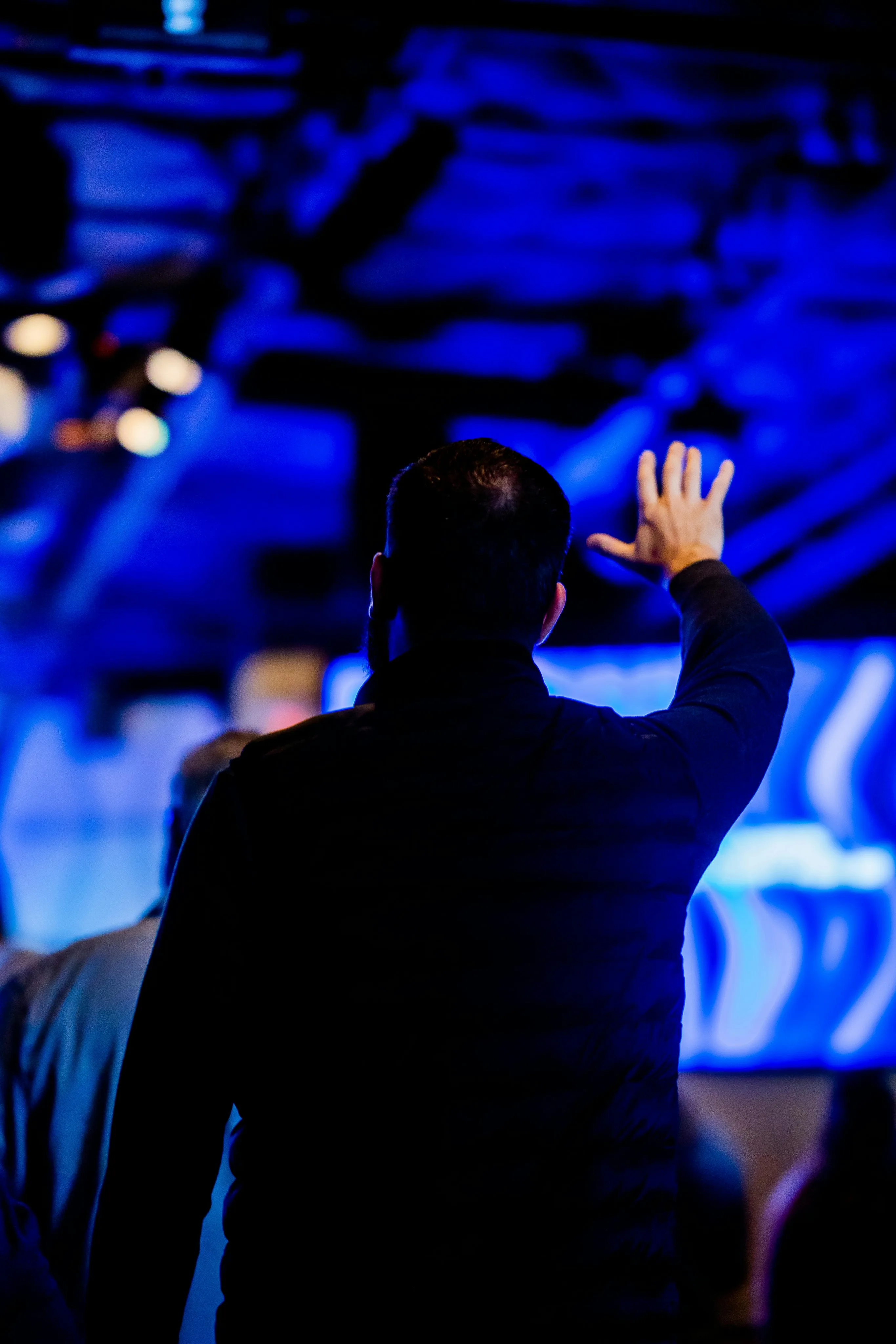
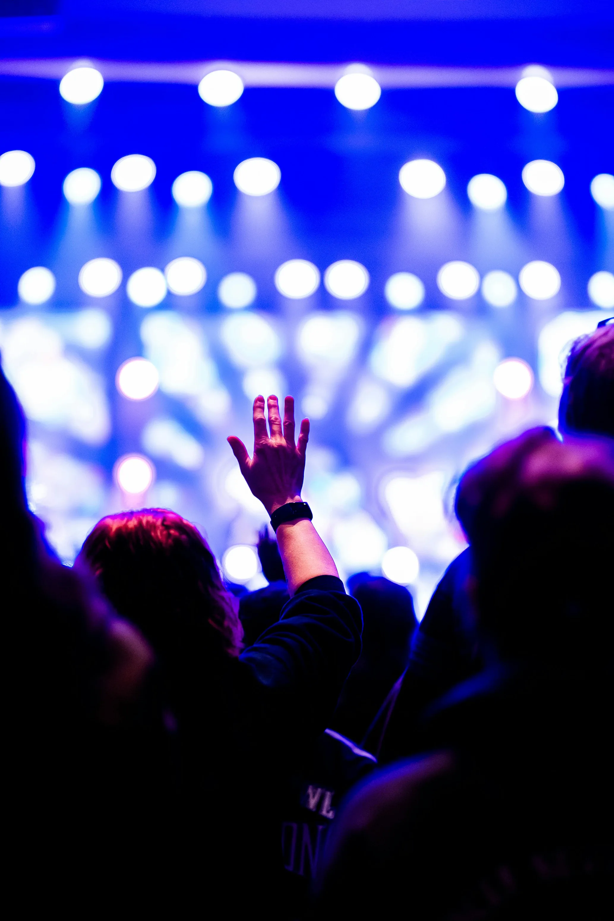
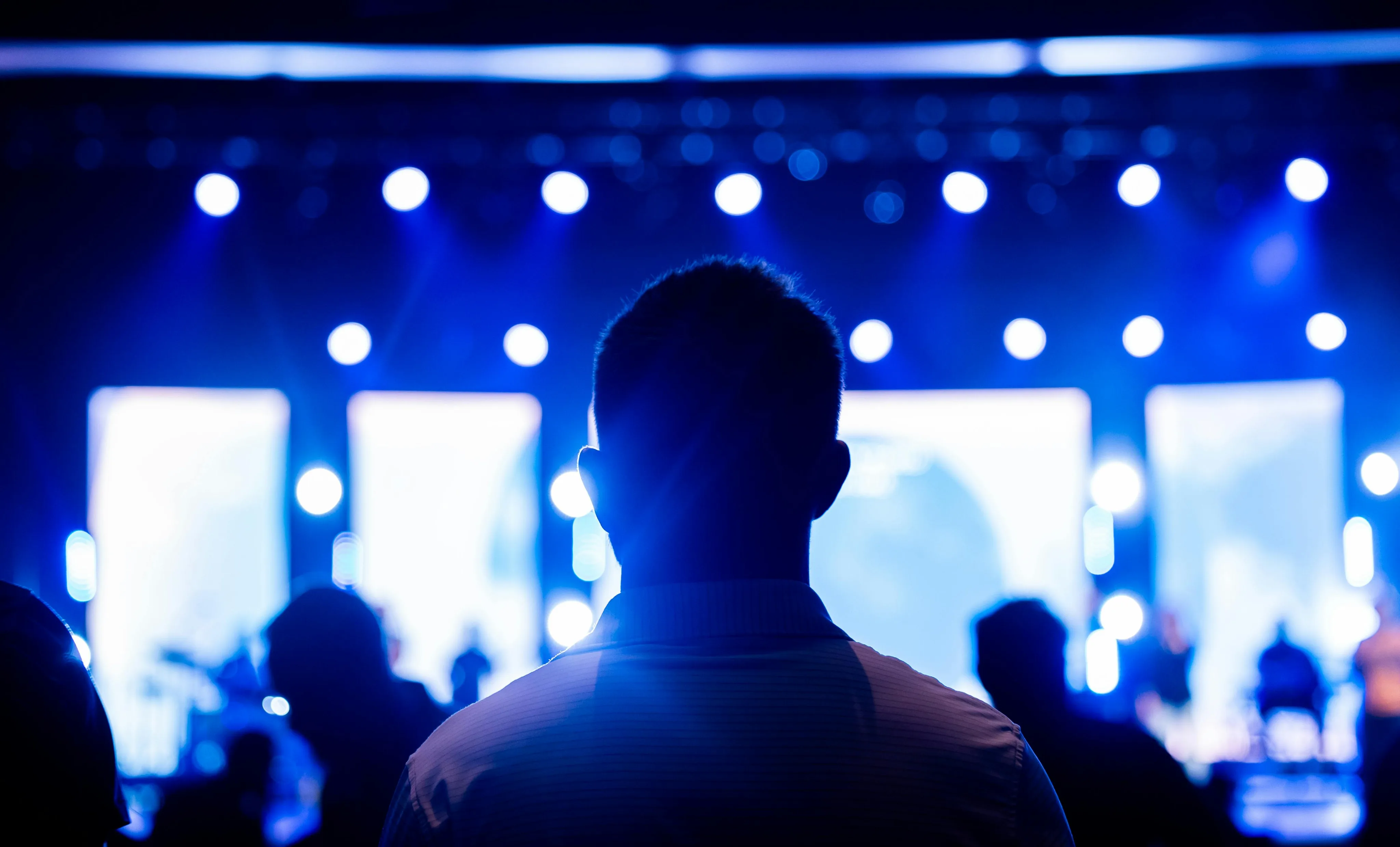
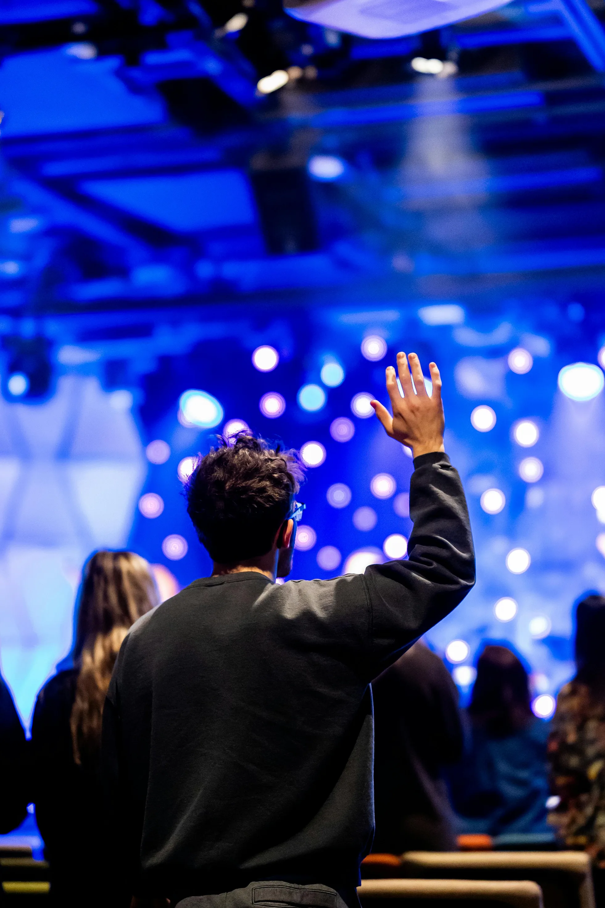
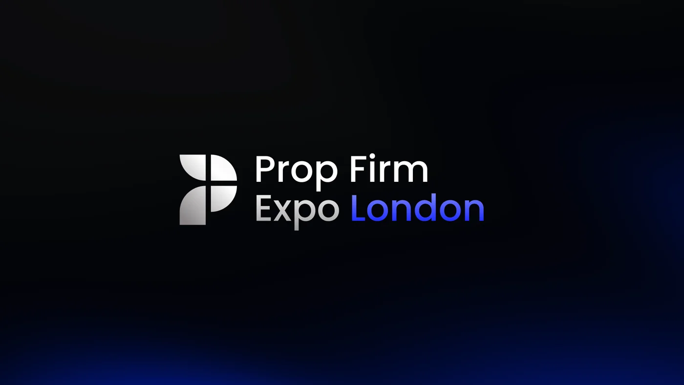
Research focused on how light and motion could form and create anticipation. Leadership instructed me to use blue as the main accent color for the city the expo took place, which was London.
Building the Tool for a
Global Remote Team
As new ways of designing and creative direction were emerging on Twitter and LinkedIn, research led me to use Claude to develop custom brand tooling that can elevate the brand from their competitors or at least be on par with major tech brands.
This made me start learning Claude Code and with the help of ChatGPT I have learned so much on how to develop shaders. The goal was to optimize the software for ease-of-use, however I ended up overbuilding it.
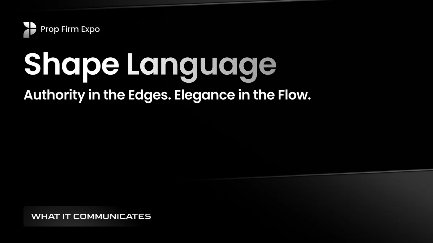
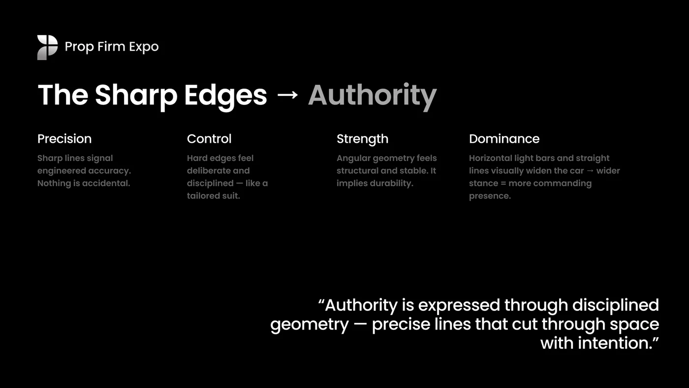
Shape Language
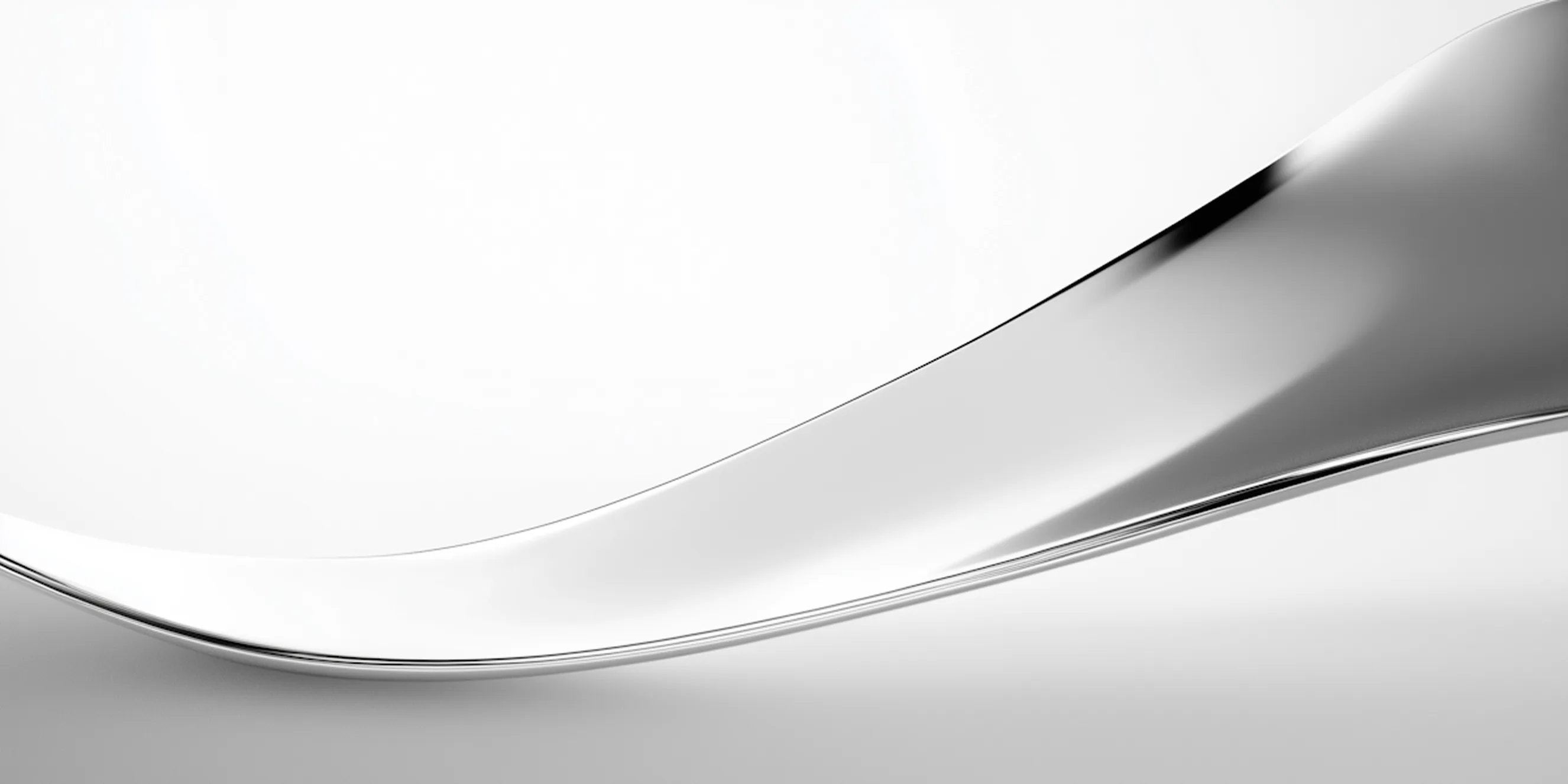
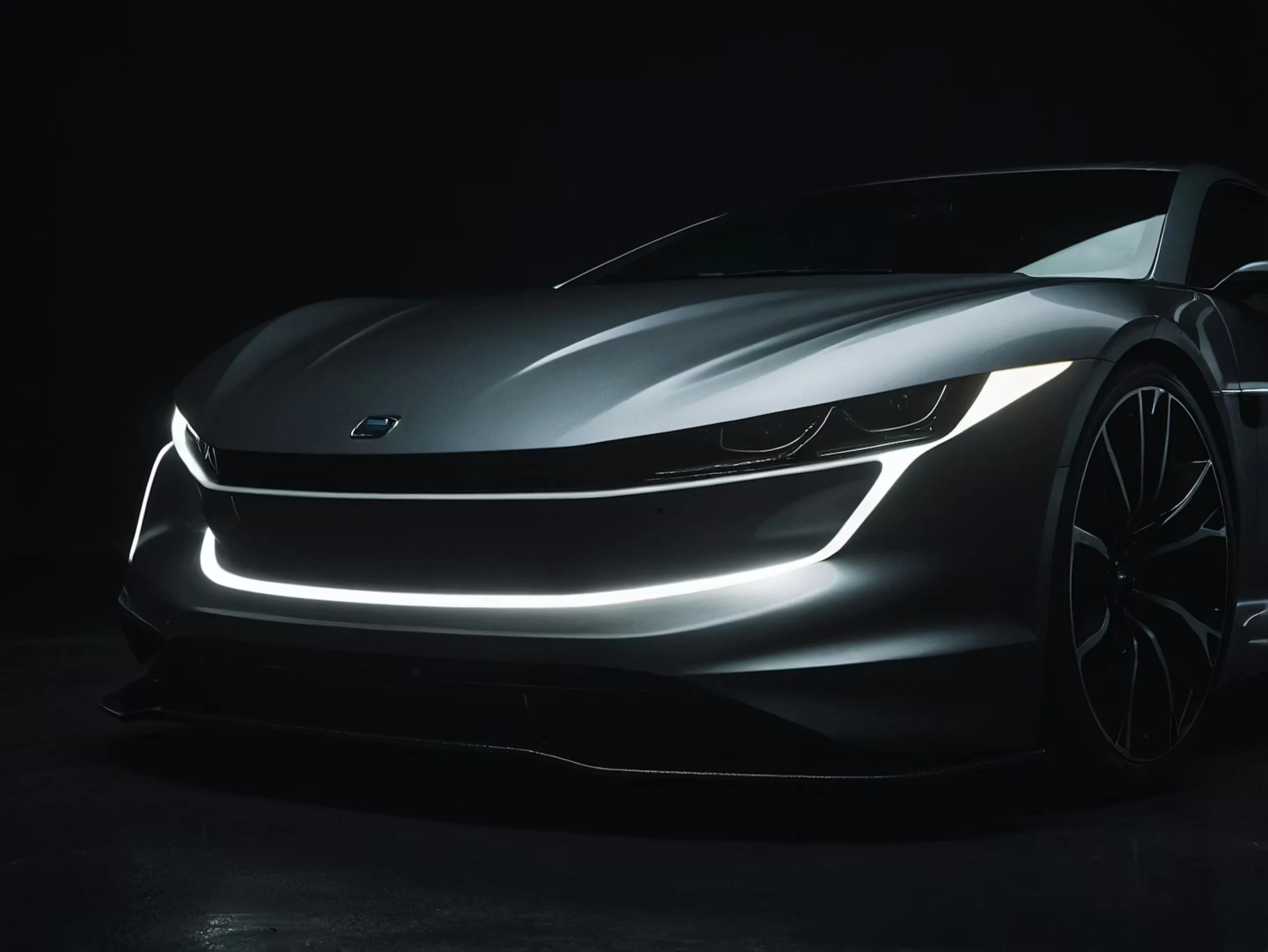
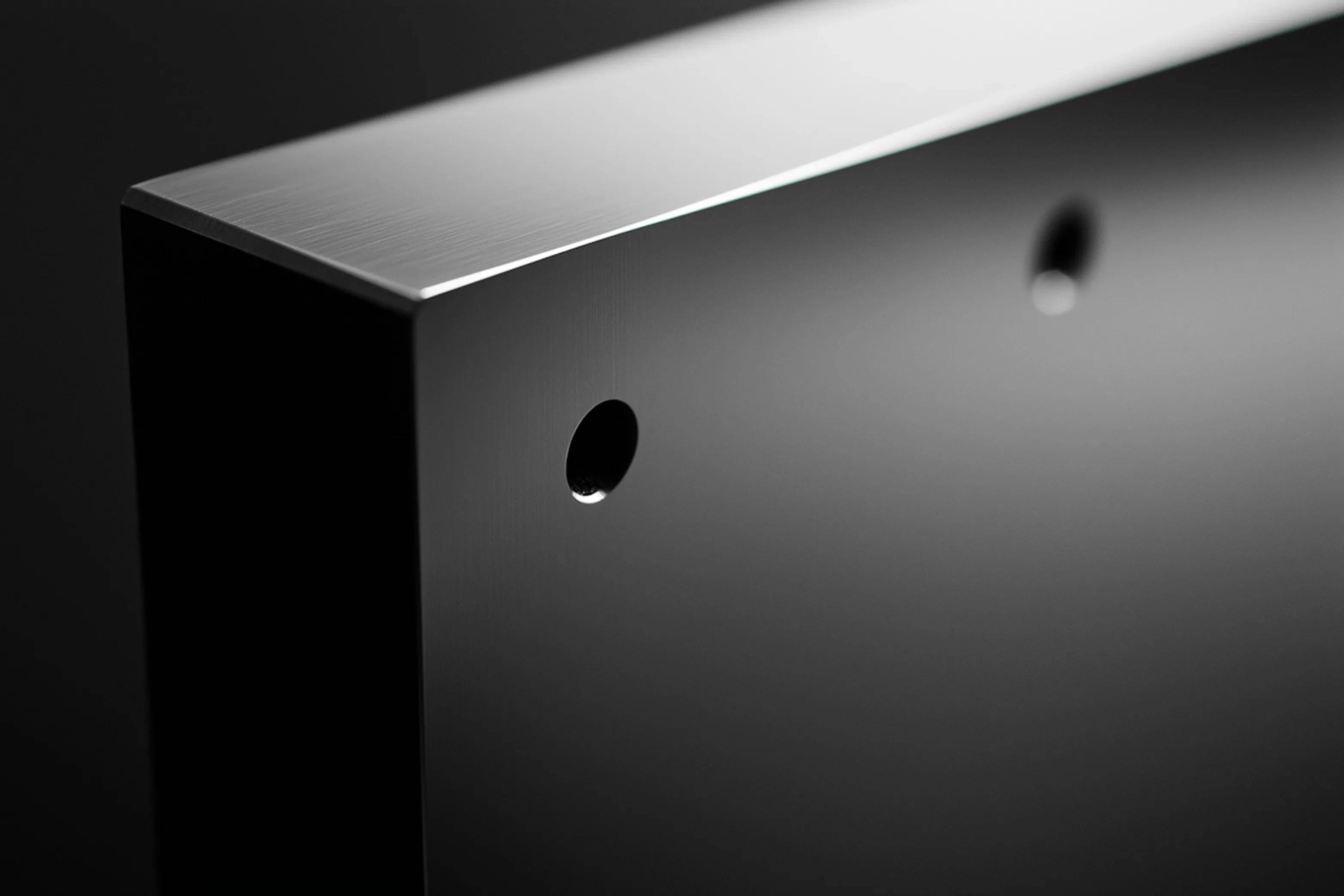
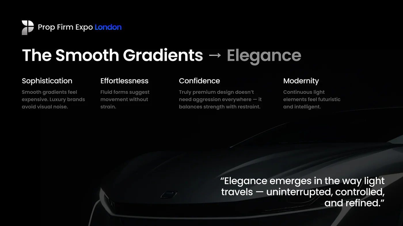
The identity should feel premium and elegant, modern and professional. The next step made me step into how light reacts and passes through sharp and soft forms. What ambients build intrigue and awe, and what ambients build anticipation.
Jumping to Figma
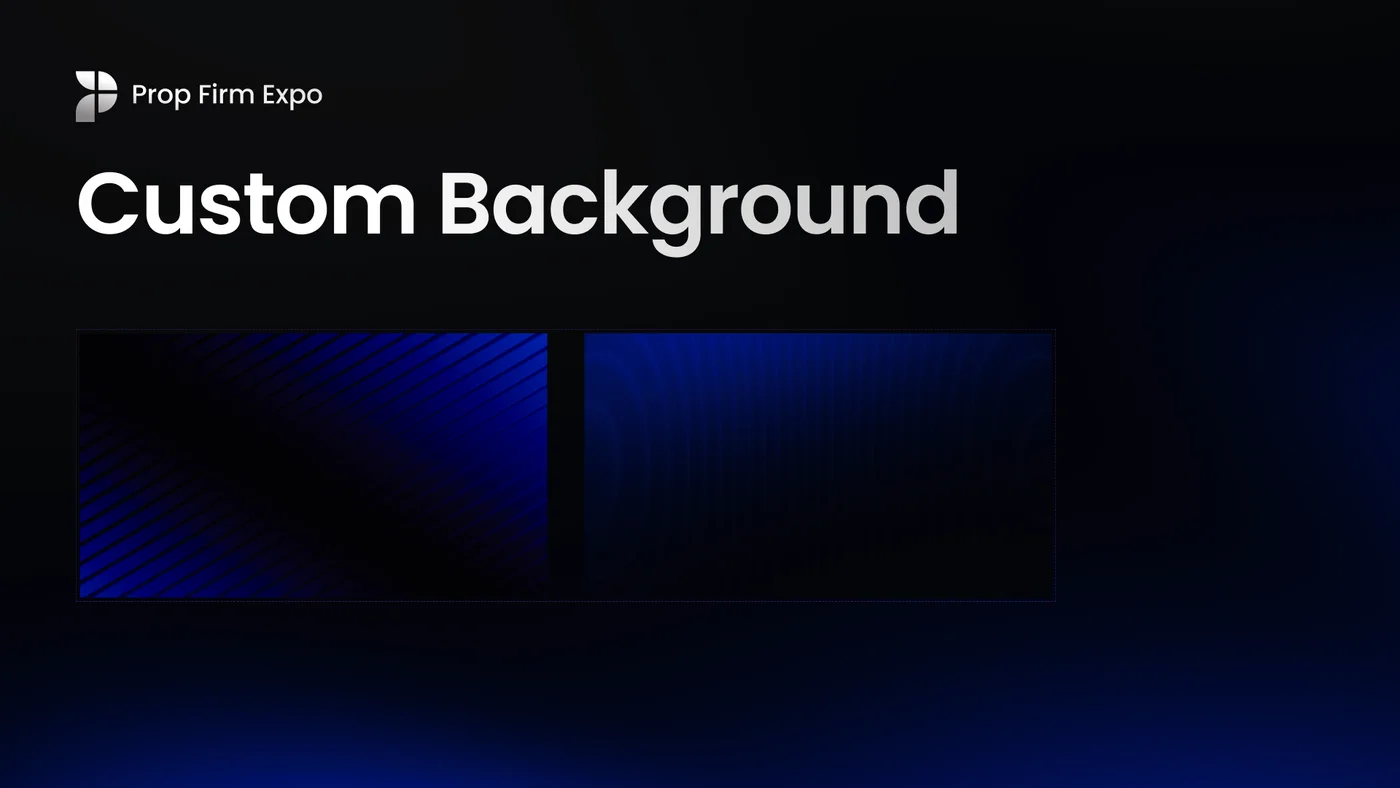
Backgrounds
The tool gave me easy access to iteration, compositions and how motion affects different marketing material.
Speakers
Were a big part of the identity and we needed components to be able to access the speakers easier and more efficient.
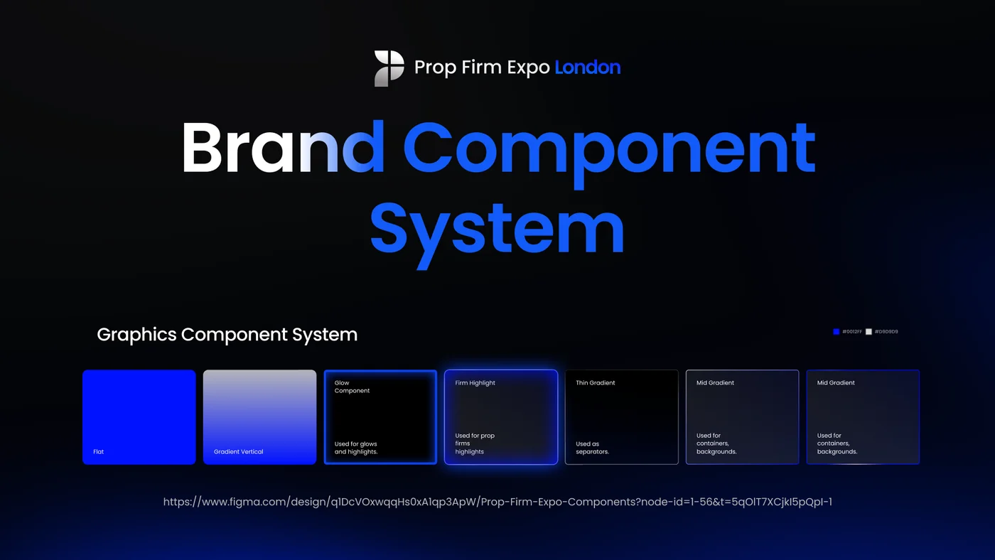
Consistent
This reduced revisions and educated the team on how the brand should look across different media channels.
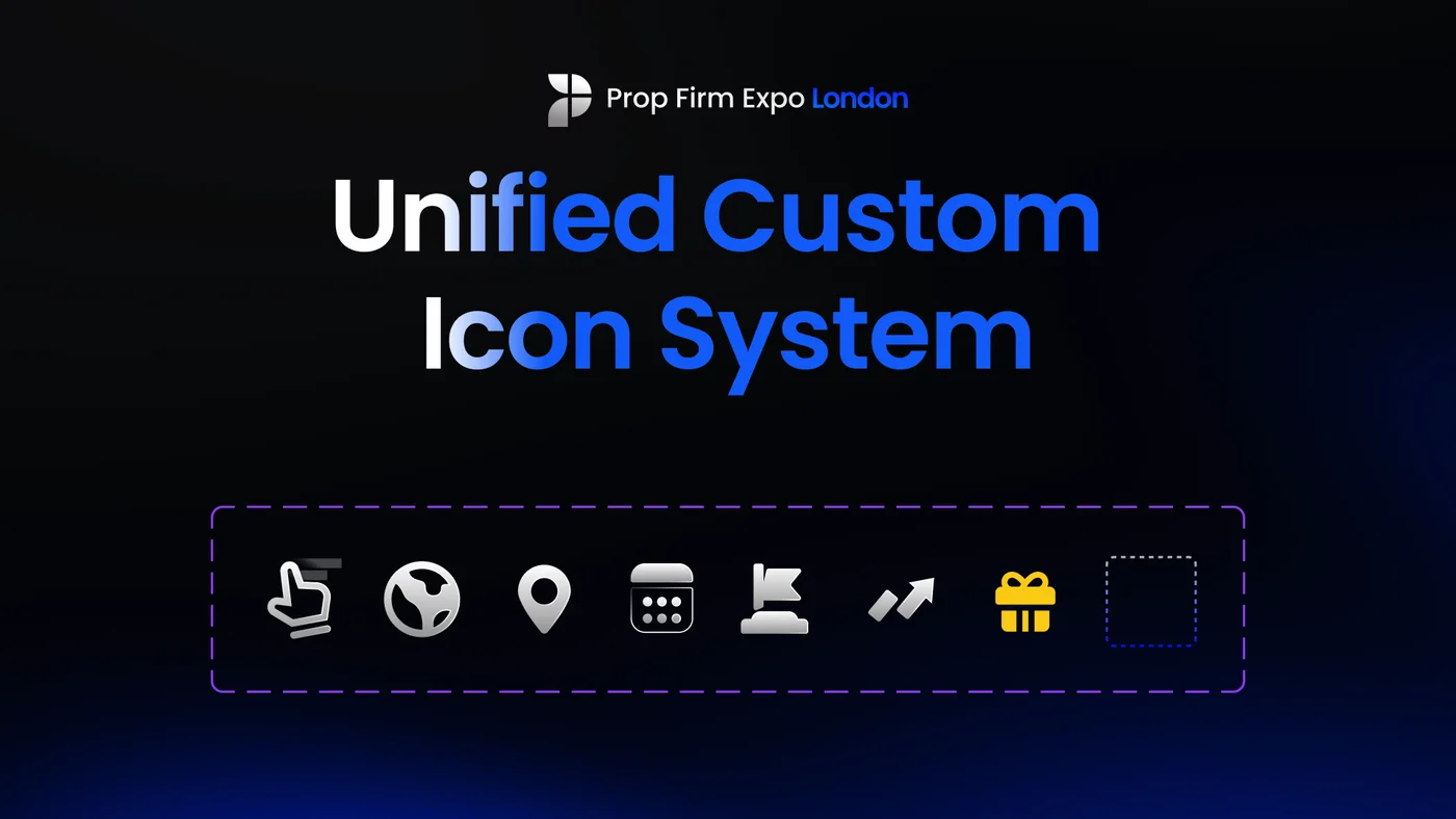
Custom Icons
Were developed to make the brand feel its own, following the shape language that was introduced.
Different Media Designs
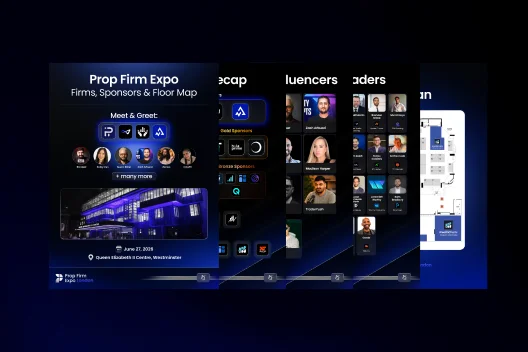
Carousels
Components, typography, colors re-used to create story driven posts.
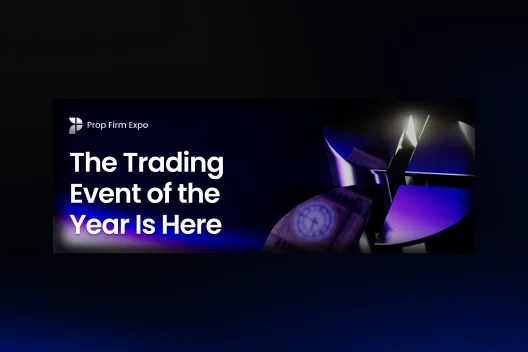
Newsletter
Brand adapting to different aspect ratios.
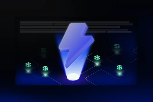
Illustrations
Expanding on color styles, and how directional lights affects vector illustrations.
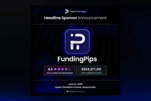
Social Media
Brand adapted to different type of marketing posts. Custom vectors and components combined.
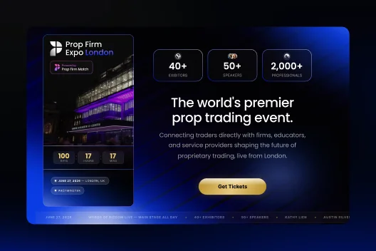
Website Pop-ups
How components combined looked on the website.
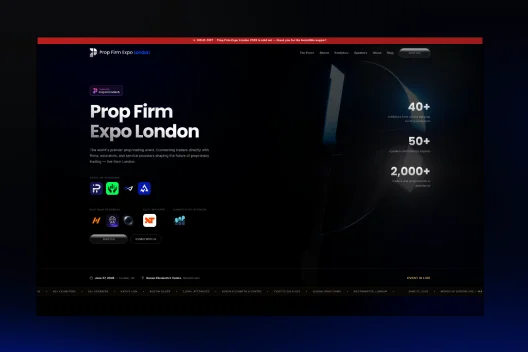
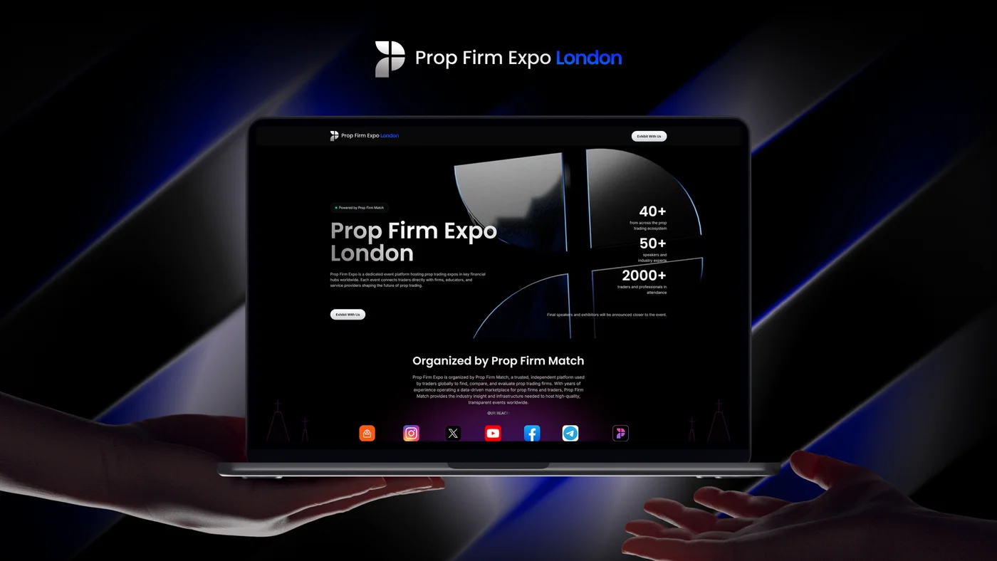
Webdesign
Click on the link to visit the website.
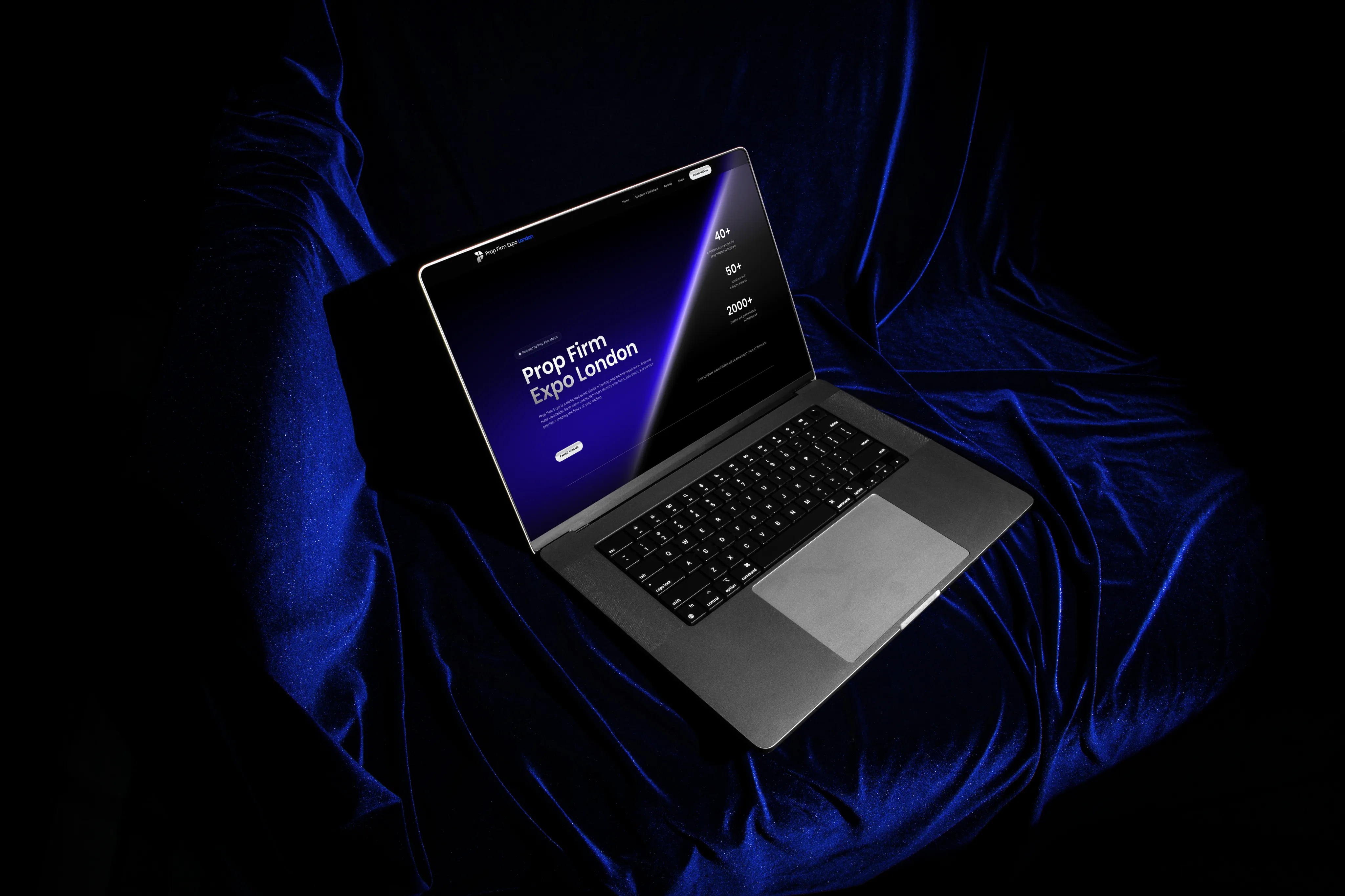
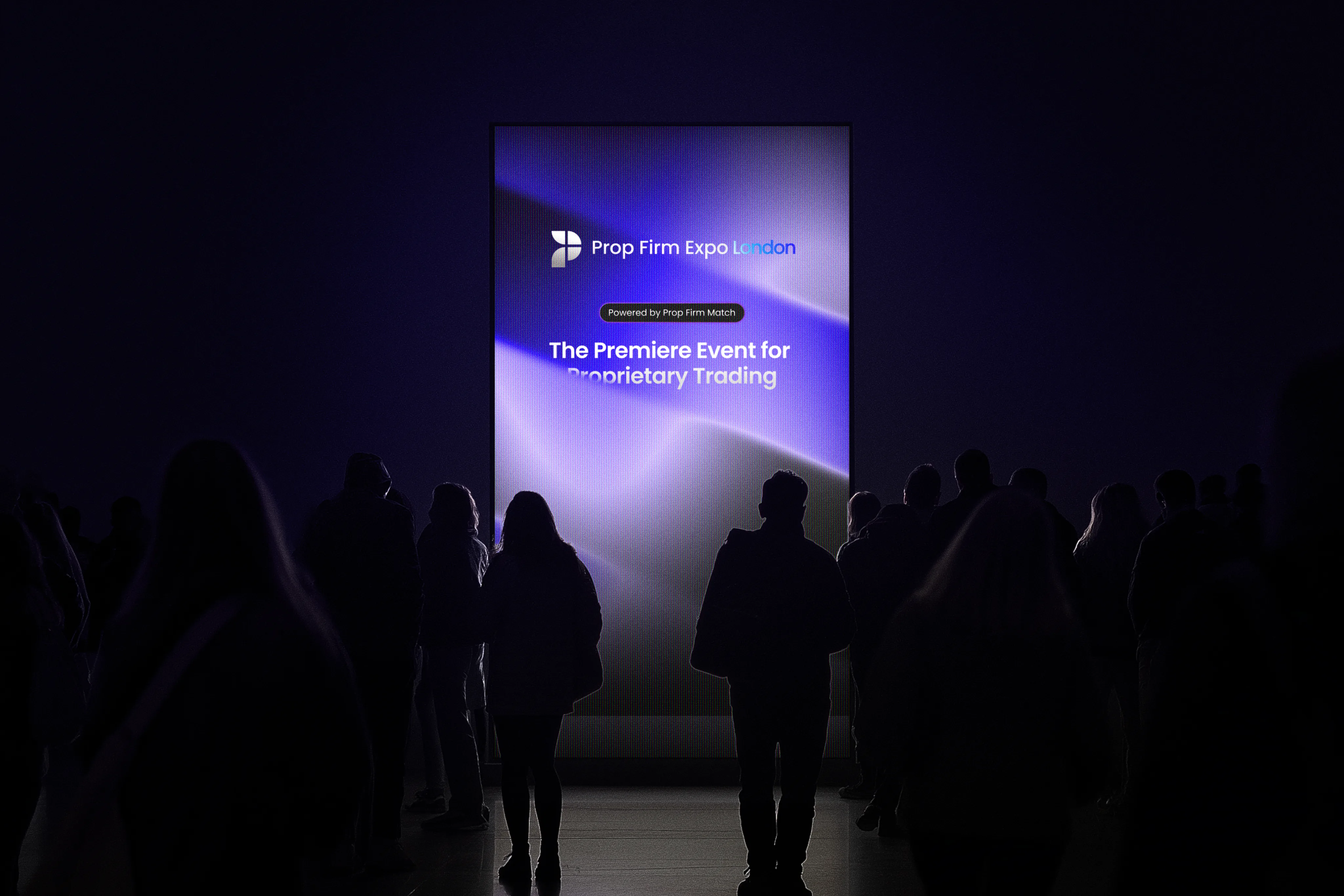
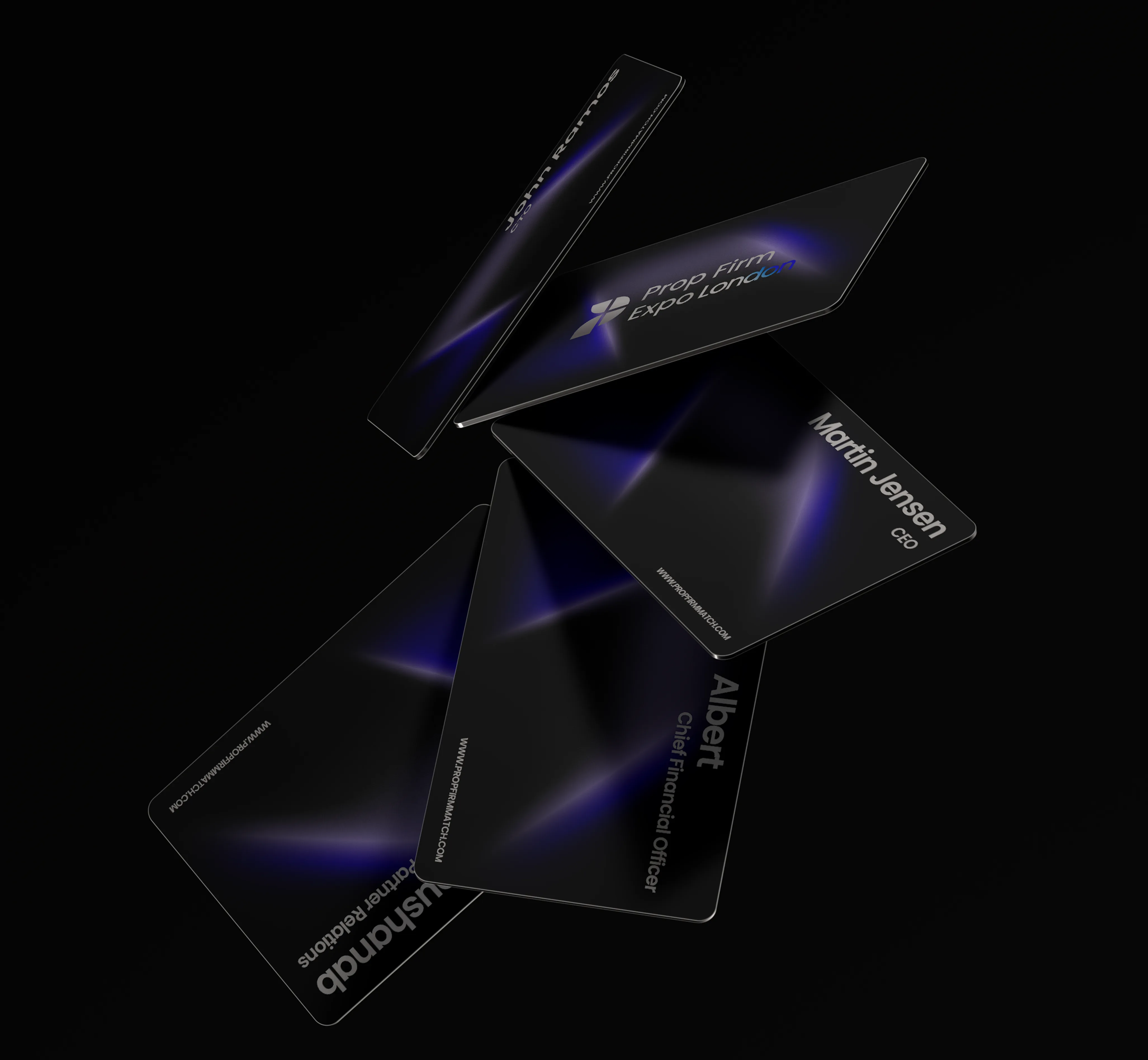
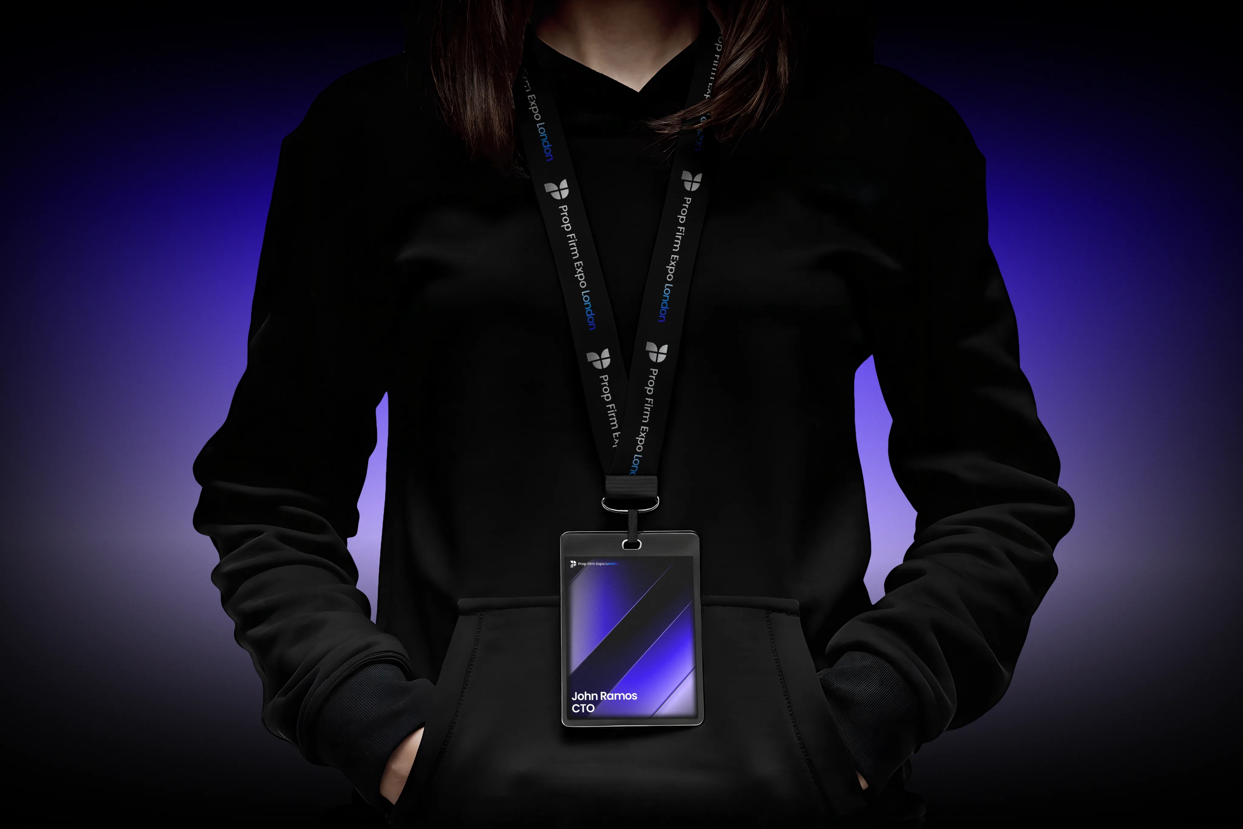
Brand Mockups
Final presentation across digital and physical touchpoints.
Brand Book
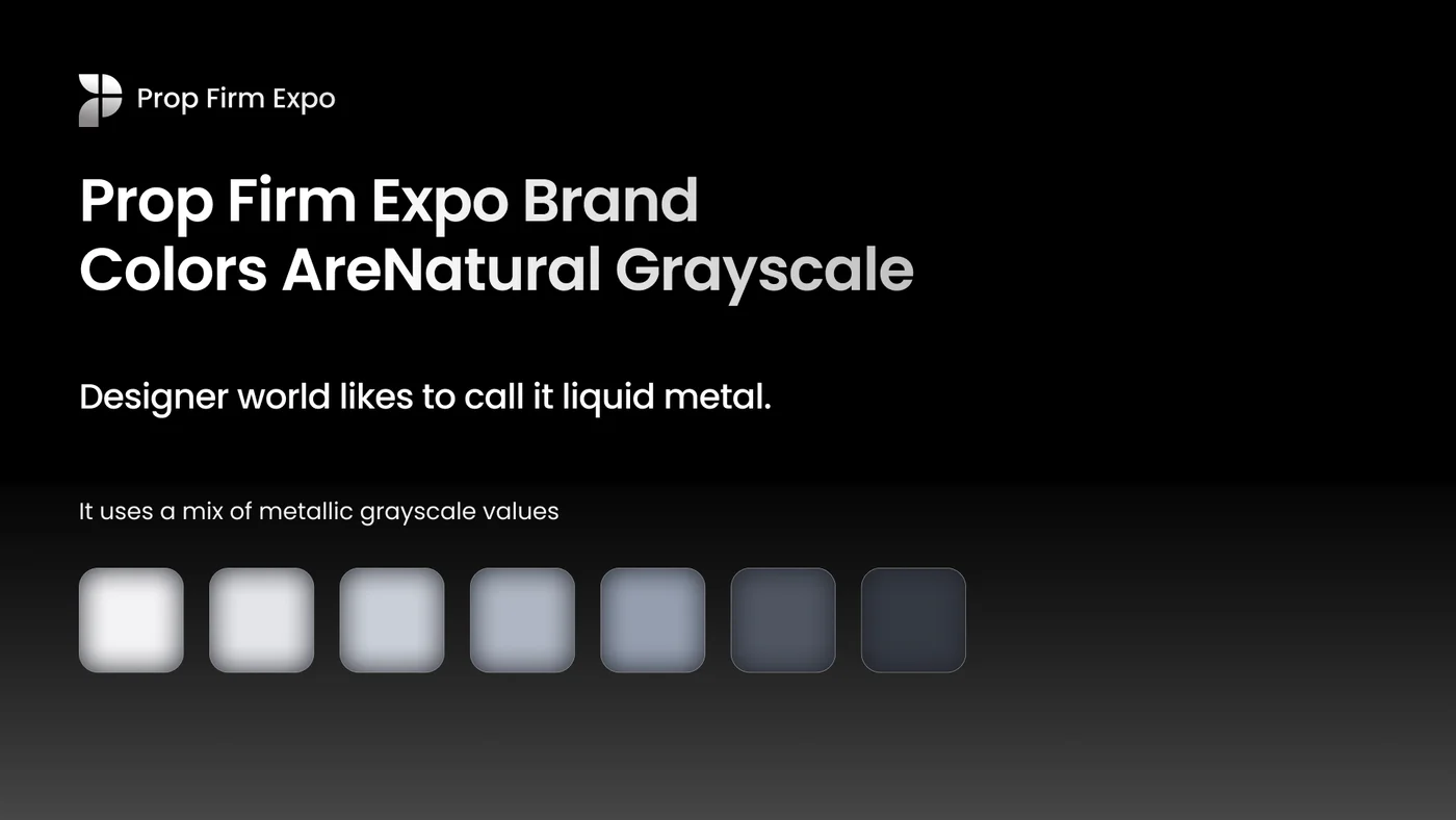
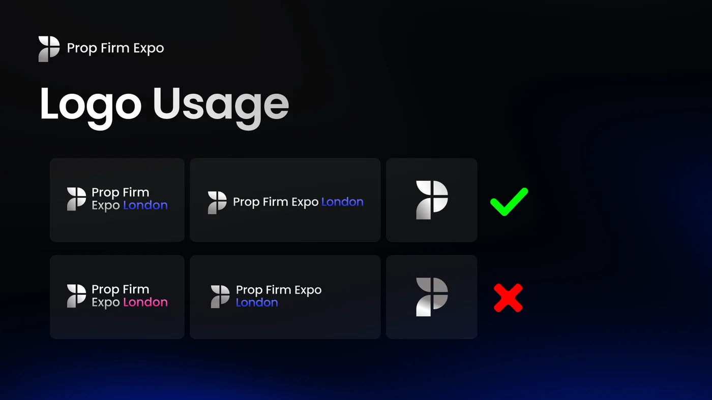
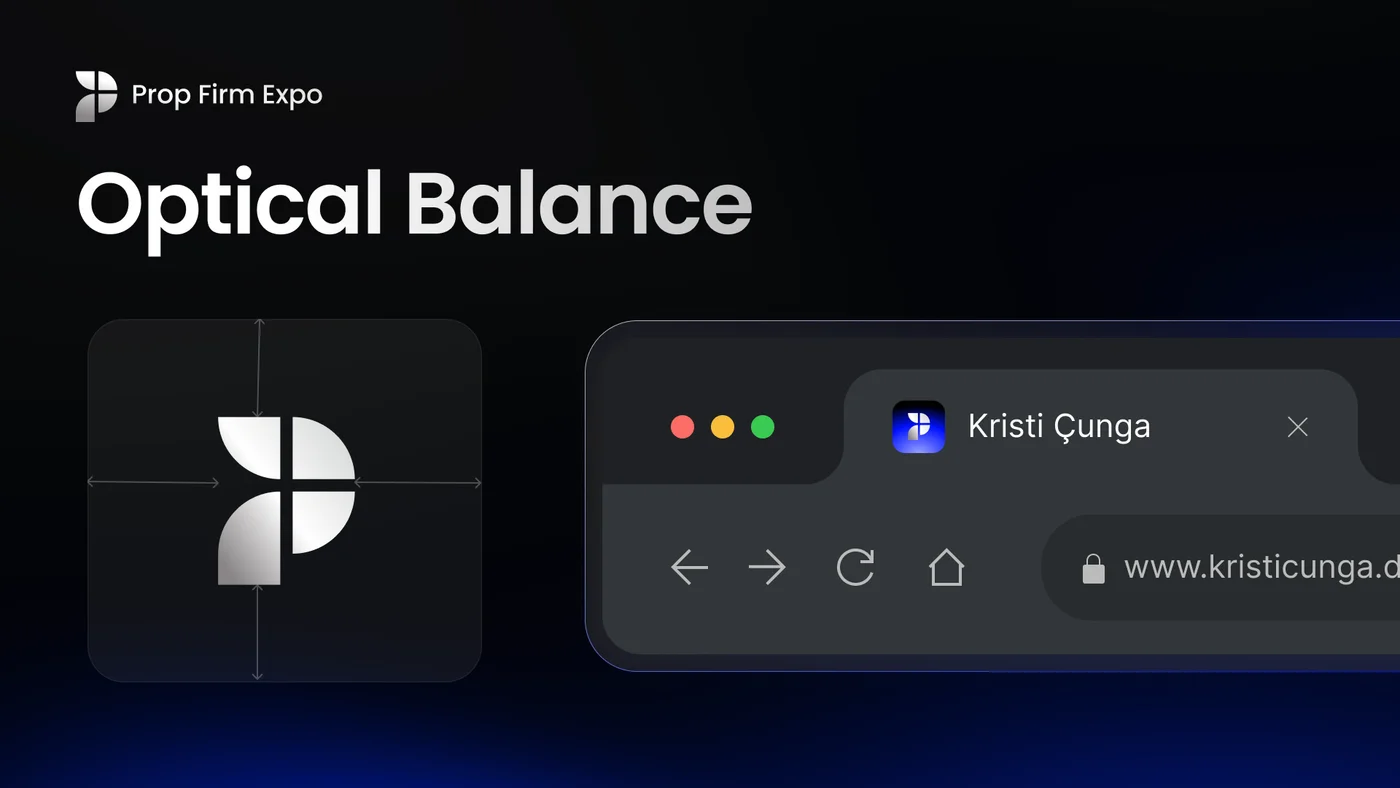
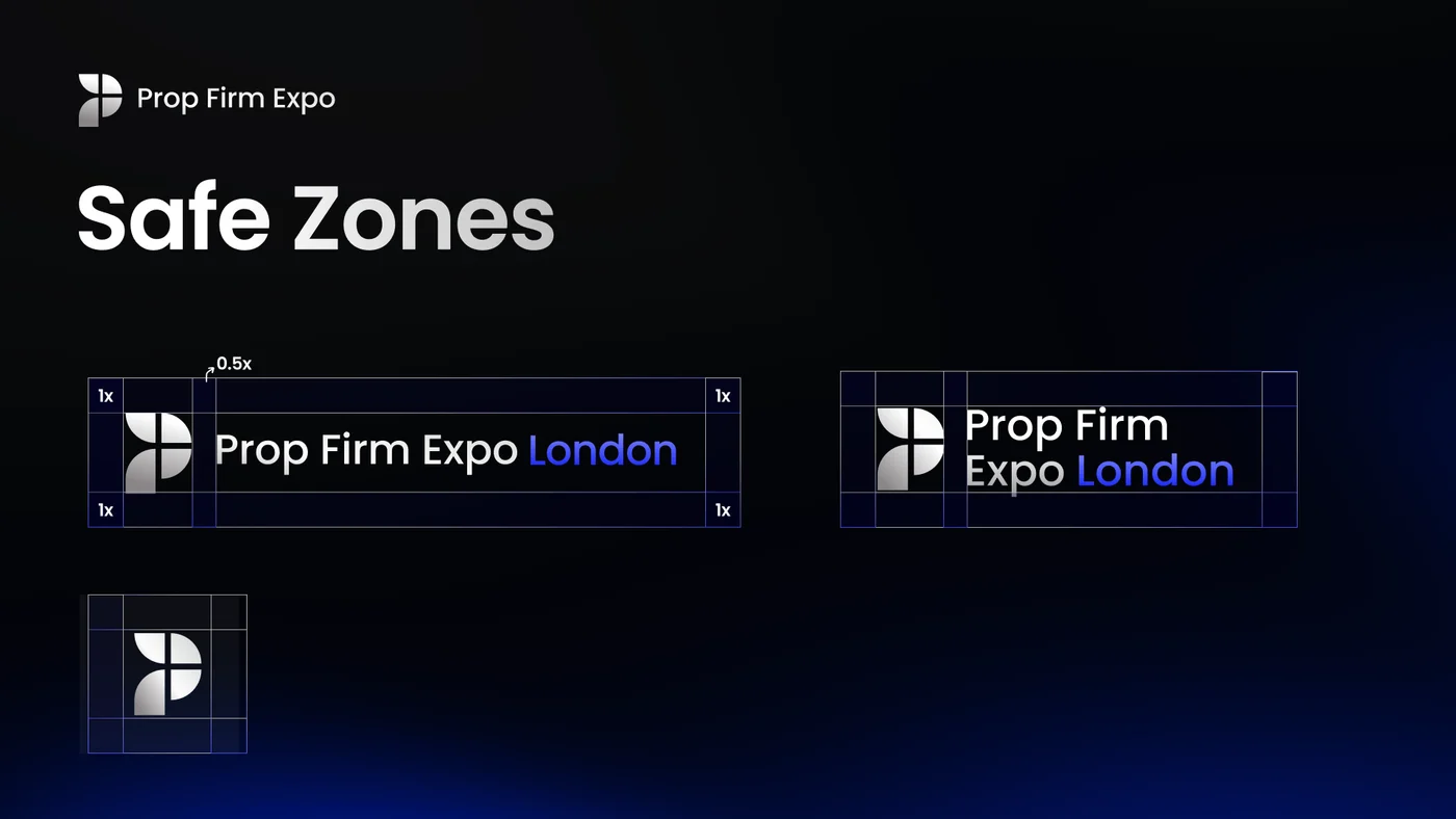
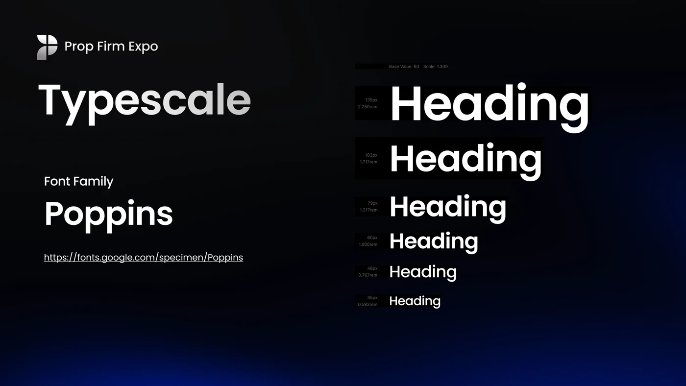
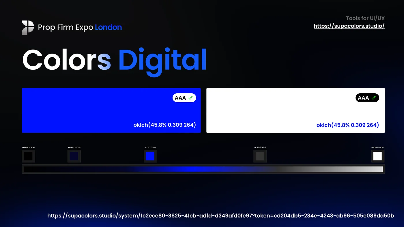
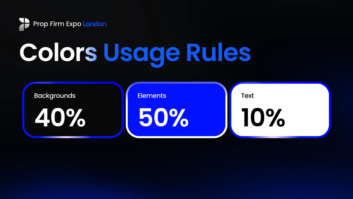
A complete brand presentation: identity, typography, colour system, and guidelines in one document.
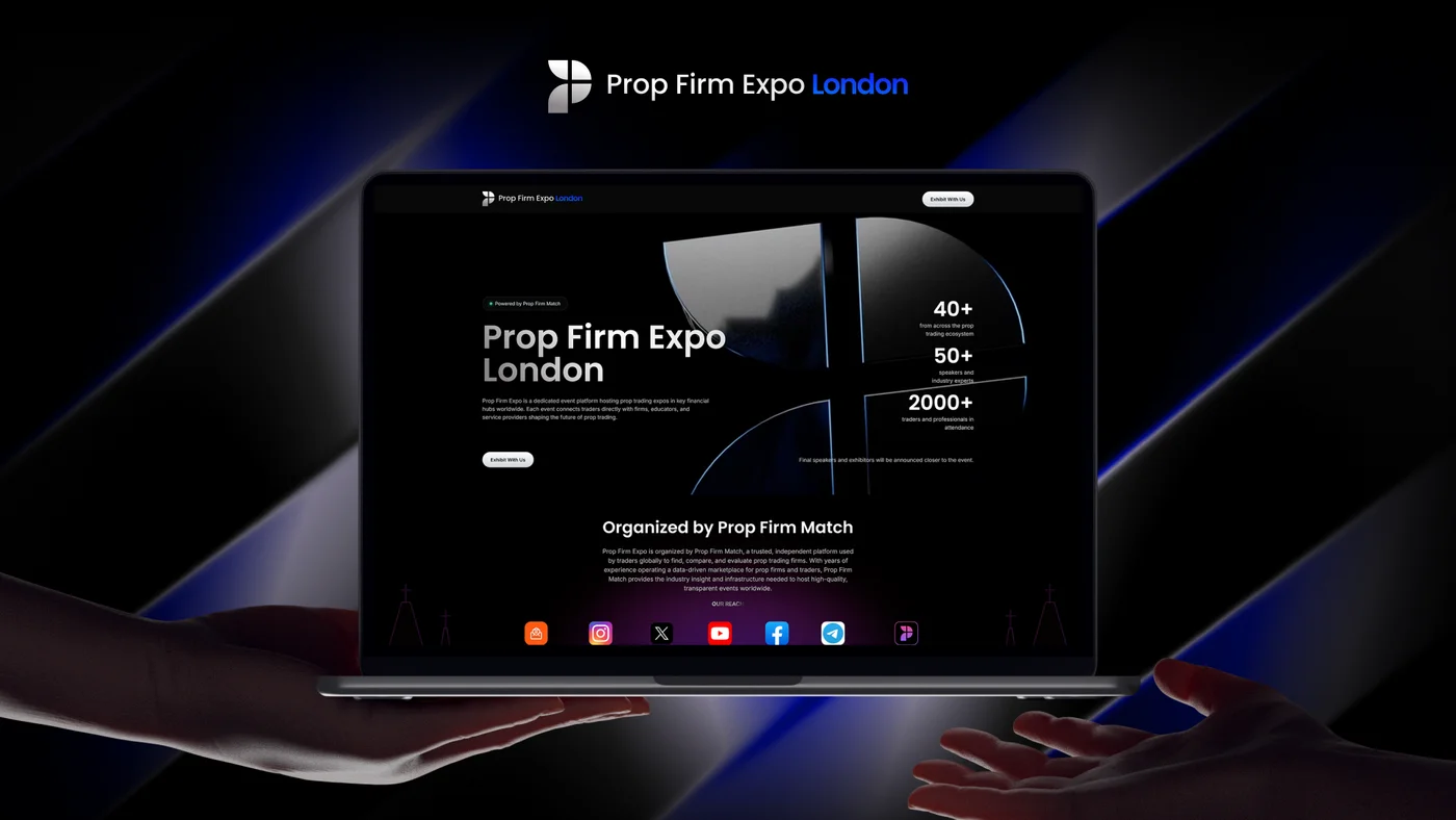
Tight deadlines, took risks, here is the payoff.